The Line-Up Font
Free for personal useAbout
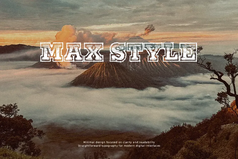
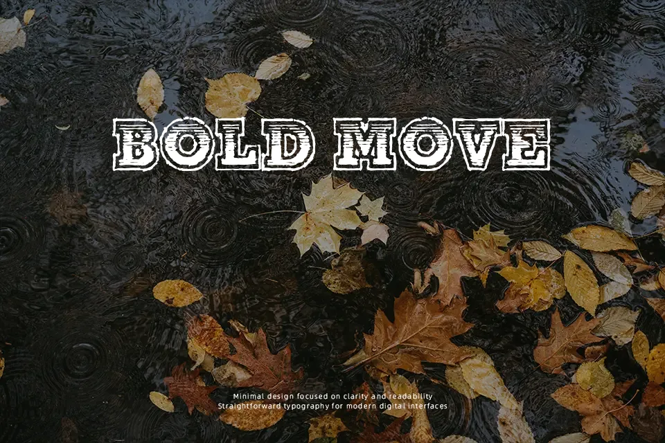
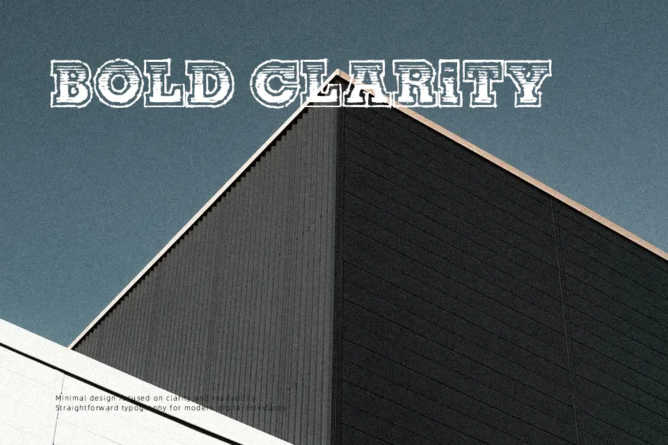
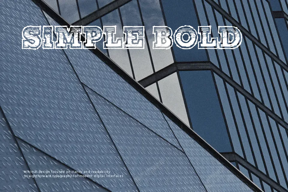
Heavy geometric serifs define The Line-Up Font, giving every letterform a rugged athletic presence across large display layouts. Thick horizontal footings combine with bold vertical stems, producing uniform character widths and tightly controlled spacing that punch through loud visual backgrounds. Proportions remain wide and stocky throughout the uppercase forms, making short athletic titles, jersey emblems, and event flyers stand out effortlessly. The solid visual rhythm ensures quick word recognition from a distance, yet this dense construction easily clogs dense paragraphs and fine body copy. Compact, high-impact headings showcase its rugged display strengths with complete confidence.
Best For: varsity sports apparel, athletic event flyers, collegiate jersey numbering, action poster headlines
Not Ideal For: continuous reading passages, compact website navigation, dense editorial layouts, mobile screen captions
Perfect for branding, headline, and logo, with a bold and display style.
License
Gallery