The Day Is My Enemy Font
Free for Commercial UseAbout
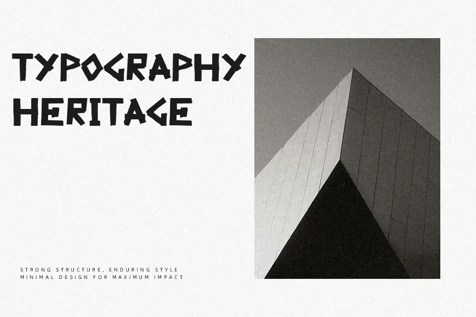
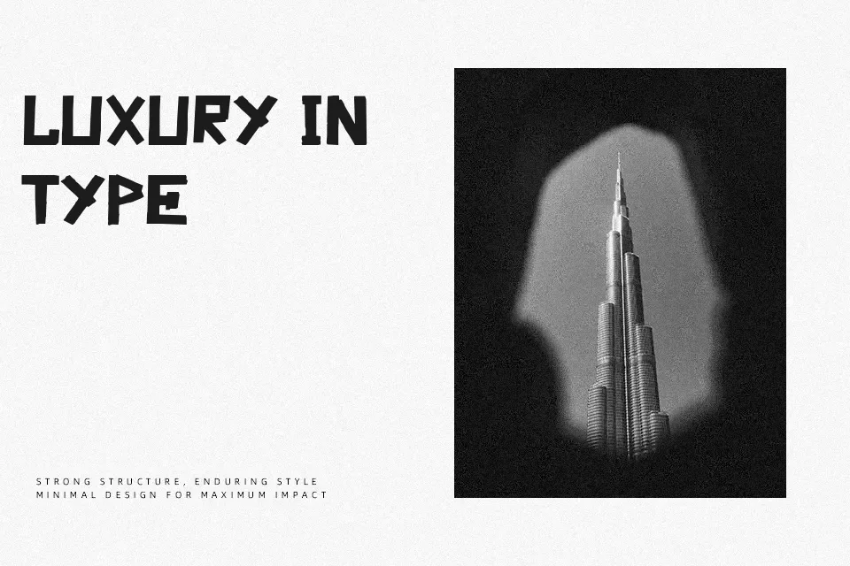
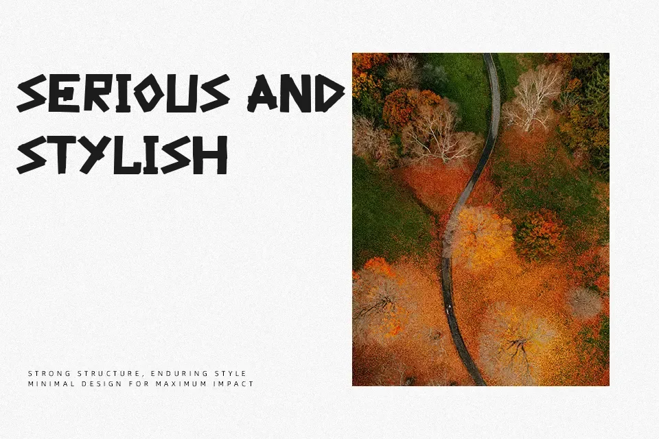
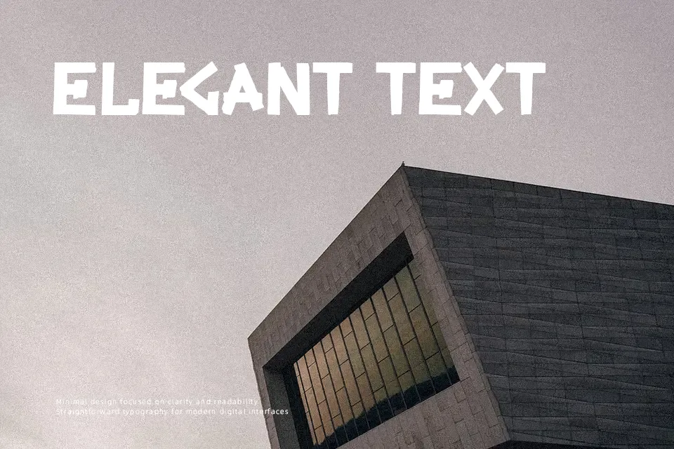
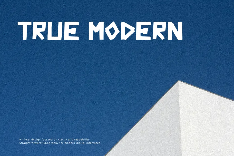
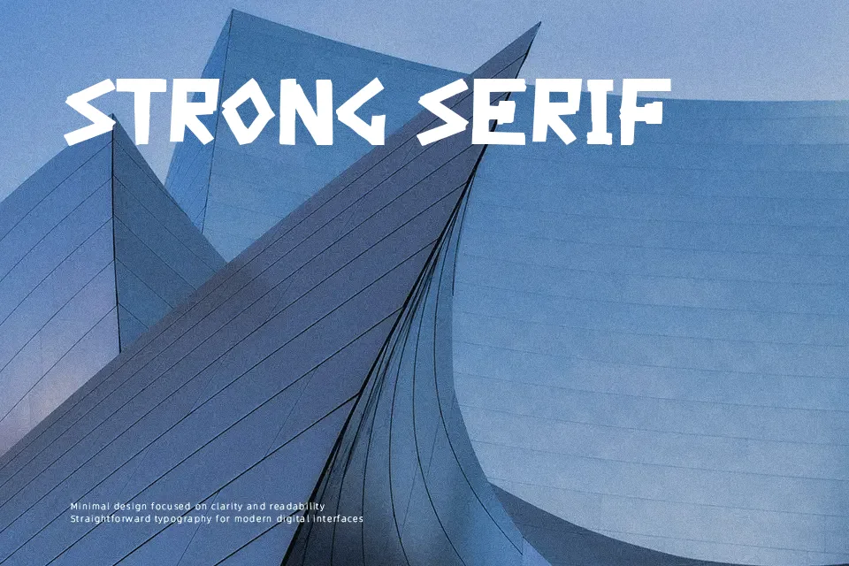
The Day Is My Enemy Font establishes an aggressive display aesthetic through raw, tape-styled construction and distressed, angular strokes. Each glyph is built from textured segments with blunt cutoffs, creating a fragmented rhythm and tight, compact spacing that amplifies visual tension. Proportions remain relatively uniform across the uppercase letterforms, preserving legibility in punchy, short-form compositions. The design commands immediate attention in large title treatments, yet dense forms reduce comfort during extended reading. While perfect for bold focal points, the abrasive silhouette becomes unreadable in prolonged paragraph text and small interface captions.
Best For: electronic music posters, gritty apparel graphics, album title treatments, bold festival signage
Not Ideal For: long body text, corporate reports, mobile app interfaces, dense book layouts
Perfect for headline, logo, and music, with a dark and decorative style.
License
Gallery