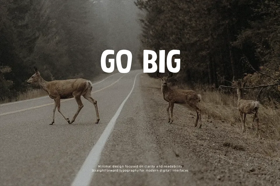
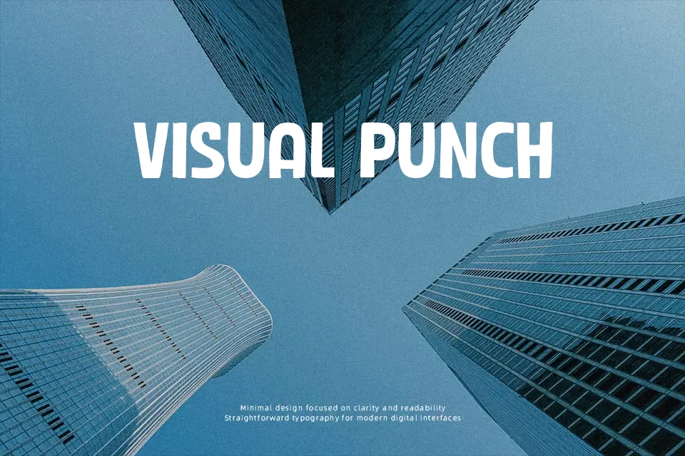
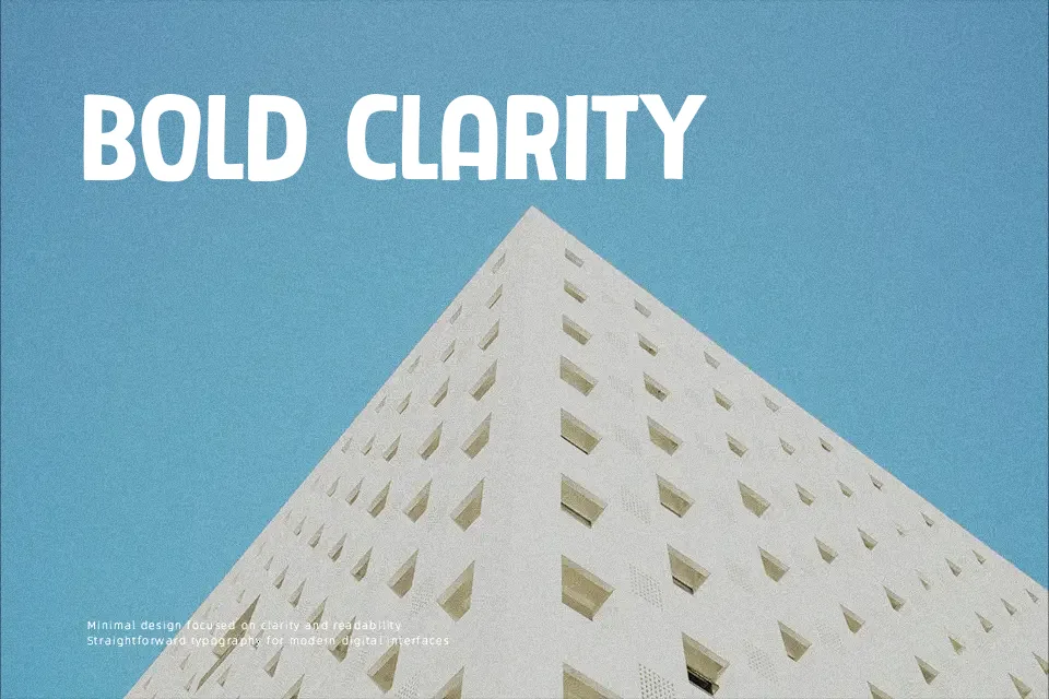
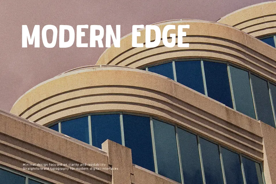
Tak Cubit Font
Free for Commercial UseAbout
Featuring exaggerated weights and softened terminals, Tak Cubit Font delivers an energetic comic aesthetic built upon chunky sans-serif proportions. The letterforms display minimal stroke contrast with deliberately soft outer edges, creating a friendly visual weight across uppercase and lowercase sets. Balanced spacing between glyphs prevents heavy character collisions while maintaining a dense graphic presence. The typeface performs best when displayed at larger sizes on amusement park signage, youth apparel graphics, and casual video game logos. However, the heavy stroke density quickly reduces legibility in long paragraph settings or tiny interface captions, making the design unsuitable for continuous body text.
Best For: children book covers, animated movie titles, playful product packaging, board game logos
Not Ideal For: continuous body text, dense editorial layouts, legal documents, small interface captions
Perfect for headline, kids, and logo, with a bold and cartoon style.
License
Gallery