Tagesschrift Font
Free for Commercial UseAbout
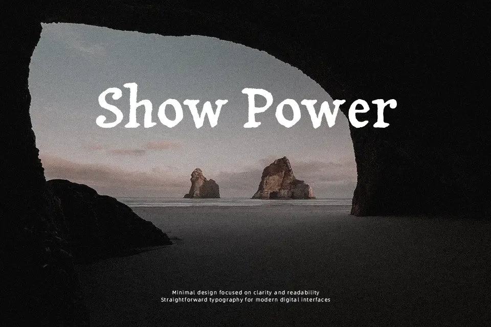
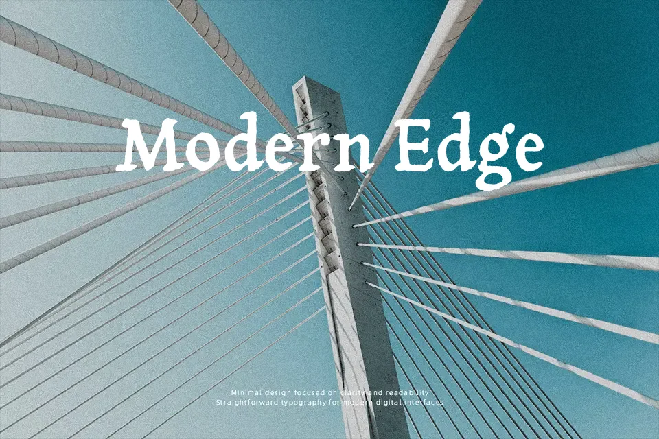
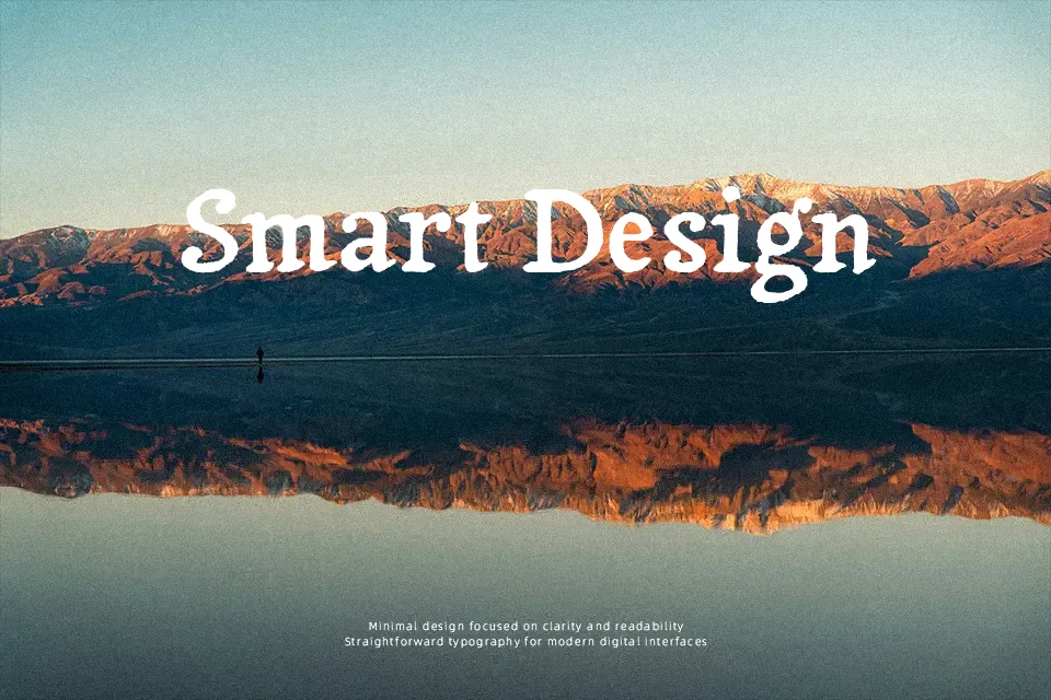
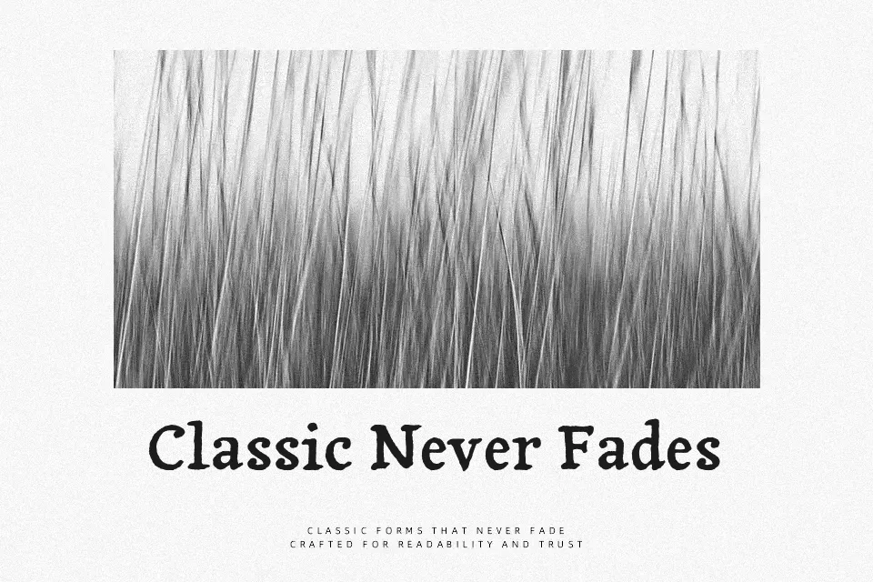
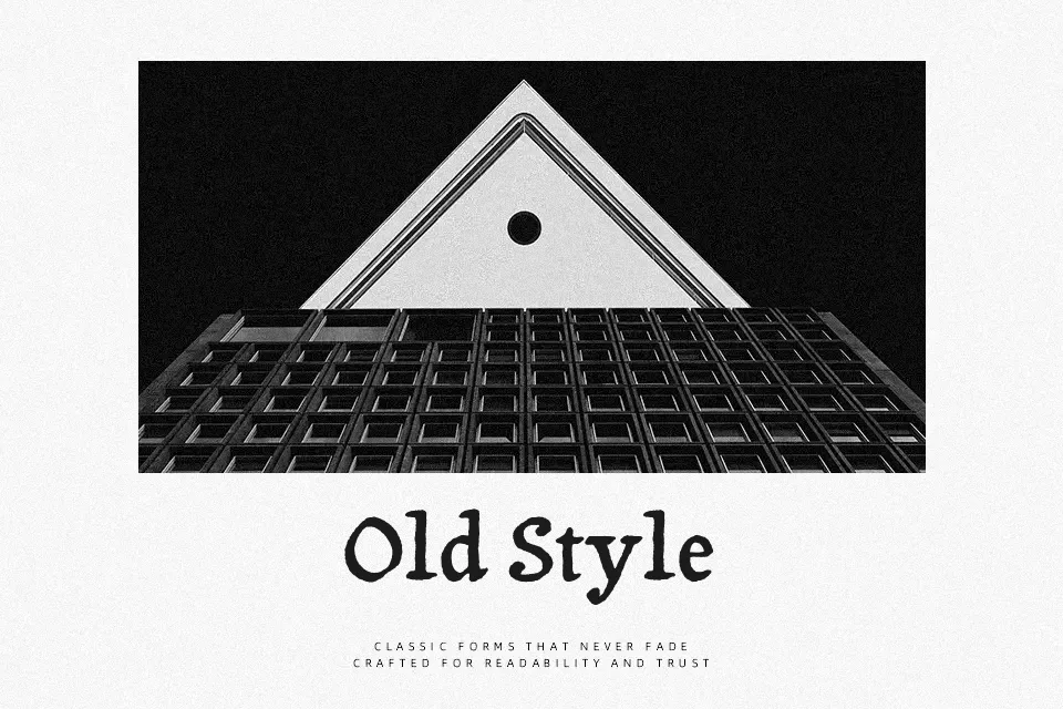
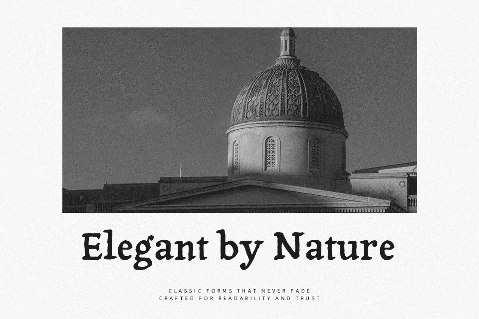
Tagesschrift grew from a quick type design experiment, so its shapes feel spontaneous yet still rooted in classic serif structure. Strokes are slightly irregular with a calligraphic tone, moderate contrast, and open counters that keep text from feeling cramped. The overall impression sits between casual and traditional, which works nicely for characterful headings, packaging, restaurant menus, and small editorial highlights where you want personality without losing legibility. In long body text or very small UI elements, the quirks can start to distract, so it makes more sense as a display or short‑copy workhorse than a dense reading face.
Best For:
Expressive headlines and title pages
Characterful packaging and label design
Editorial pull quotes and short intros
Restaurant and café menus with a crafted feel
Not Ideal For:
Dense body text in books or reports
Tiny UI labels or system interfaces
Minimalist, ultra-clean branding systems
Perfect for branding, editorial, and headline, with a artistic and display style.
License
Gallery