Static Heights Font
Free for personal useAbout
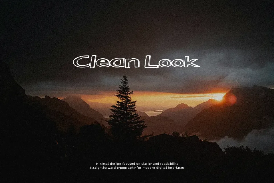
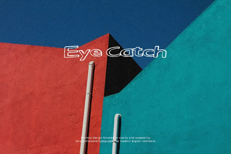
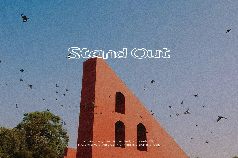
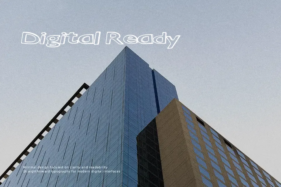
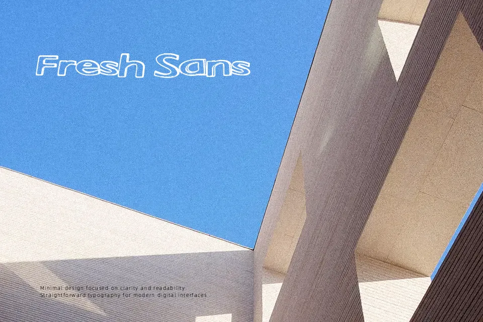
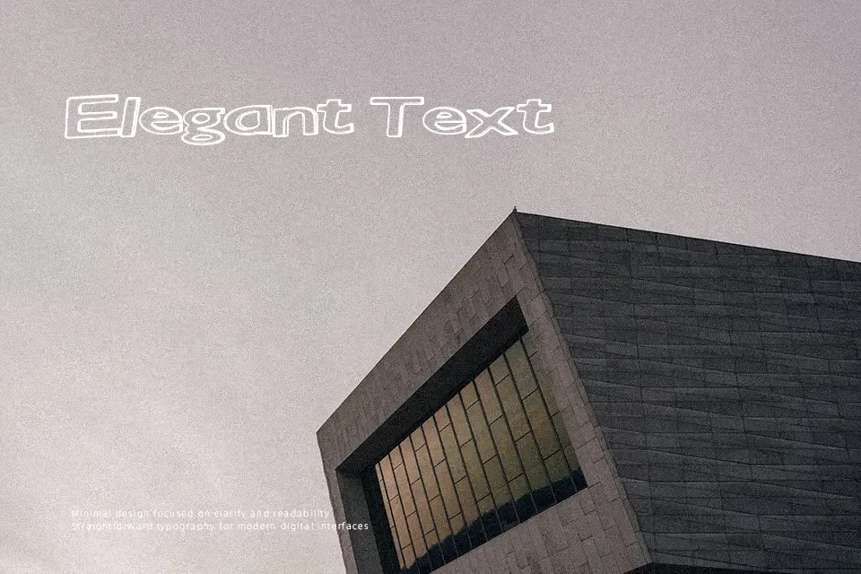
The letterforms of Static Heights Font present an elongated vertical structure marked by distressed horizontal fractures and uneven stroke weights. Each character displays pronounced verticality with compressed proportions, creating a tense, rhythmic display pattern. Spacing between glyphs is relatively compact, which enhances visual cohesion in prominent headers but reduces legibility at smaller scales. While the typeface makes a compelling visual statement on album covers, apparel graphics, and industrial-themed promotional banners, dense text passages quickly lose clarity. Heavy visual fragmentation makes continuous reading uncomfortable, so designers will achieve optimal impact by reserving the design strictly for short, isolated headline applications.
Best For: music festival posters, streetwear apparel graphics, video game title screens, alternative album covers
Not Ideal For: long paragraph text, mobile user interfaces, corporate document body text, dense spreadsheet tables
Perfect for gaming, headline, and music, with a creative and condensed style.
License
Gallery