StableNo Font
Free for Commercial UseAbout
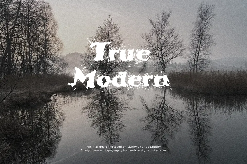
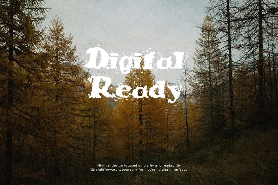
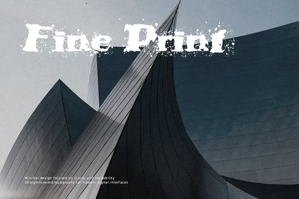
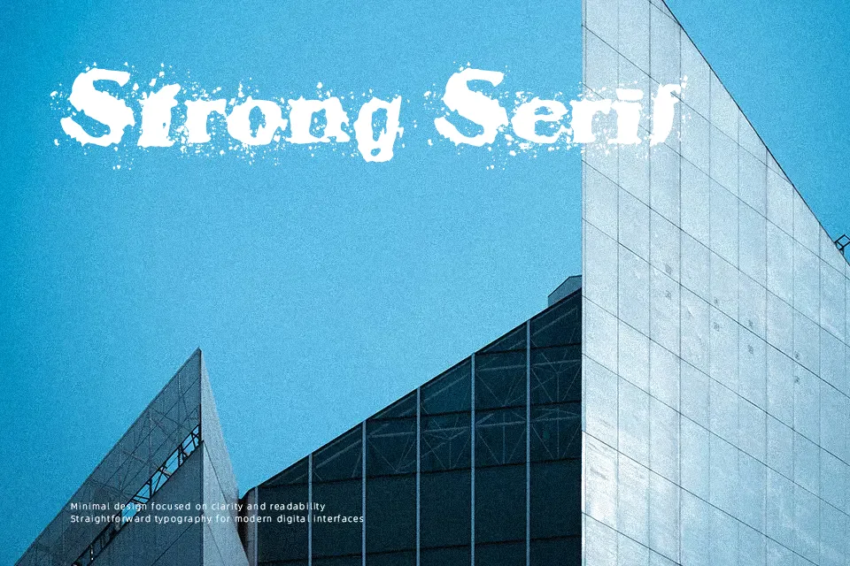
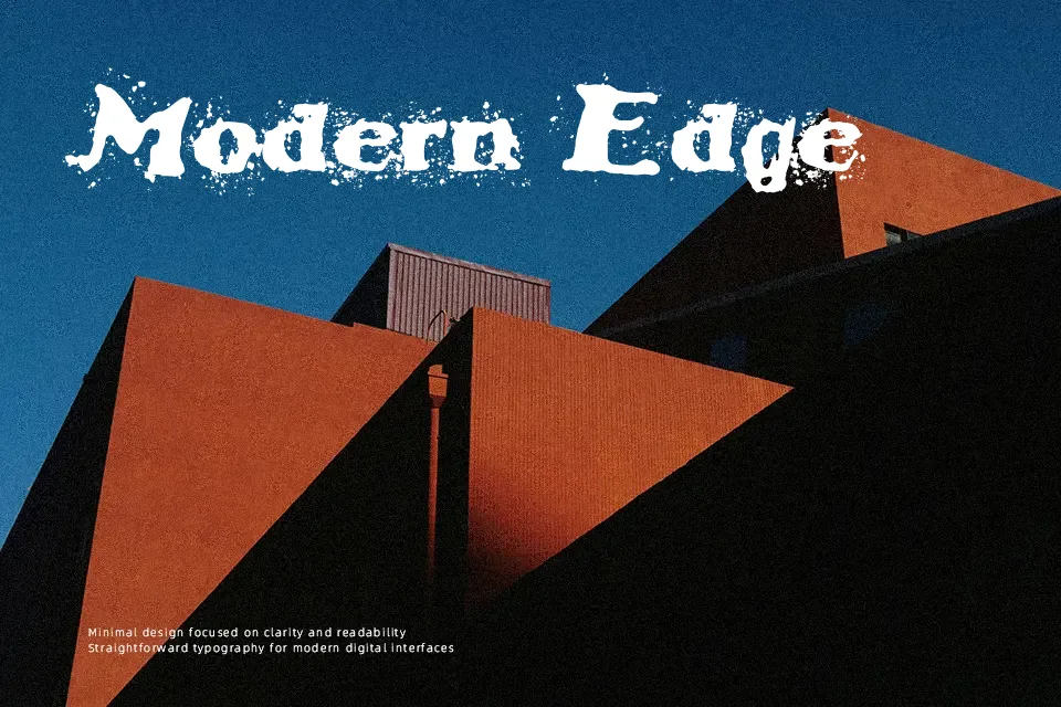
StableNo uses heavy, damaged-looking letterforms with irregular edges and dense, textured strokes. Its uppercase-focused appearance creates a forceful visual rhythm, while the rough surface treatment makes individual forms feel less clean than conventional display type. Spacing is best appreciated at larger sizes, where the disrupted outlines remain distinct and the design reads as intentional rather than crowded. It works well for short headlines, cover art, and bold graphic compositions. The typeface is less comfortable in compact text because the distressed details can obscure small counters and punctuation. In practice, it performs most clearly when given generous scale and space.
Best For: music event posters,album cover artwork,streetwear graphics,large promotional headlines
Not Ideal For: long paragraph text,small interface labels,legal documents,dense editorial layouts
Perfect for advertising, headline, and music, with a bold and decorative style.
License
Gallery