South Amsterdam Font
Free for personal useAbout
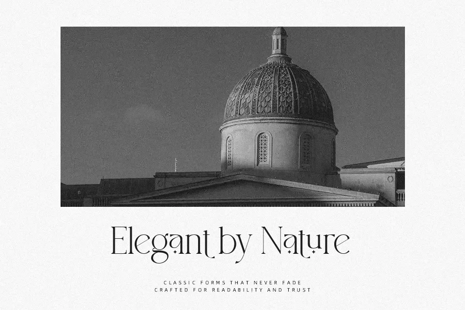
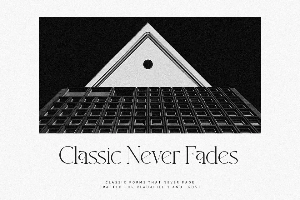
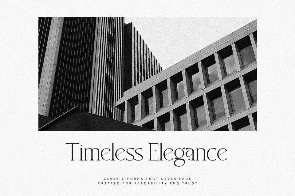
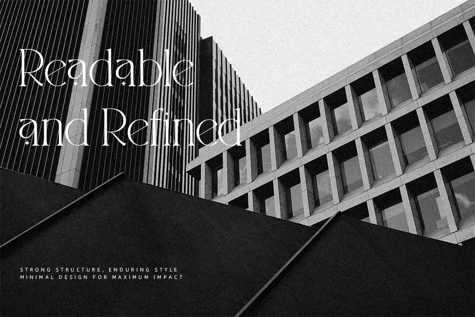
South Amsterdam Font uses tall, narrow serif letterforms with pronounced thick-to-thin stroke contrast and pointed terminals. Its uppercase characters create a formal, display-oriented rhythm, while the lowercase maintains a similarly refined, compact appearance. Spacing appears balanced for short lines, helping the shapes stay distinct in logos, invitations, labels, and headline settings. The included numerals and basic punctuation follow the same high-contrast construction. It performs best at larger sizes, where the delicate strokes and decorative serif details are easier to read; small captions and continuous text can lose clarity.
Best For: fashion magazine headlines,wedding invitation headings,cosmetic packaging,logo wordmarks
Not Ideal For: long paragraph text,small interface labels,technical manuals,dense editorial layouts
Perfect for fashion, headline, and invitation, with a classic and decorative style.
License
Gallery