Source Serif 4 Font
Free for Commercial UseAbout
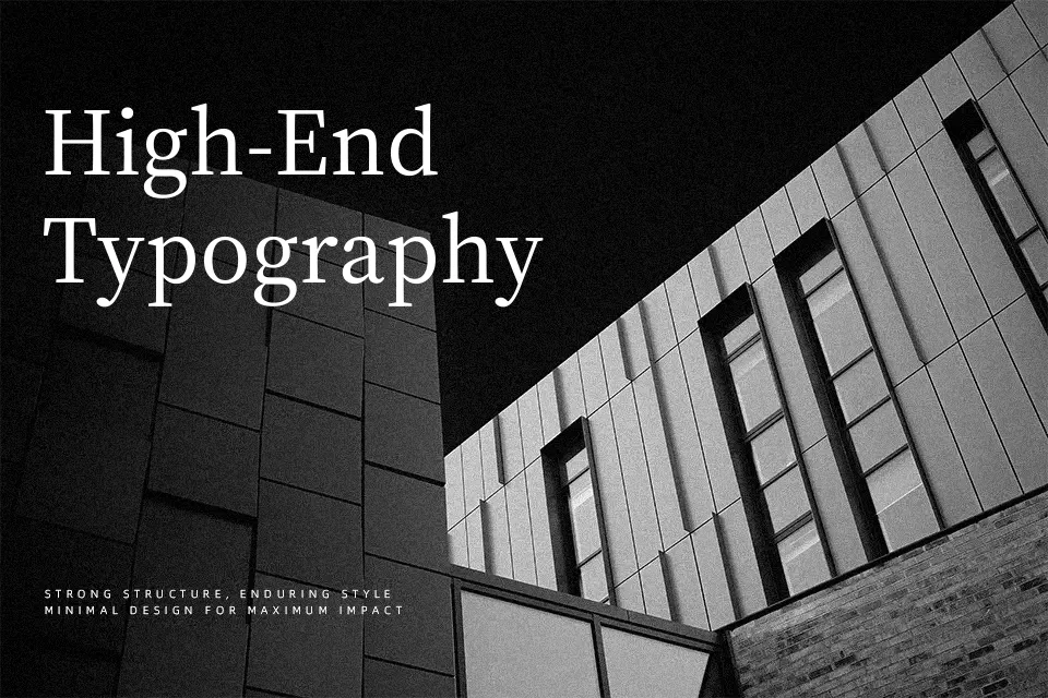
Source Serif 4 brings a transitional serif structure with moderate contrast, sturdy serifs, and generous x-height that keeps paragraphs readable even at small sizes. Its optical sizes and wide weight range let you move from quiet body copy to assertive subheads without leaving the family. The overall impression leans serious and professional, closer to a modernized book face than to a display showpiece. I reach for it when I need dependable text on content-heavy sites, reports, or academic work, especially paired with a clean sans like Source Sans. It is less convincing for loud, highly expressive branding or playful kids’ graphics, where you may want something more characterful or decorative.
Best For:
Long-form editorial layouts and articles
Content-heavy websites and blogs focusing on readability
Reports, documentation, and academic-style PDFs
Interfaces that pair it with a neutral sans for hierarchy
Not Ideal For:
Playful kids graphics or toy branding
Highly decorative logos needing distinctive silhouettes
Edgy music, gaming, or streetwear visuals
Very cramped UI where serif detailing can feel busy
Perfect for body text, editorial, and headline, with a classic and serif style.
License
Gallery