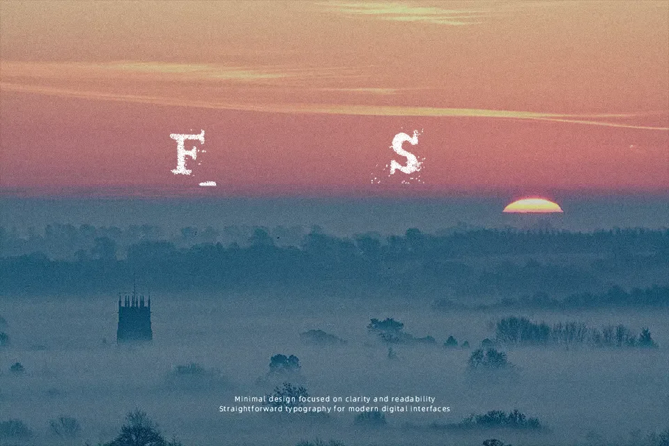
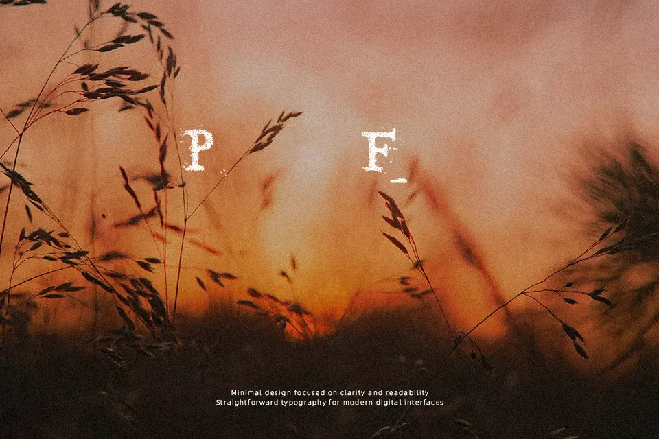
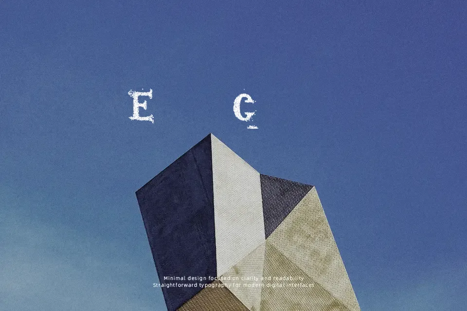
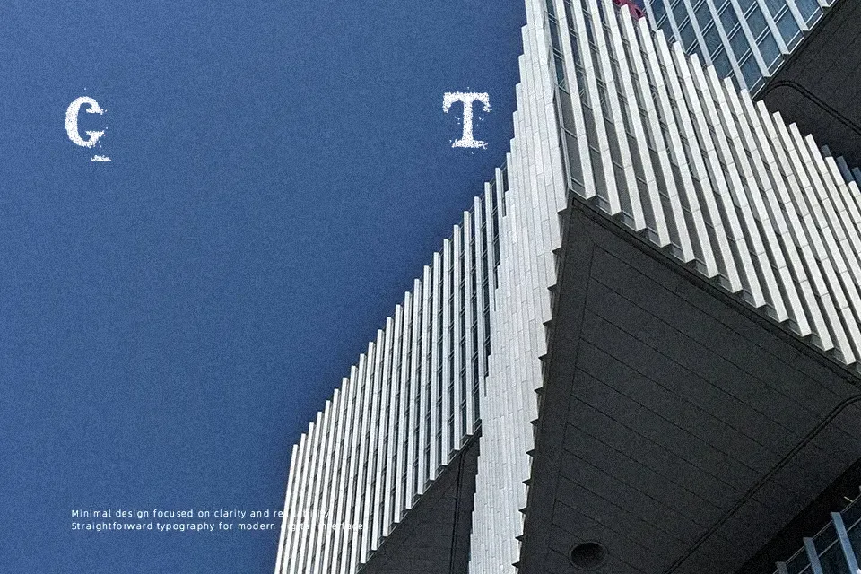
Sopa de letras Font
Free for personal useAbout
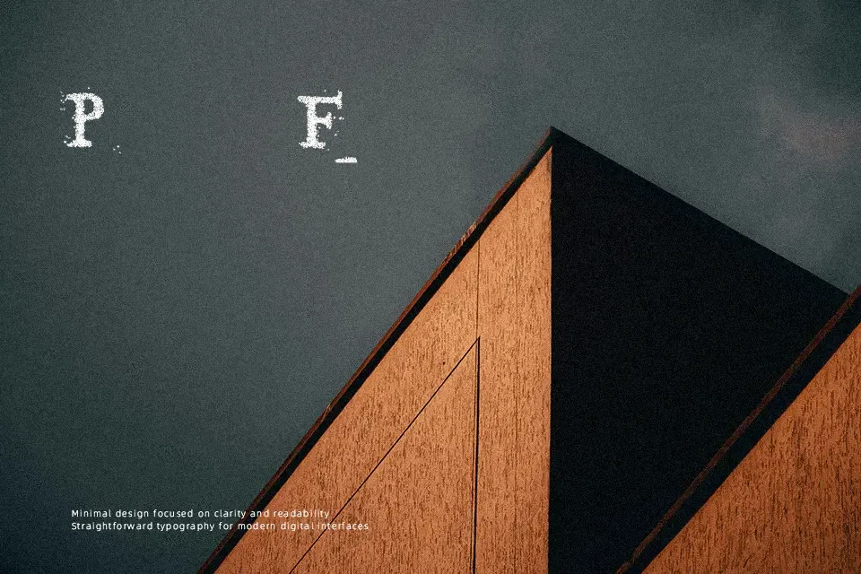
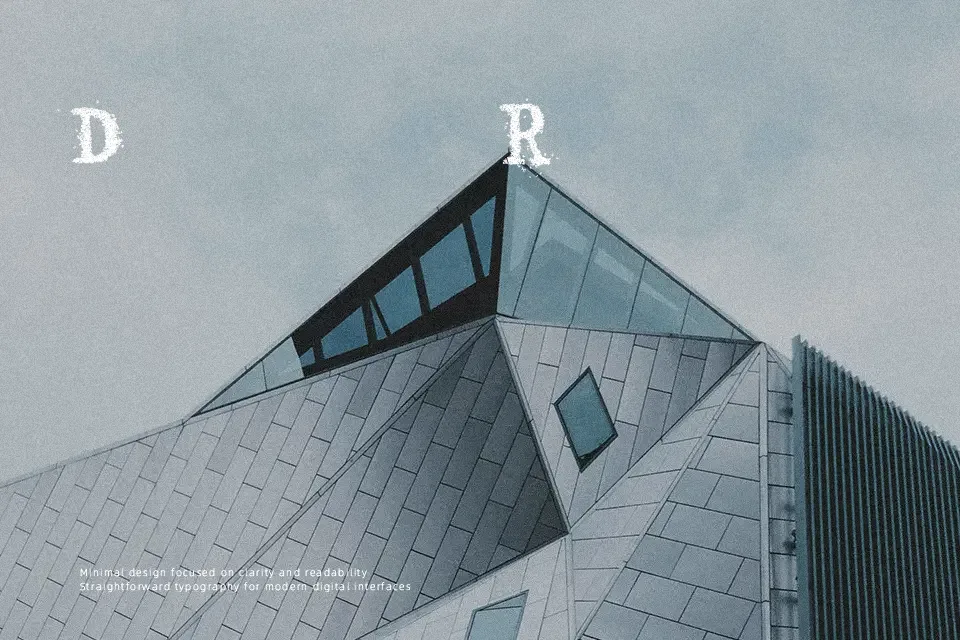
Sopa de letras Font uses decorative, display-focused letterforms with an irregular visual rhythm that gives short words a playful presence. The strokes and proportions are best appreciated at larger sizes, where the individual shapes have room to remain distinct. Spacing appears more useful for brief headlines, labels, and graphic titles than for extended passages. It can support poster-style layouts, packaging accents, or informal identity work where a conventional text face would feel too restrained. In practical use, the decorative construction keeps it more legible in short, generously sized lines; small captions and dense settings are likely to lose clarity.
Best For: poster headlines,playful product packaging,informal logo treatments,children’s design graphics
Not Ideal For: long paragraph text,small interface labels,technical manuals,dense editorial layouts
Perfect for headline, kids, and logo, with a artistic and decorative style.
License
Gallery