Simonetta Font
Free for Commercial UseAbout
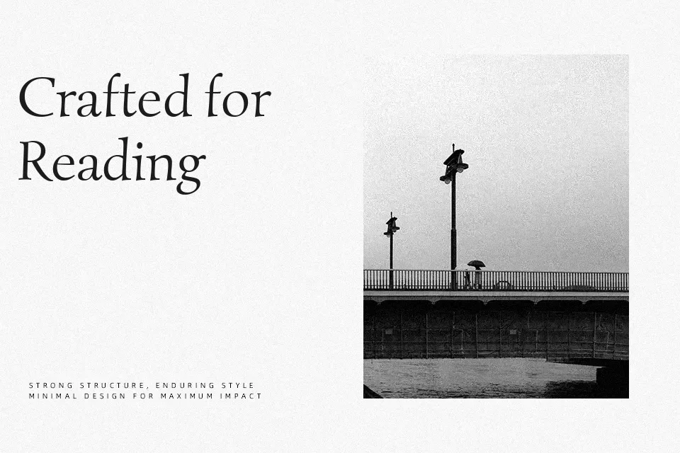
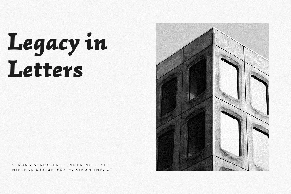
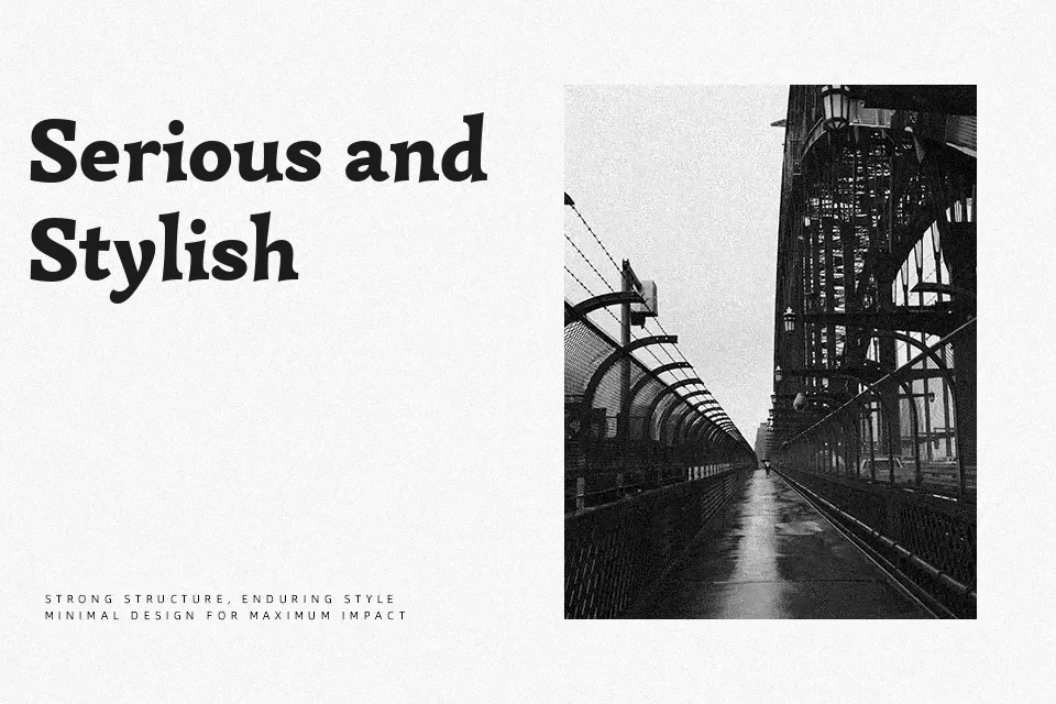
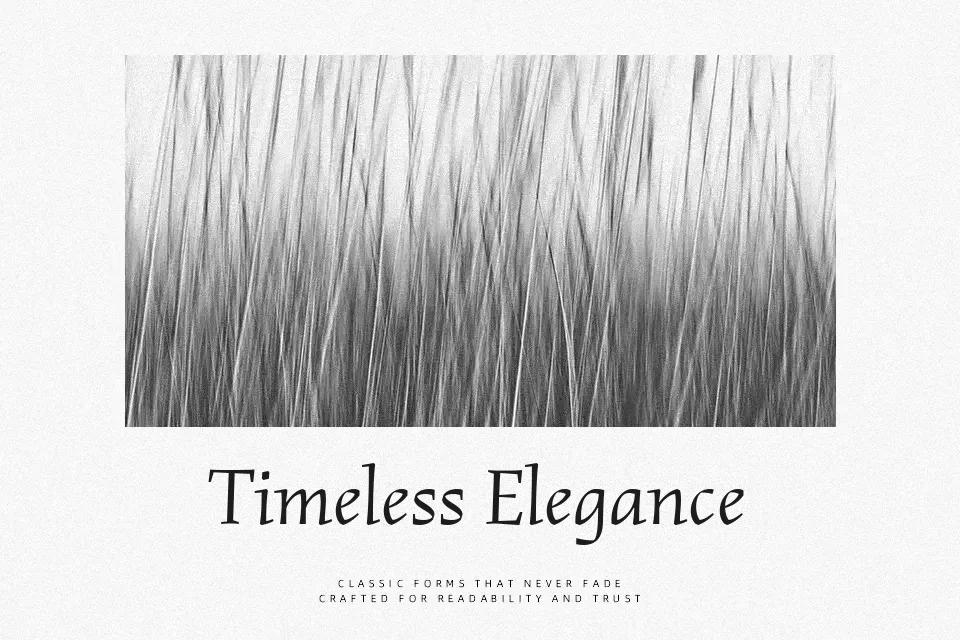
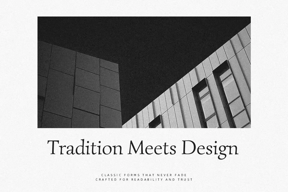
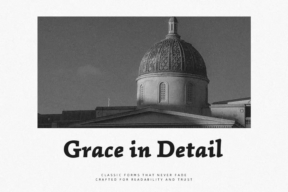
Simonetta blends Italian humanist roots with a contemporary serif structure, using one-sided serifs, soft terminal drops, and a slight overall lean that keeps paragraphs lively rather than stiff. The regular weight feels airy, with open counters and generous spacing, while the black styles bring a denser, more expressive voice for standout titles. In practice, it suits book covers, essay-style blogs, restaurant menus with a cultured tone, and branding for arts or cultural projects that want warmth instead of corporate polish. I would avoid it for dense technical documentation or tiny mobile UI labels, where the slant and detailing can start to feel busy and reduce legibility at very small sizes.
Best For:
literary-focused branding and wordmarks
editorial headings and pull quotes
arts and culture event posters
menu and packaging with a humanist feel
Not Ideal For:
very small mobile UI text
highly technical documentation
ultra-minimal tech branding
long-form body copy at tiny sizes
Perfect for branding, editorial, and poster, with a artistic and display style.
License
Gallery