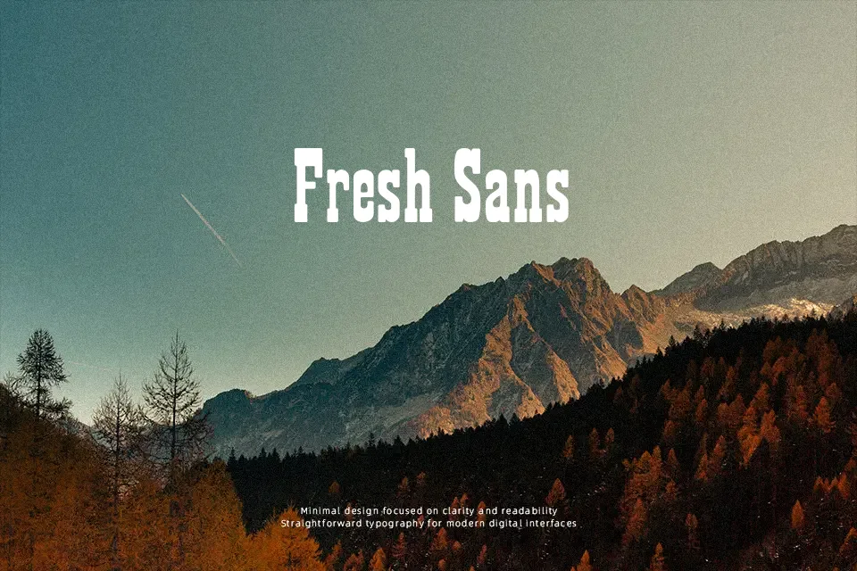
Showguide Font
Free for personal useAbout
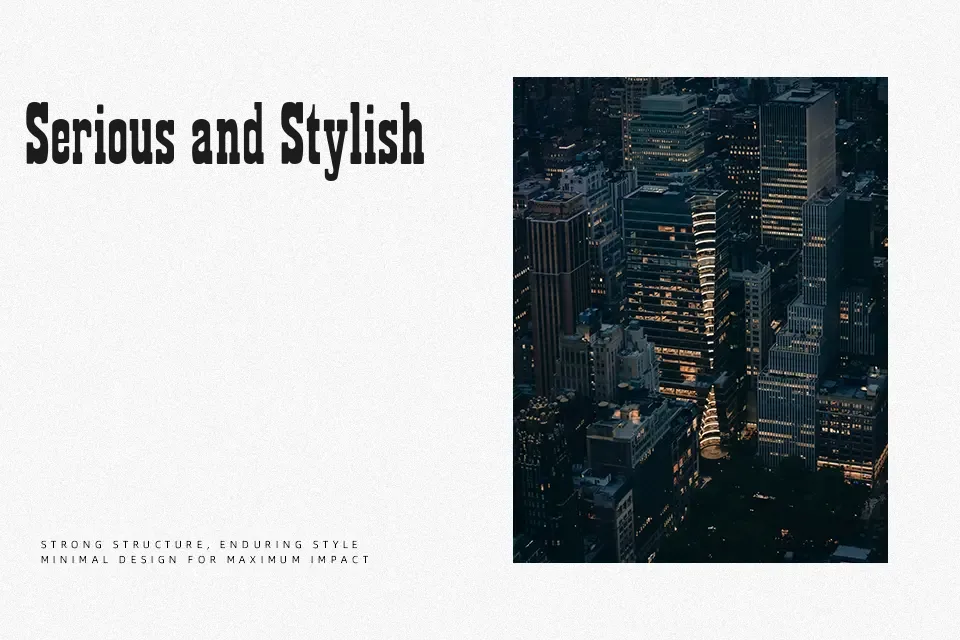
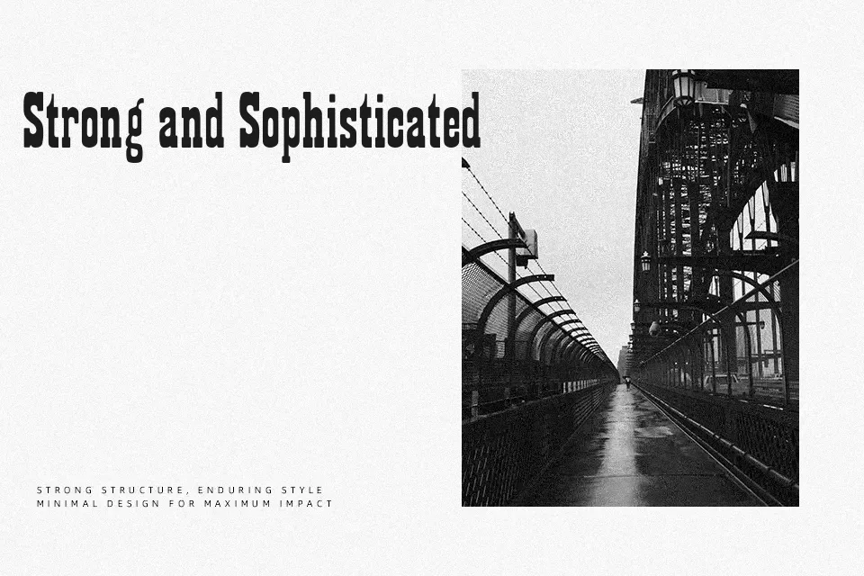
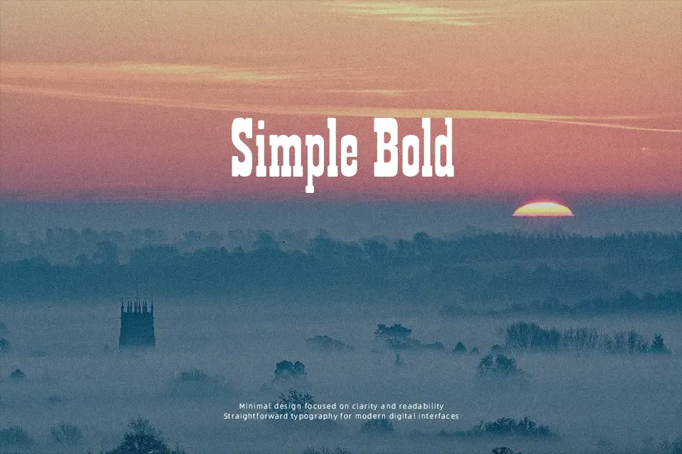
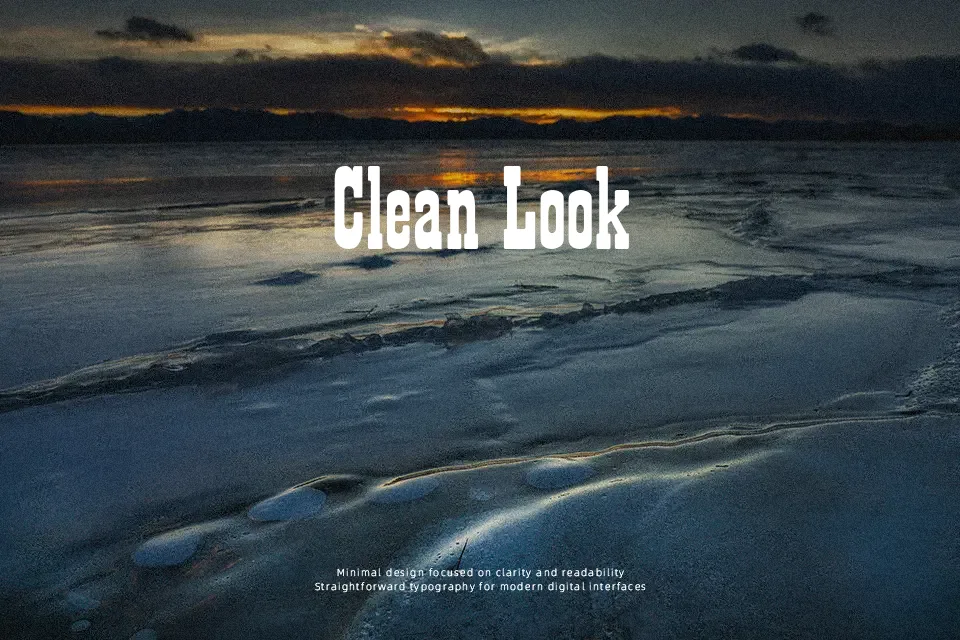
Featuring prominent horizontal slabs and tightly compressed letter proportions, Showguide Font presents a classic nineteenth-century wood type display style built for maximum visual weight. The letterforms exhibit heavy stroke thickness, pronounced block serifs, and narrow internal counters that produce an assertive vertical rhythm. In terms of spacing, the compact character fitting maintains solid density across short title treatments, theatrical title cards, and heritage product labels. However, the extreme stroke weight and condensed proportions severely compromise legibility in multi-line paragraphs and small captions. For large headline displays, the prominent serifs ensure immediate distinction across expansive print layouts.
Best For: vintage event posters, rustic product packaging, theatrical headlines, saloon signage
Not Ideal For: long body text, small interface captions, continuous editorial paragraphs, mobile app body copy
Perfect for headline, logo, and packaging, with a bold and condensed style.
License
Gallery