Sake Moru Font
Free for personal useAbout
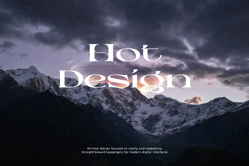
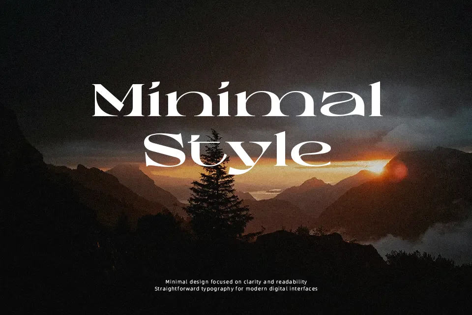
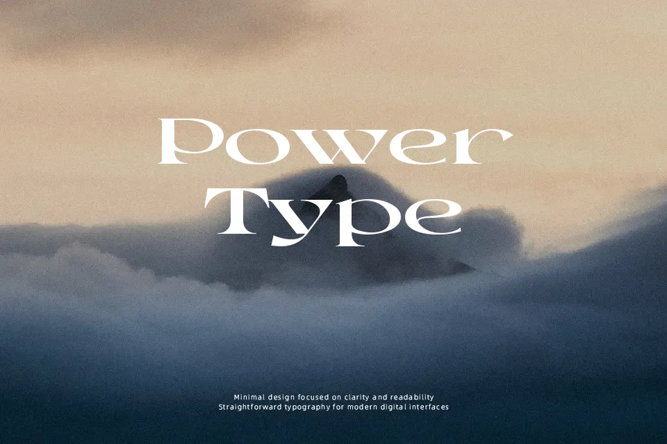
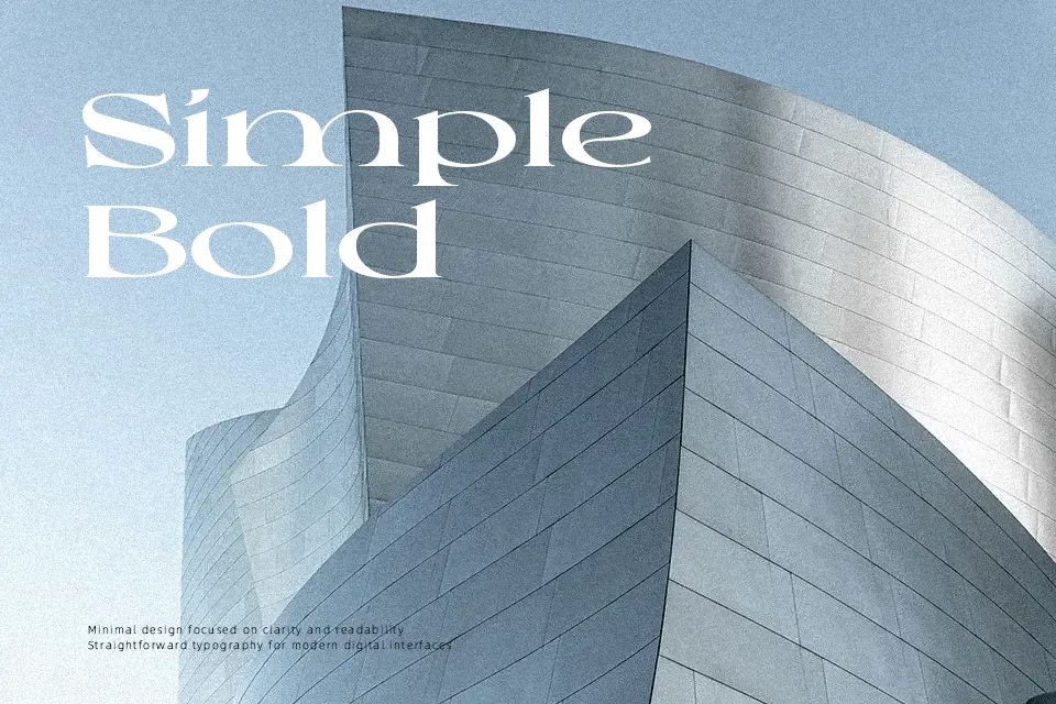
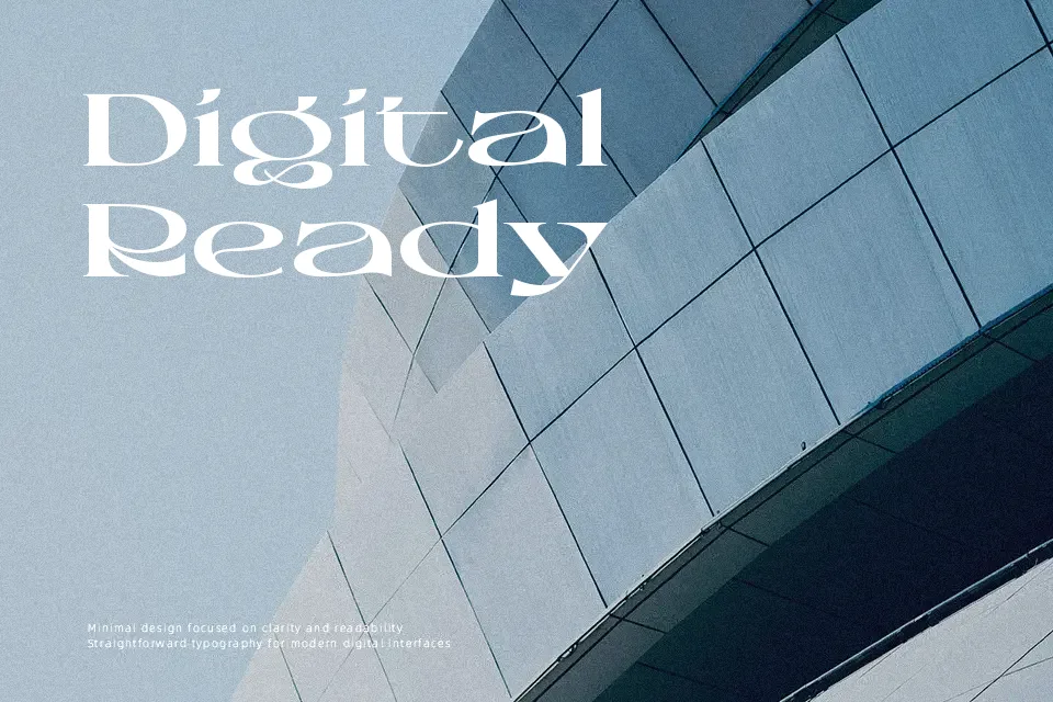
Structured with ultra-wide proportions and dramatic stroke contrast, Sake Moru Font brings a heavy retro groove to vintage display compositions. The letterforms combine sharp diagonal tapers with bloated, rounded outer curves, establishing an energetic visual rhythm across title layouts. Because character spacing is relatively tight and horizontal dimensions are heavily stretched, the design maintains excellent impact on album covers, merchandise graphics, and festival banners. However, these complex stylized contours and compressed vertical counters significantly hinder legibility in continuous text blocks. The typeface functions best as a dedicated headline treatment rather than an everyday workhorse for body copy.
Best For: 1970s music festival posters, retro apparel graphics, beverage bottle packaging, vinyl record cover titles
Not Ideal For: continuous body text, mobile interface menus, technical manuals, dense editorial columns
Perfect for headline, logo, and music, with a bold and decorative style.
License
Gallery