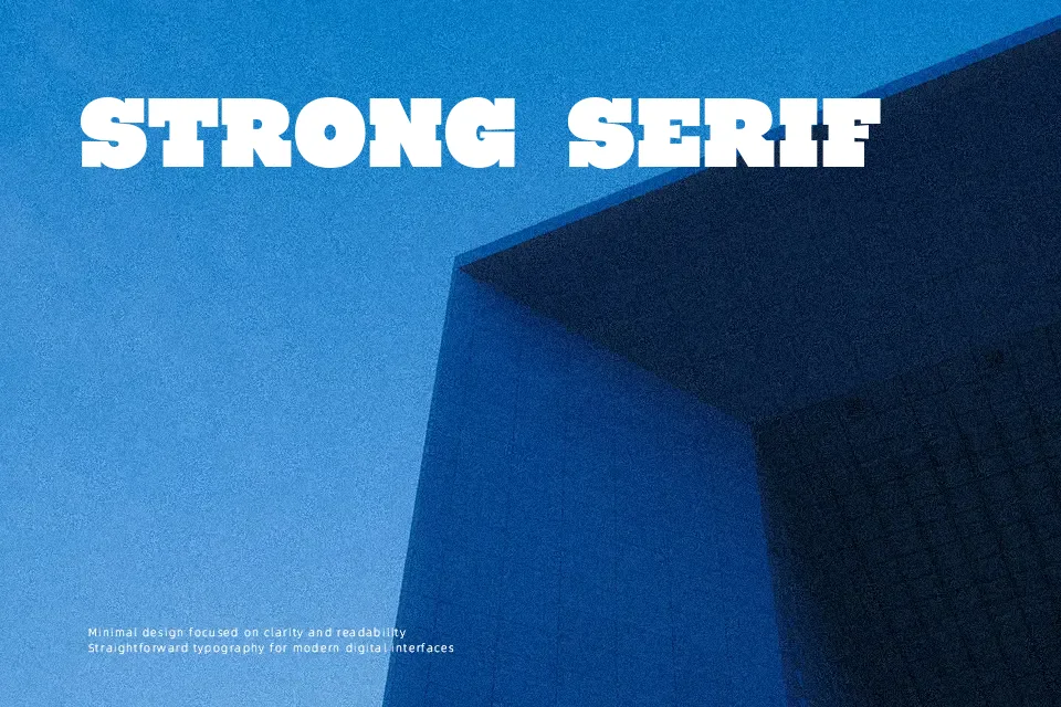
Ryno Slab Font
Free for personal useAbout
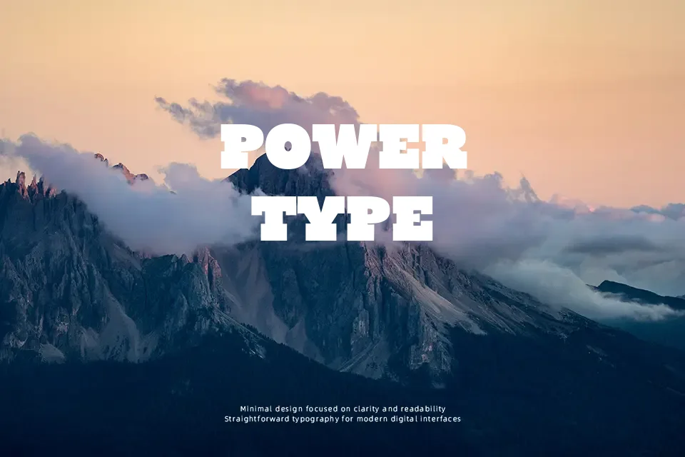
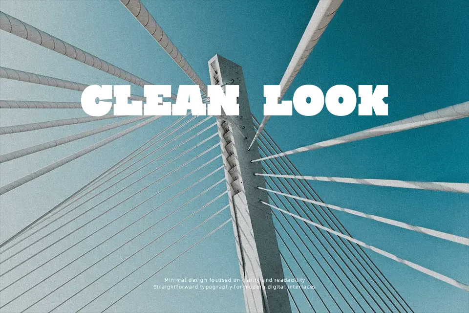
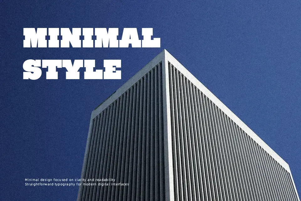
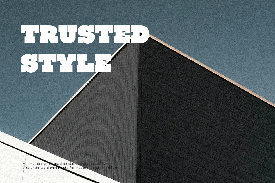
Building a strong visual foundation, Ryno Slab Font introduces a heavy, unapologetic slab serif structure designed for maximum impact. The letterforms display consistent, thick strokes paired with chunky, squared-off serifs that anchor each character firmly to the baseline. Its balanced, slightly open spacing prevents the dense forms from bleeding together, maintaining excellent clarity in large display text. This commanding typeface works exceptionally well for sports apparel graphics, vintage-inspired branding, and bold magazine headers. However, the heavy proportions become less effective at smaller sizes, where the thick serifs reduce continuous reading comfort. Ultimately, the robust weight and rigid geometry make this design a powerful choice for short, attention-grabbing statements rather than dense paragraphs.
Best For:
bold magazine headers
sports apparel graphics
vintage-inspired branding
heavy poster headlines
Not Ideal For:
long paragraph text
small interface labels
dense editorial layouts
Perfect for branding, headline, and packaging, with a bold and display style.
License
Gallery