Russia Five Font
Free for personal useAbout
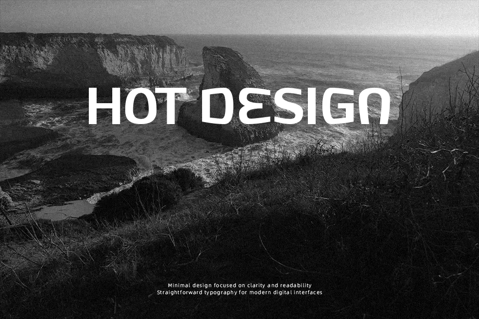
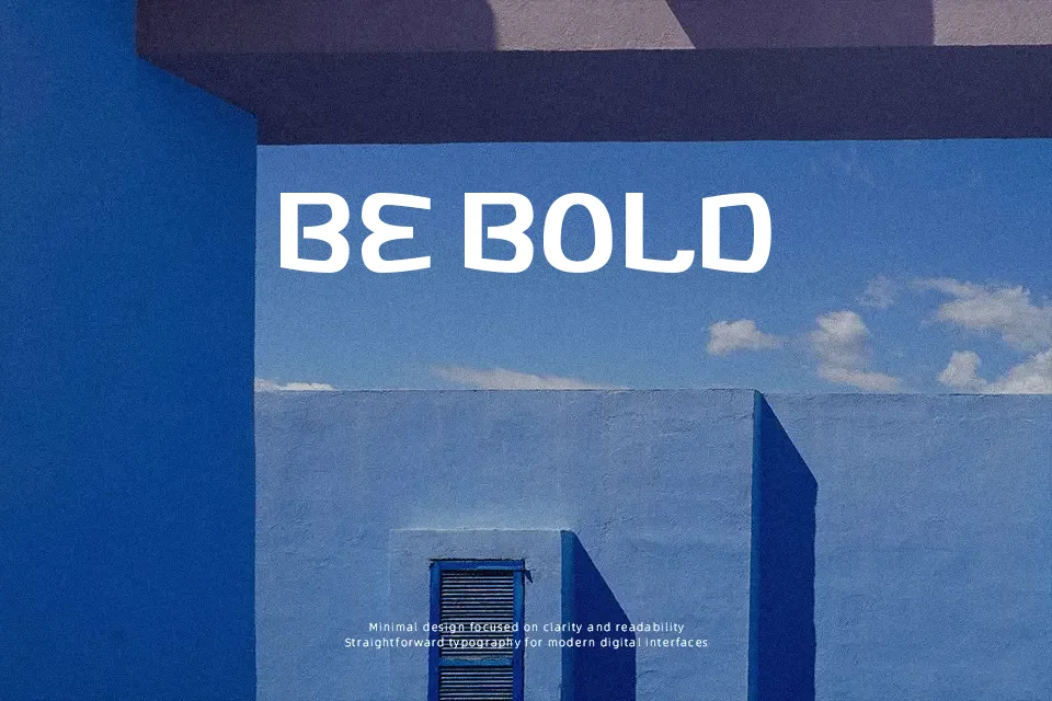
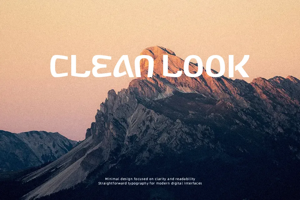
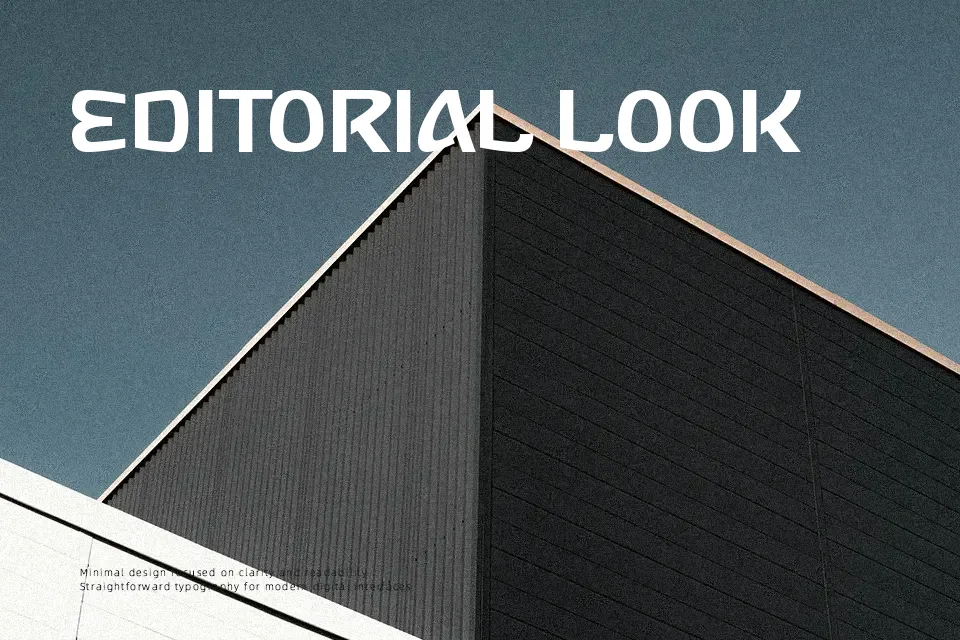
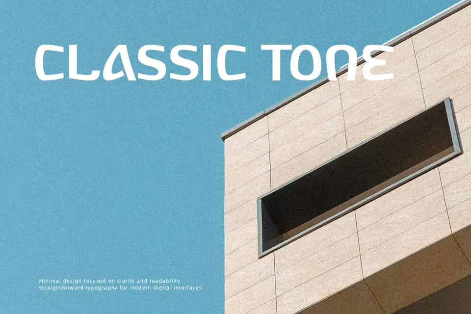
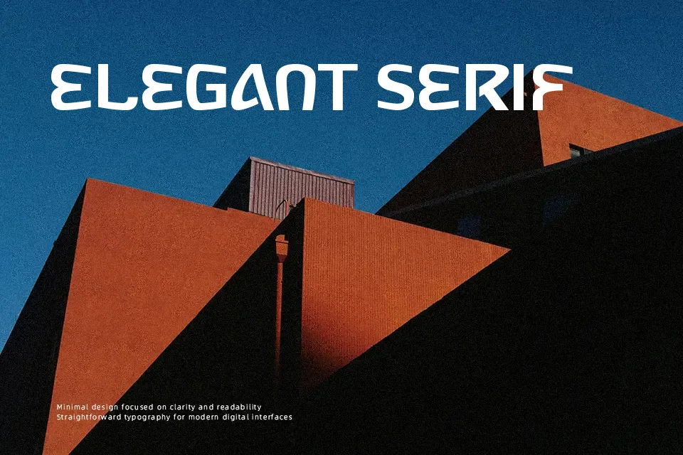
Russia Five Font presents a heavy, geometric display structure characterized by thick, uniform strokes and rigid angles. The letterforms incorporate stylized faux-Cyrillic structural elements, giving the uppercase characters a blocky, constructivist appearance. Spacing is relatively tight, emphasizing its solid, monumental proportions rather than airy readability. The bold strokes improve visibility in large-scale posters, making it a commanding choice for aggressive headlines or sports-themed graphics. However, the unconventional letter shapes and dense forms reduce comfort during extended reading. Because of its highly stylized structural quirks, small interface labels and continuous editorial layouts will struggle with clarity.
Best For:
sports event posters
athletic team branding
constructivist style headlines
music festival graphics
Not Ideal For:
continuous body text
small interface labels
corporate financial reports
dense editorial columns
Perfect for branding, headline, and poster, with a bold and decorative style.
License
Gallery