Rude Basic Font
Free for personal useAbout
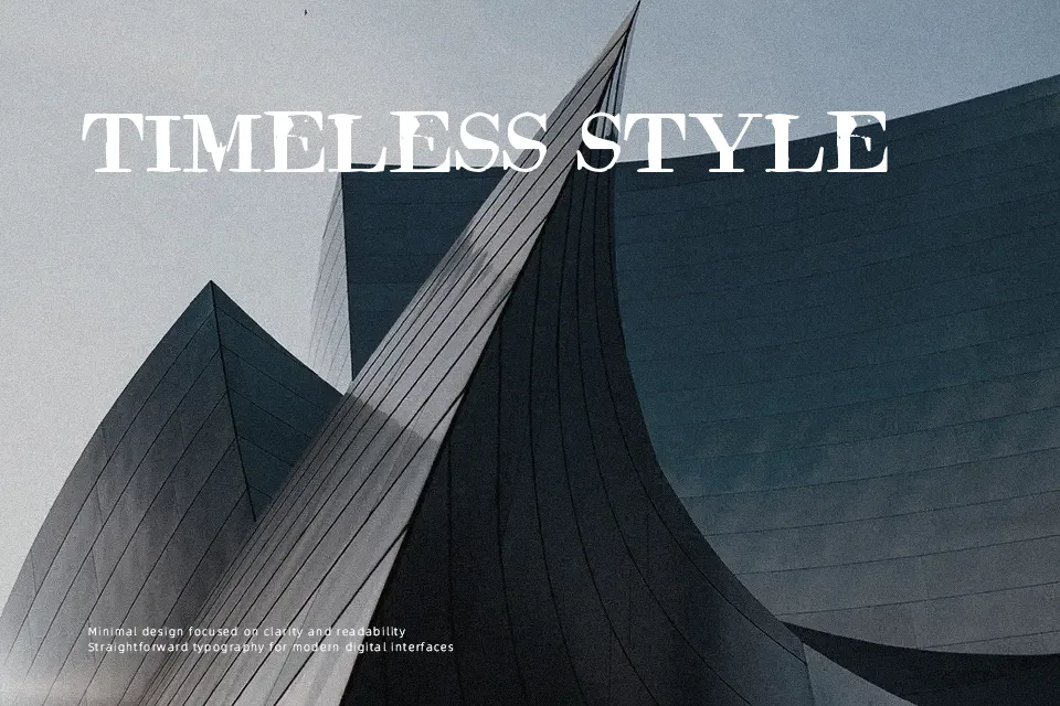
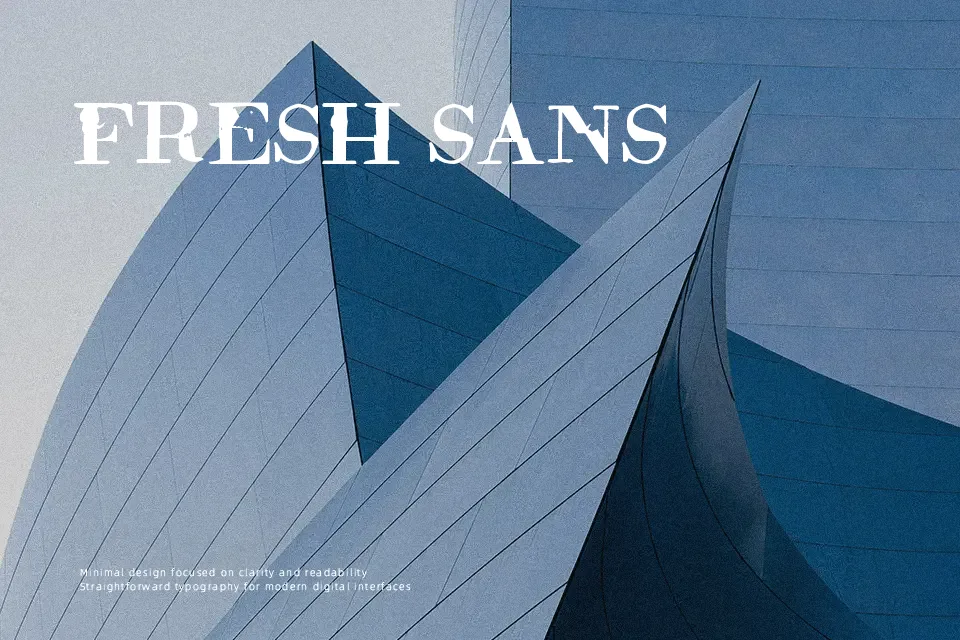
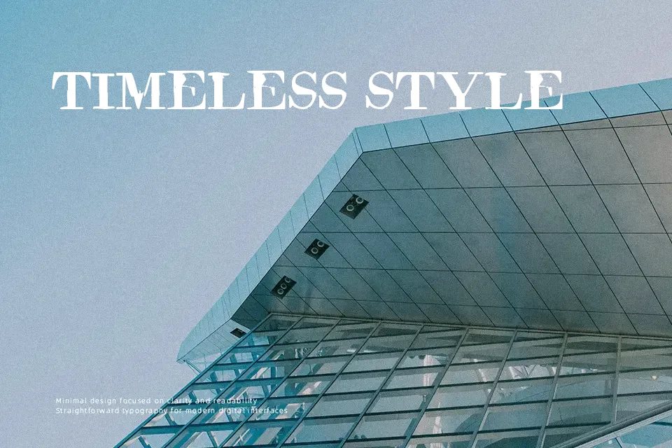
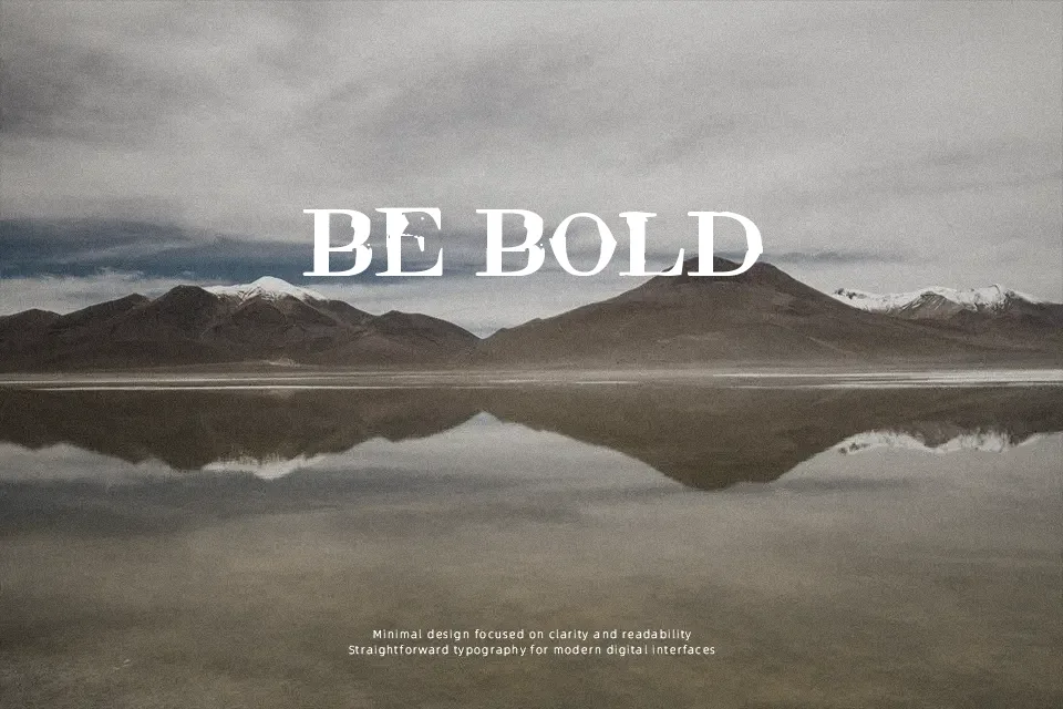
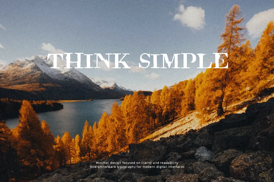
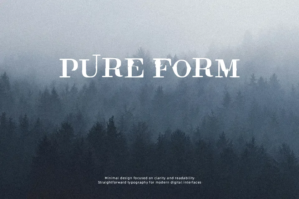
The structure of Rude Basic Font relies on jagged, aggressive strokes that give each letter a fragmented, handcrafted appearance. Uneven outlines and distorted proportions create a sense of chaotic movement across the baseline. The spacing between characters remains somewhat unpredictable, which enhances its raw aesthetic but requires careful kerning in custom digital layouts. Heavy texturing within the glyphs provides strong visual impact for large-scale applications like underground music posters or extreme sports branding. However, these highly decorative details become less effective at smaller sizes, making the typeface difficult to process in continuous reading environments. Ultimately, the bold letterforms maintain strong visibility in large display text but should be avoided for dense paragraph structures.
Best For:
grunge music album covers
underground event posters
streetwear apparel graphics
extreme sports branding
Not Ideal For:
long paragraph text
corporate reports
small interface labels
dense editorial layouts
Perfect for fashion, headline, and music, with a dark and decorative style.
License
Gallery