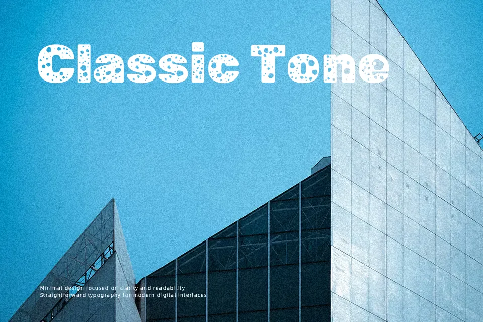
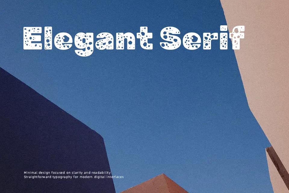
Rubik Moonrocks Font
Free for Commercial UseAbout
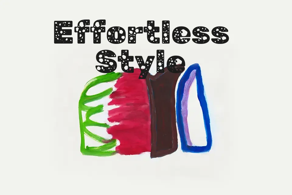
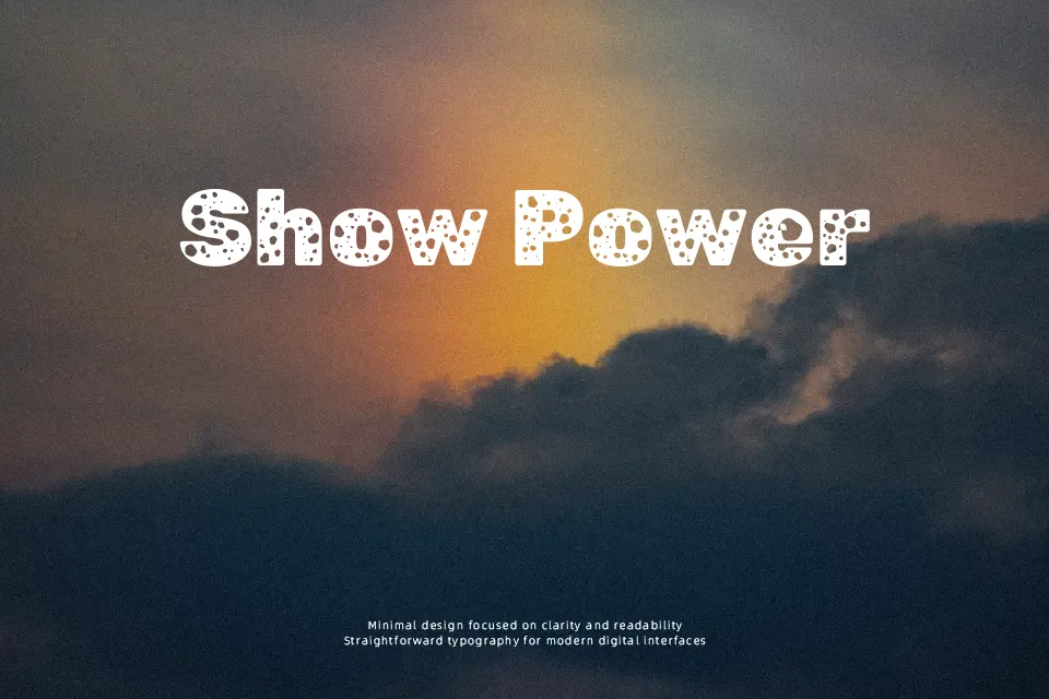
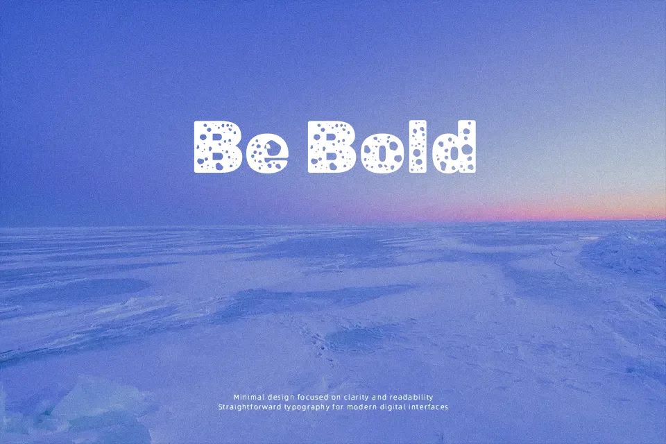
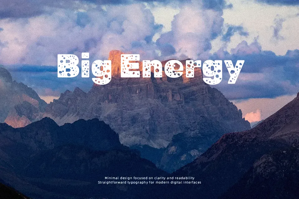
Rubik Moonrocks takes the geometric base of the Rubik family and pushes it into a more experimental, almost sci‑fi silhouette, with heavy strokes, rounded corners, and irregular inner shapes that feel hand‑tweaked rather than mechanical. Letters sit wide and sturdy, so headlines feel solid and a bit quirky, especially in all caps. This style works nicely for posters, stream overlays, and product graphics where you want attitude more than neutrality, but it quickly feels overpowering in dense paragraphs or small captions. I would reach for it when the typography is part of the illustration, and switch to a calmer sans serif once real reading starts.
Best For:
bold poster titles,gaming or sci‑fi themed graphics,experimental branding wordmarks,social media visuals that rely on big type
Not Ideal For:
long-form body copy,formal corporate documents,small UI labels or navigation,highly traditional editorial layouts
Perfect for branding, gaming, and headline, with a bold and display style.
License
Gallery