Rubik Distressed Font
Free for Commercial UseAbout
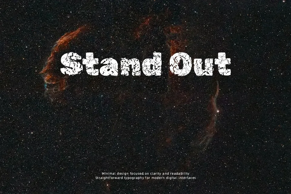
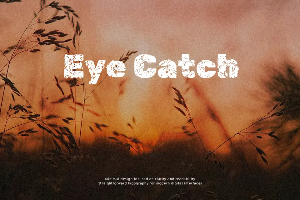
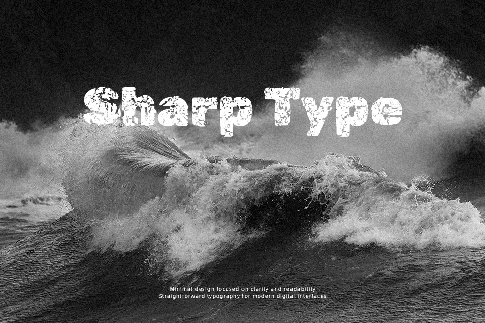
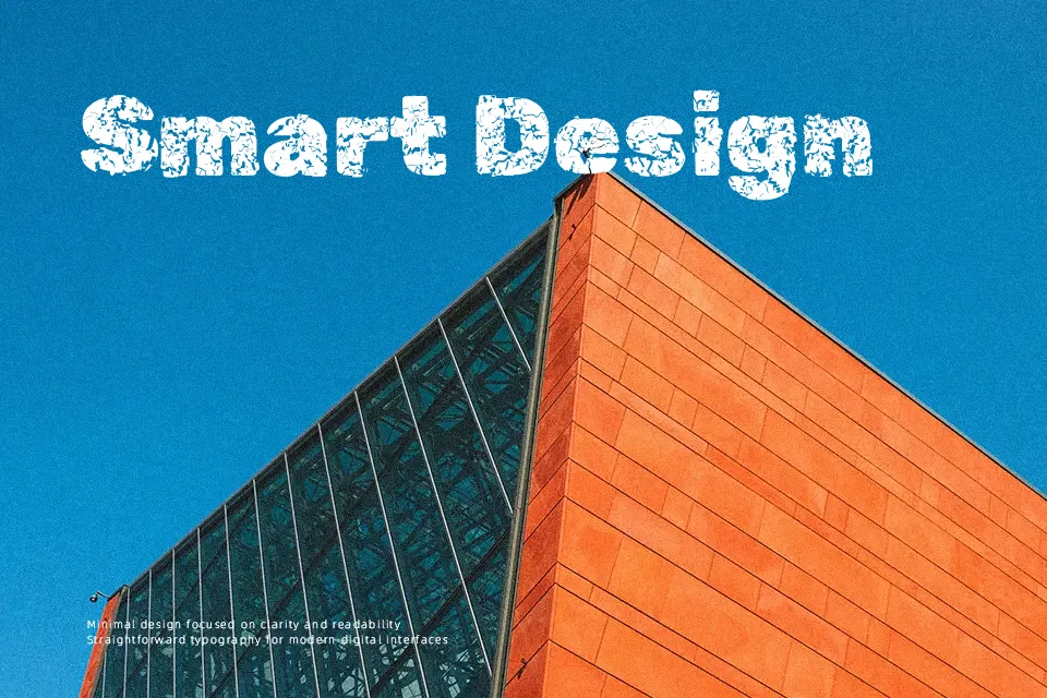
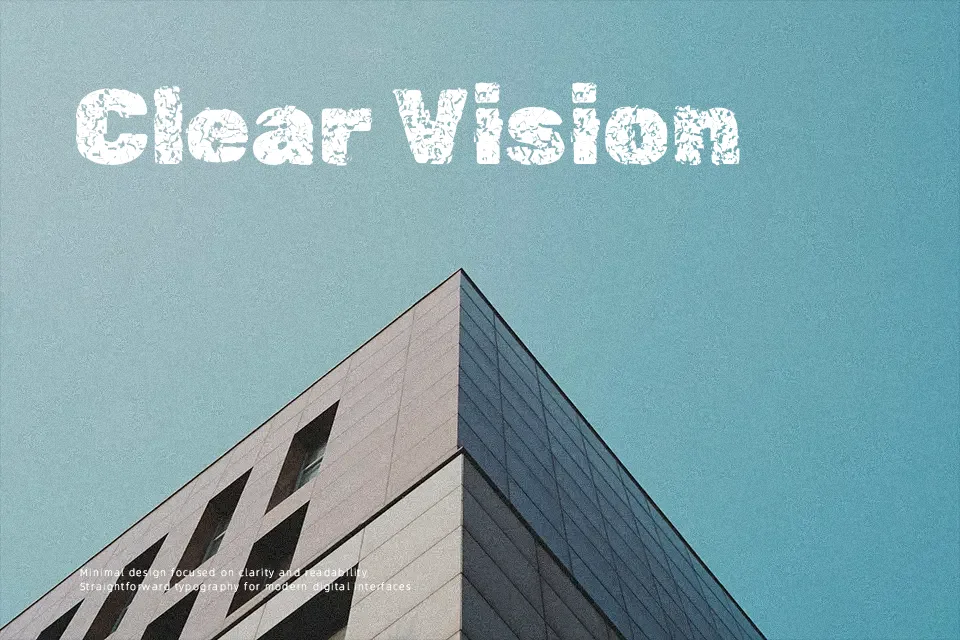
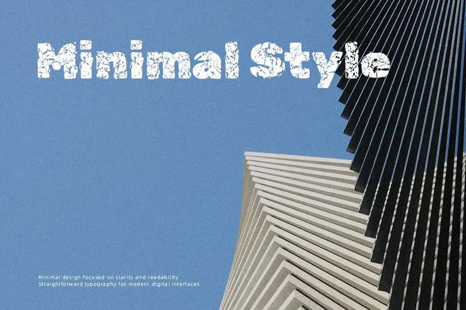
Rubik Distressed takes the geometric skeleton of Rubik and erodes it with heavy texture, leaving chunky strokes, broken edges, and an uneven ink-like finish. The weight sits on the bolder side, and the spacing is fairly open, so even with the distressed details it stays readable at medium and large sizes. It feels unpolished, grunge, and a bit rebellious, which makes it fit naturally in poster work, album covers, horror or Halloween graphics, and branding that leans into a worn or industrial look. For long paragraphs or small UI labels, the texture quickly becomes visual noise, so it is better kept for short headlines and key words rather than body text. If you like fonts such as Rubik Dirt, this version feels harsher and more eroded, which can be an advantage when you want a more aggressive voice.
Best For:
gritty poster headlines and event titles
album covers, zines, and alternative music branding
Halloween or horror-themed graphics and titles
bold wordmarks for rugged or industrial brands
Not Ideal For:
long-form body text or reading-heavy layouts
clean corporate presentations or formal reports
small UI labels, captions, or accessibility-focused text
minimal, ultra-polished luxury branding
Perfect for advertising, branding, and headline, with a bold and display style.
License
Gallery