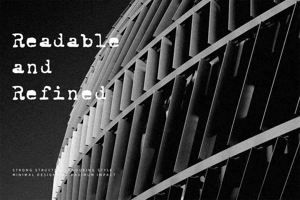
Royal Pain Font
Free for personal useAbout
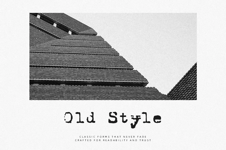
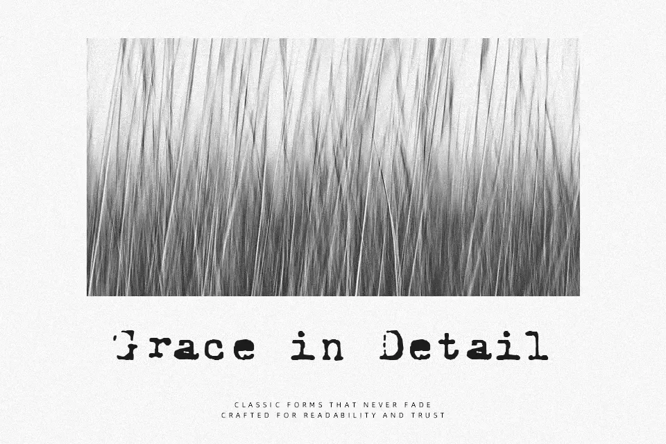
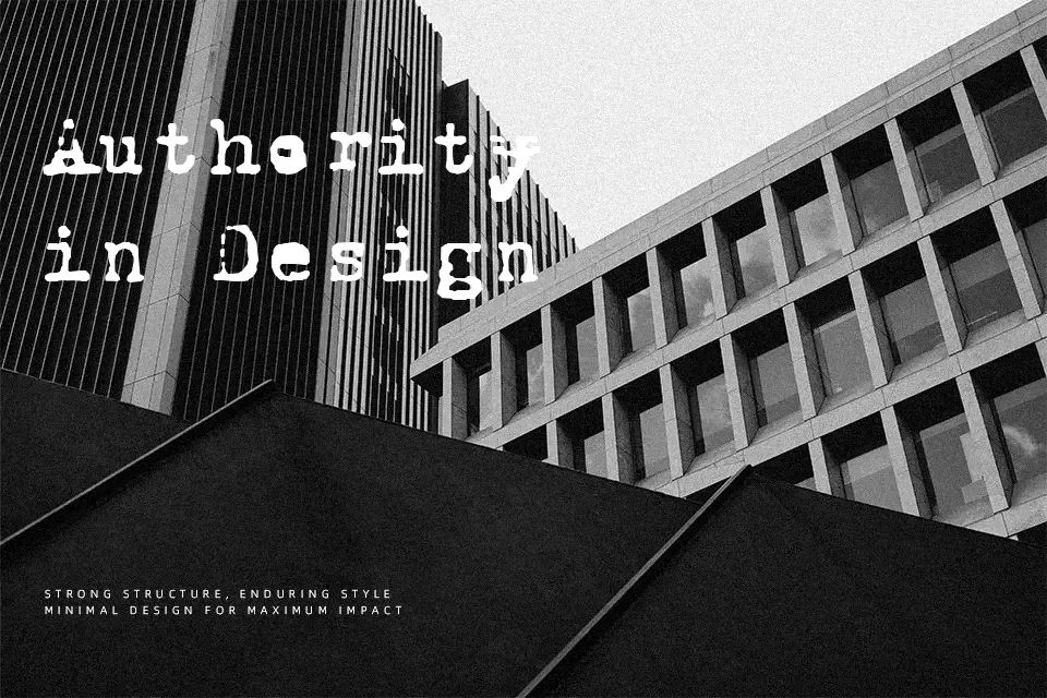
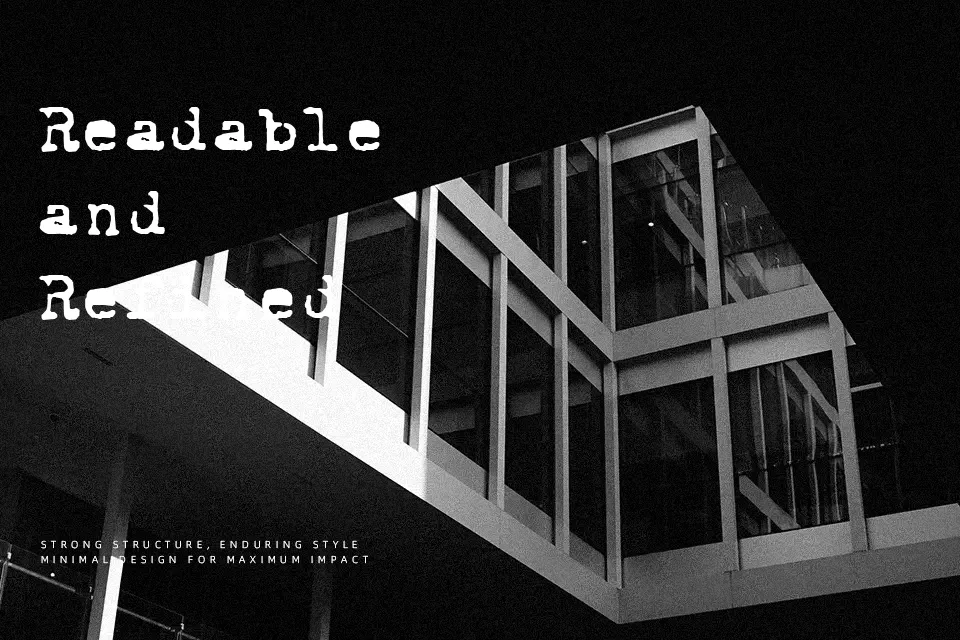
Royal Pain Font establishes a strong mechanical rhythm through its rugged letterforms and consistent character widths. The design features thick slab serifs with intentionally distressed strokes, creating a raw and textured visual appearance. Its predictable spacing helps maintain alignment in structured layouts, while the overall proportions resemble classic analog impressions. This typeface performs exceptionally well when applied to vintage product packaging or retro poster headlines that require an authentic aesthetic. However, the irregular textures reduce continuous reading comfort, making these letterforms less suitable for dense body text or long paragraphs. The heavy strokes remain clearly visible at large display sizes but tend to lose their structural clarity when scaled down for small captions.
Best For:
vintage product packaging
retro poster headlines
music festival posters
editorial headers
Not Ideal For:
dense body text
long paragraph reading
small interface labels
Perfect for editorial, headline, and packaging, with a classic and decorative style.
License
Gallery