Rokkitt Font
Free for Commercial UseAbout
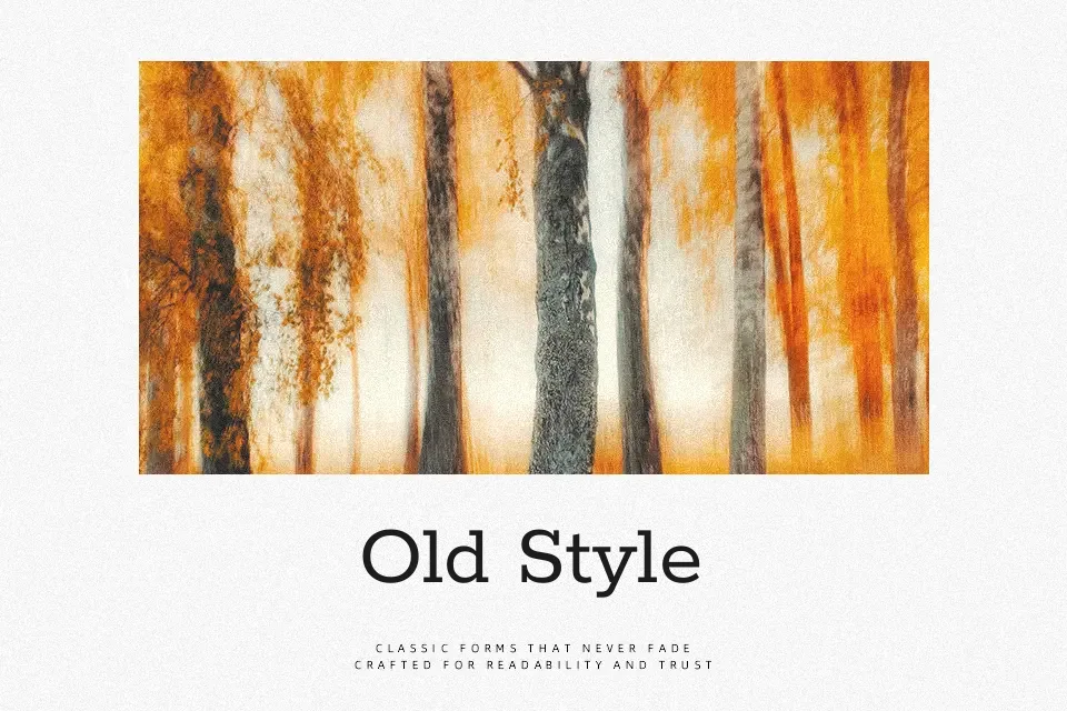
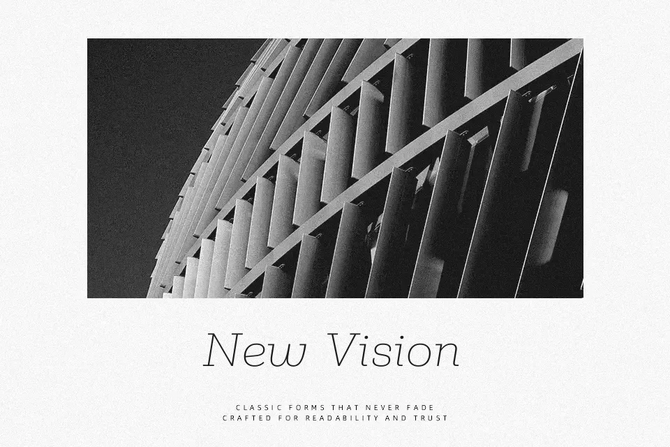
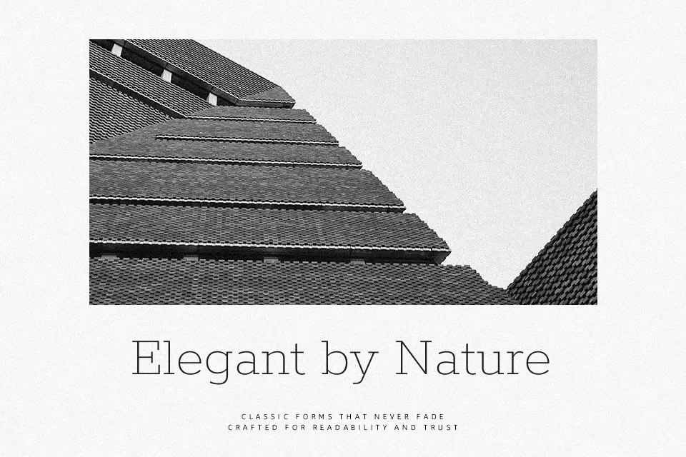
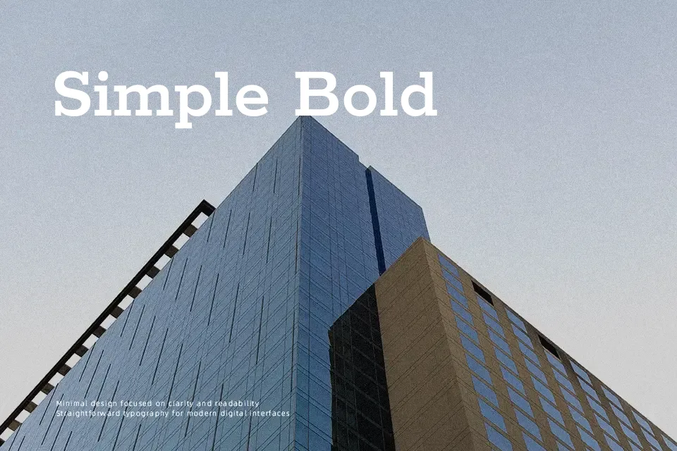
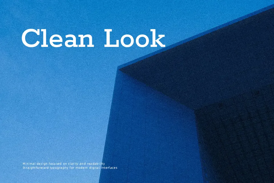
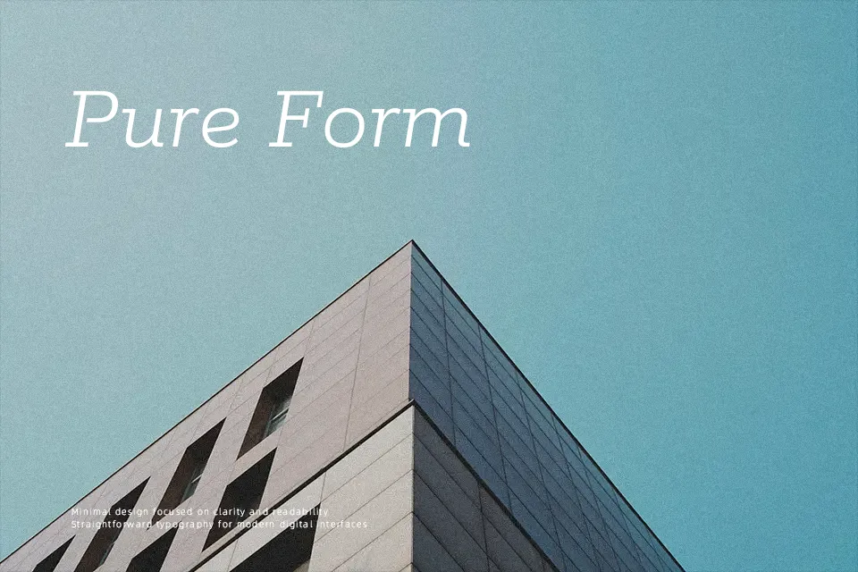
Rokkitt is a slab serif with geometric bones, blocky rectangular serifs, and a fairly upright, orderly rhythm that still feels approachable. Its strokes stay clean and consistent across weights, with open counters and generous spacing that keep even darker styles readable in print and on screen. The family is extensive, from thin to black and variable, so you can push hierarchy in magazine layouts, posters, and structured branding systems without swapping families. It shines when you want a solid, contemporary voice rooted in 19th‑century “Egyptian” slab traditions, but it can feel too heavy-handed for very delicate, airy interfaces or long, small-size body text.
Best For:
Editorial headlines and section titles in print or digital layouts
Posters and signage that need strong, geometric letterforms
Branding systems that mix sturdy slabs with a contemporary tone
Not Ideal For:
Very long body copy at small sizes where a softer serif reads easier
Ultra-minimal UI elements that call for lighter, low-contrast sans fonts
Projects needing a handwritten or highly expressive script feel
Perfect for body text, branding, and editorial, with a bold and slab serif style.
License
Gallery