Rise Up Font
Free for personal useAbout
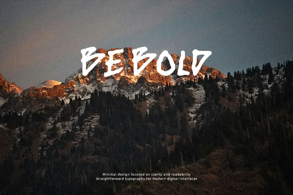
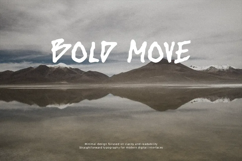
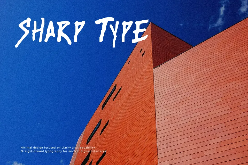
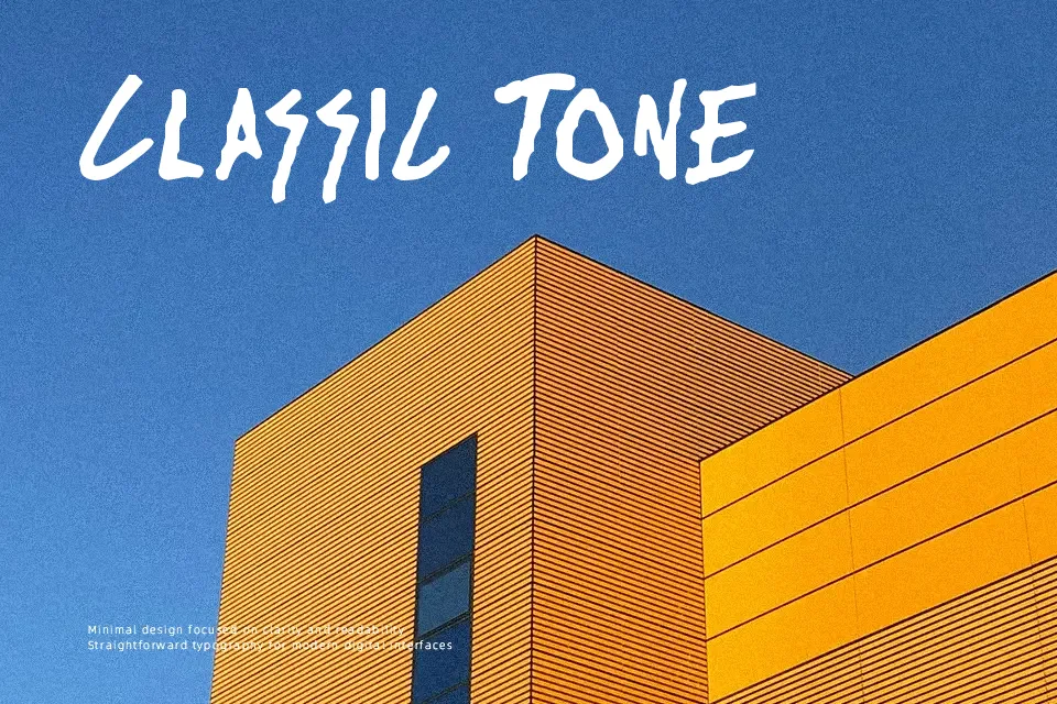
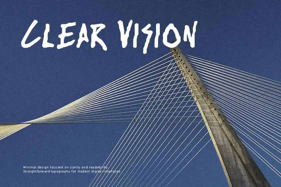
Rise Up Font features a bold, hand-drawn structure defined by energetic, uneven strokes and dynamic angles. The character proportions lean slightly irregular, enhancing the spontaneous and lively rhythm across large headlines. Its thick weight and tightly packed spacing create substantial visual mass, making the letterforms highly impactful but dense. The heavy strokes help maintain clarity in larger display formats where strong visibility is required. However, the irregular shapes and condensed spacing become less effective at smaller sizes, significantly reducing continuous reading comfort. Because of its dominant presence, the typeface is highly suitable for striking promotional graphics and streetwear branding, but it remains heavily restricted and less ideal for dense editorial paragraphs or small interface captions.
Best For:
music festival posters
streetwear apparel graphics
lively gaming logos
rebellious graphic branding
Not Ideal For:
dense editorial layouts
small interface labels
technical manuals
spreadsheet data
Perfect for gaming, headline, and logo, with a bold and comic style.
License
Gallery