QWERTYpe Font
Free for personal useAbout
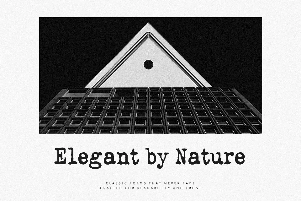
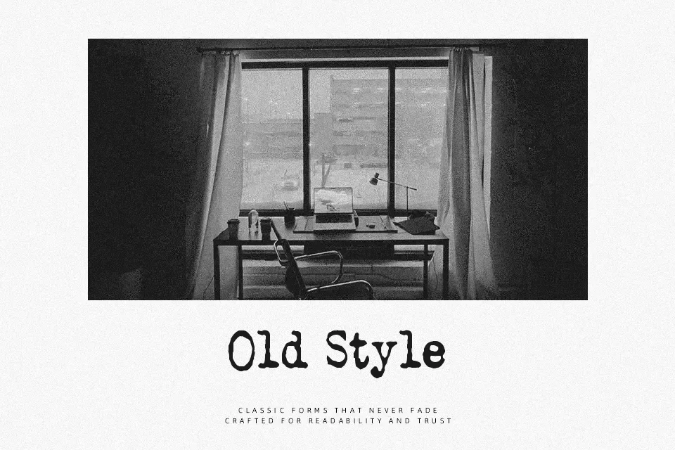
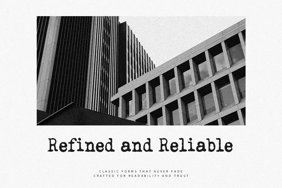
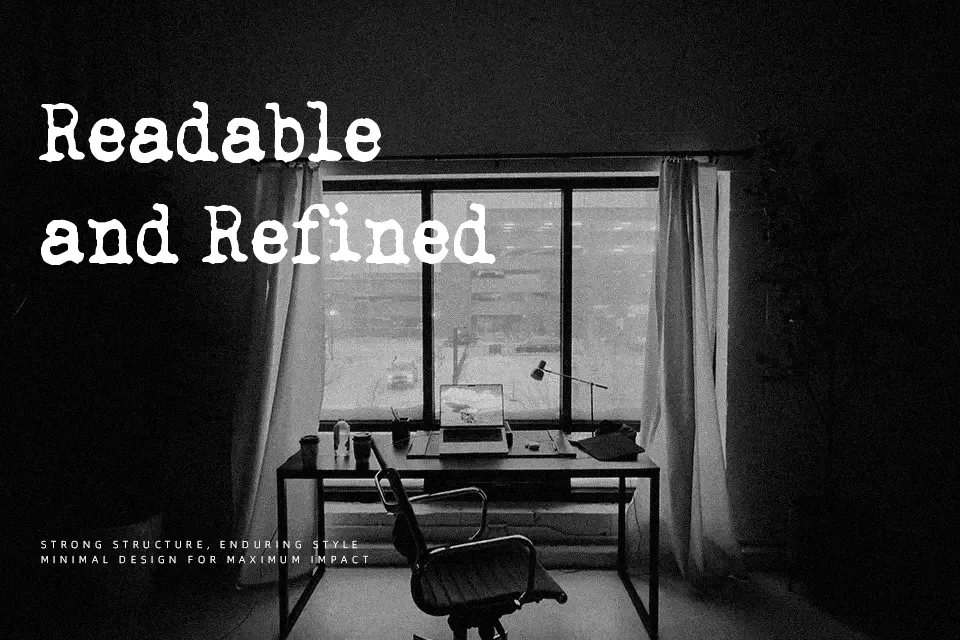
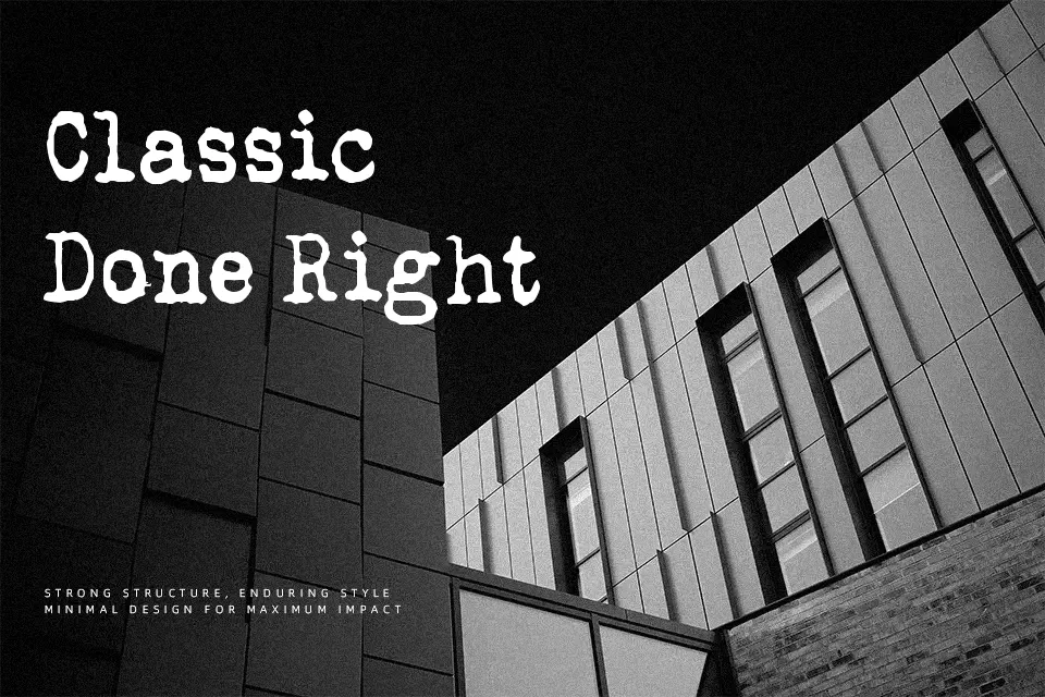
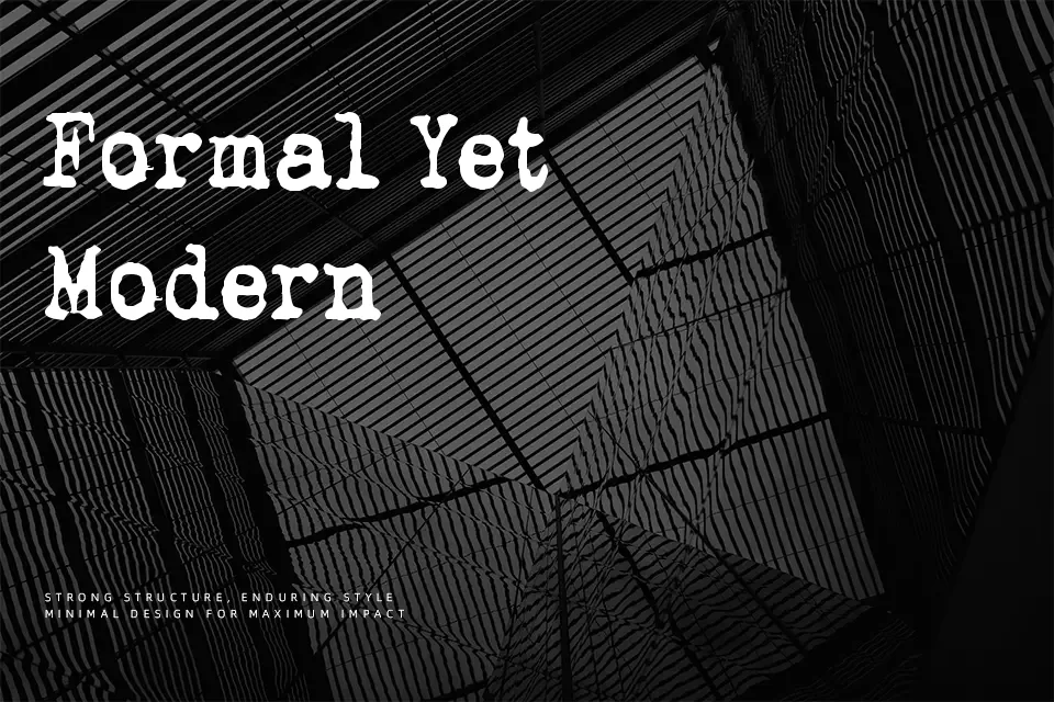
The structural foundation of QWERTYpe Font relies on rigid, uniform strokes and consistent character widths that closely mimic traditional mechanical typing. Its pronounced slab serifs and fixed-width proportions create a highly predictable visual rhythm, establishing a classic, retro aesthetic. The letterforms carry a slightly textured, stamped appearance that enhances its vintage appeal. The spacing helps maintain clarity in larger headlines, giving titles a strong, authoritative presence. However, these rigid, monospace-like proportions present challenges in continuous reading environments, making it less suitable for long paragraphs. This typeface performs exceptionally well for stylistic branding, retro product packaging, and nostalgic editorial headers, but tight layouts will suffer from its uncompromising horizontal spacing.
Best For:
vintage product packaging, retro editorial headers, nostalgic branding, creative social media graphics
Not Ideal For:
dense paragraph text, corporate legal documents, small interface labels
Perfect for branding, editorial, and headline, with a classic and decorative style.
License
Gallery