PT Serif Font
Free for Commercial UseAbout
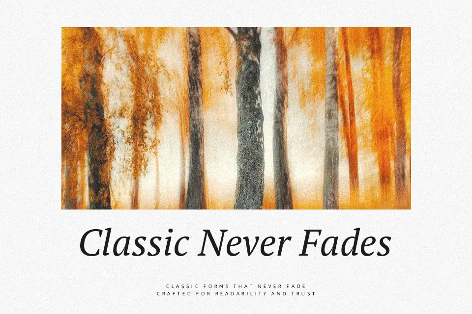
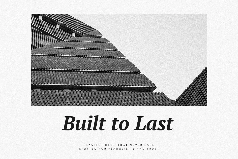
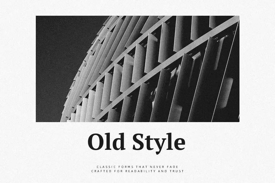
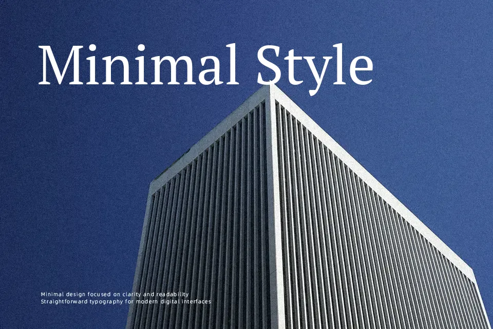
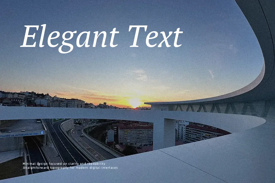
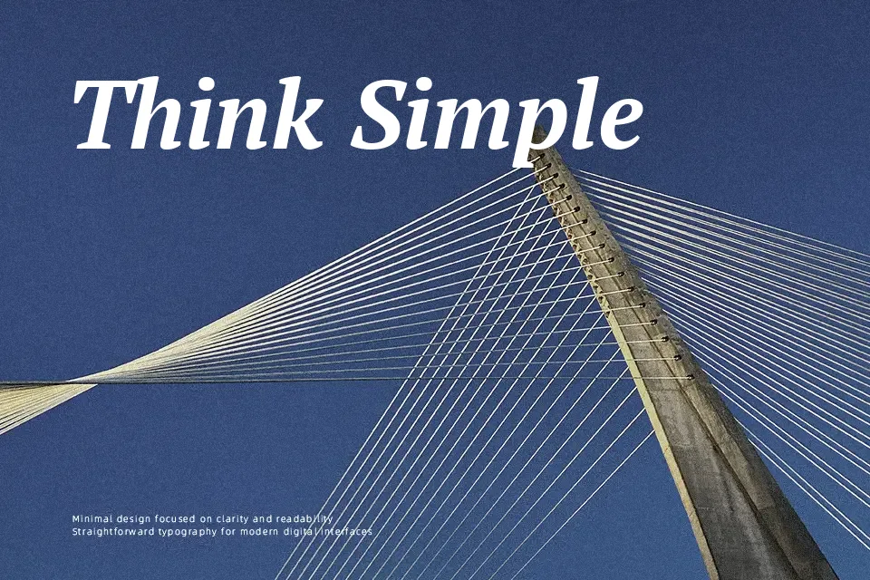
PT Serif is a text-focused serif with moderate contrast, sturdy stems, and softly bracketed serifs that keep paragraphs calm and readable rather than showy. The proportions feel balanced, with a relatively large x-height, open counters, and spacing tuned for continuous reading instead of tight, flashy headlines. It carries a serious, slightly classical tone that fits magazines, blogs, documentation, and book-like interfaces where you need structure without stiffness, similar in spirit to fonts like Merriweather but a bit more restrained. It struggles in very expressive branding or ultra-minimal tech branding, where you may want something either more decorative or more geometric.
Best For:
Long-form editorial body text
Content-heavy websites and blogs
Book interiors and reports
Documentation and knowledge bases
Not Ideal For:
Highly expressive display logos
Ultra-minimal tech branding
Kids or playful creative layouts
Very tight, oversized headlines
Perfect for advertising, body text, and editorial, with a classic and serif style.
License
Gallery