Promotion Font
Free for personal useAbout
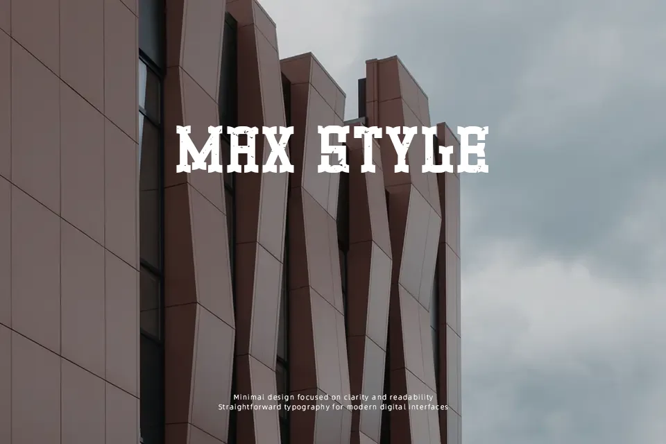
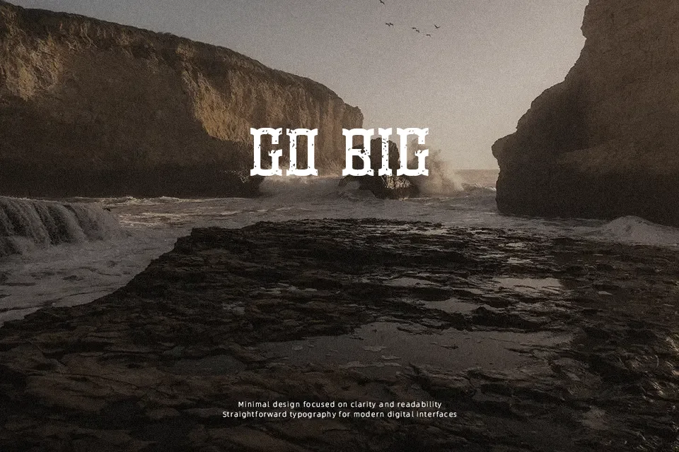
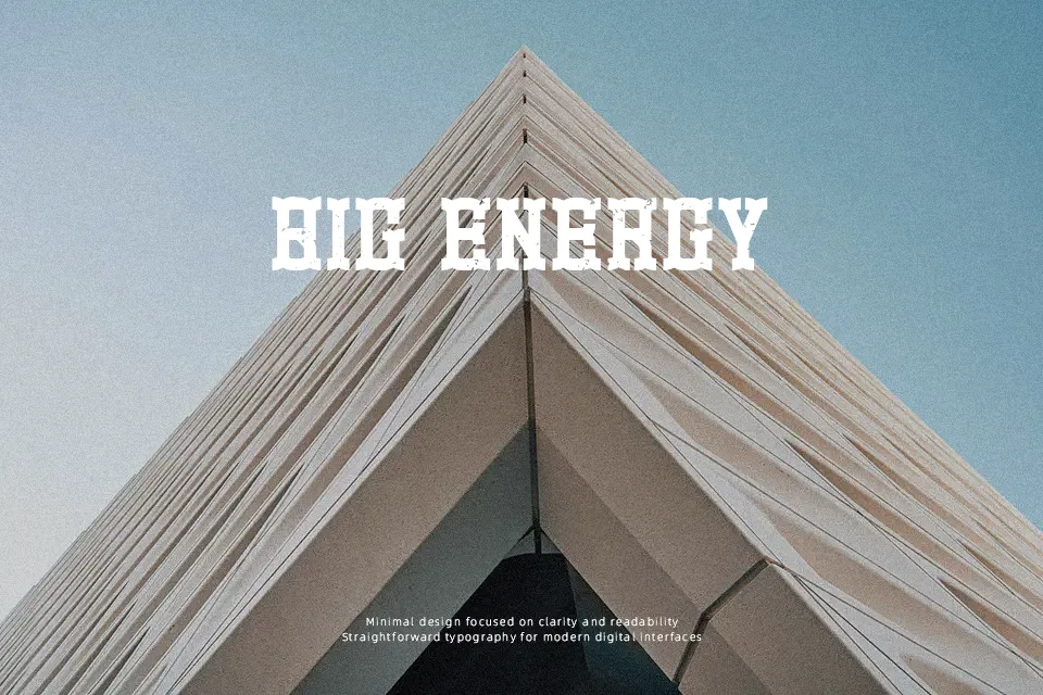
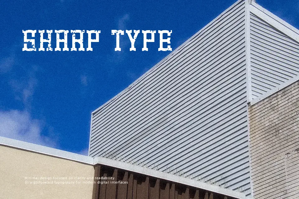
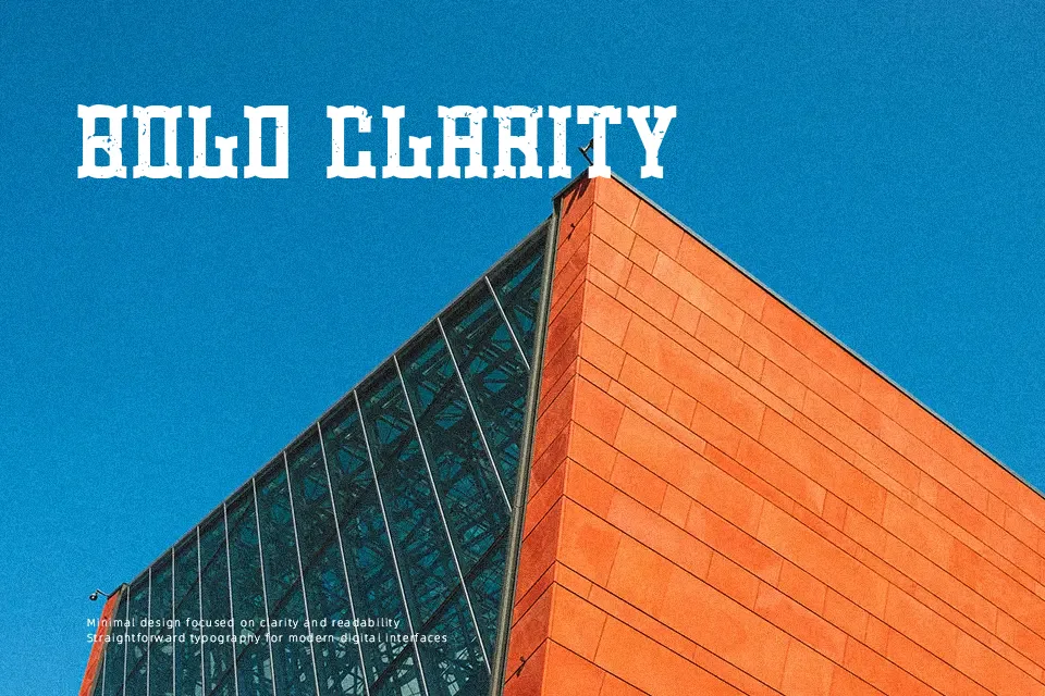
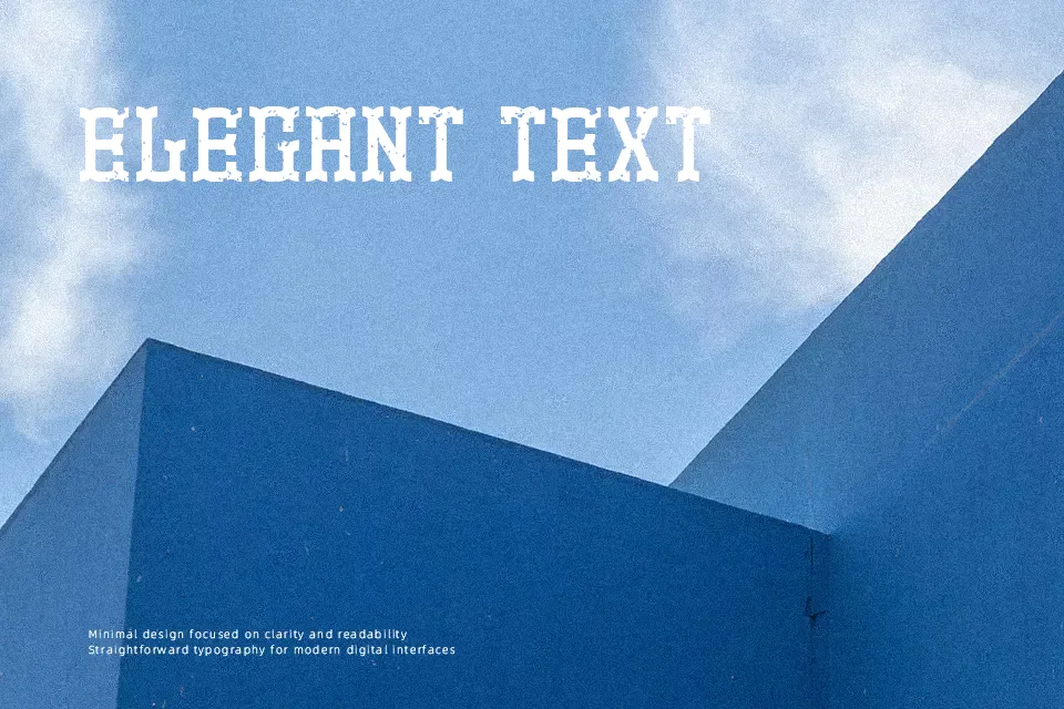
Promotion Font establishes a commanding visual presence through its heavy strokes and distinct angular serifs. The rigid structure and prominent decorative spurs give the letterforms an authoritative, vintage character. Spacing is tightly controlled, allowing headlines to pack a solid, unified punch without feeling overly cramped. The uppercase-driven proportions maintain excellent rhythm and balance across short lines of text. While the robust design guarantees immediate impact in large display scenarios like festival posters or rustic apparel graphics, these same bold characteristics reduce comfort during continuous reading. Dense forms and sharp terminals can cause visual fatigue at smaller sizes, making it less suitable for long paragraphs.
Best For:
vintage apparel graphics, music festival posters, rustic product packaging
Not Ideal For:
long paragraph text, dense editorial layouts, small interface labels
Perfect for advertising, branding, and headline, with a bold and decorative style.
License
Gallery