Primrose Font
Free for personal useAbout
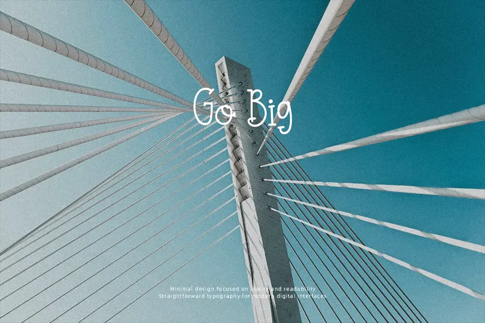
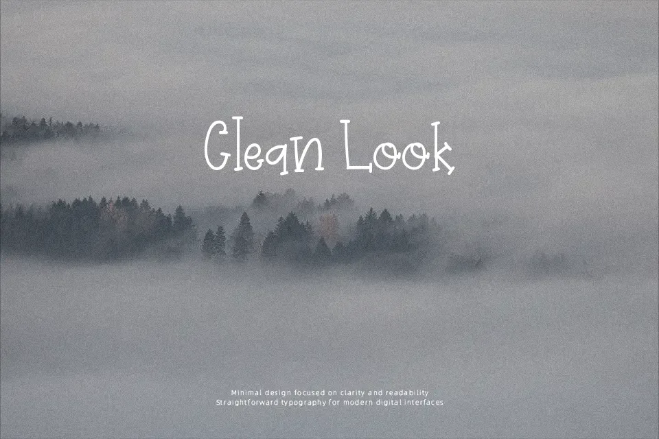
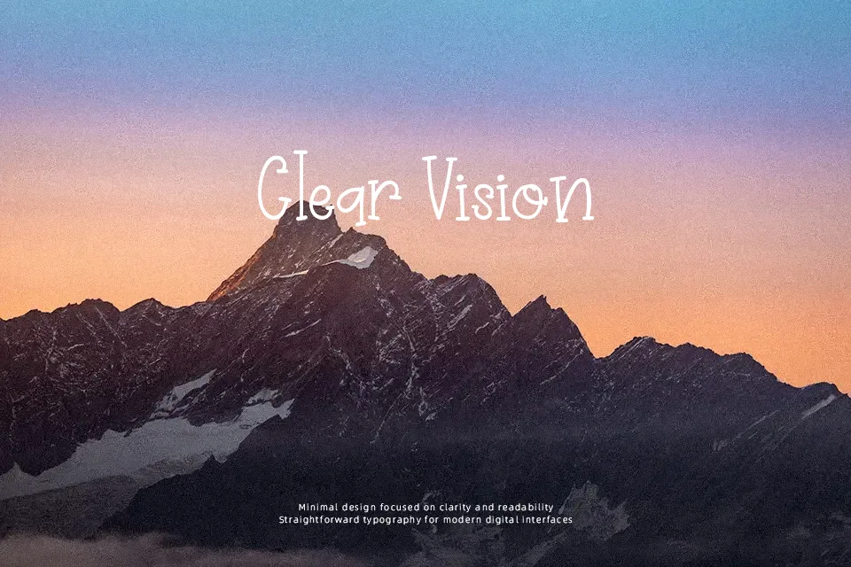
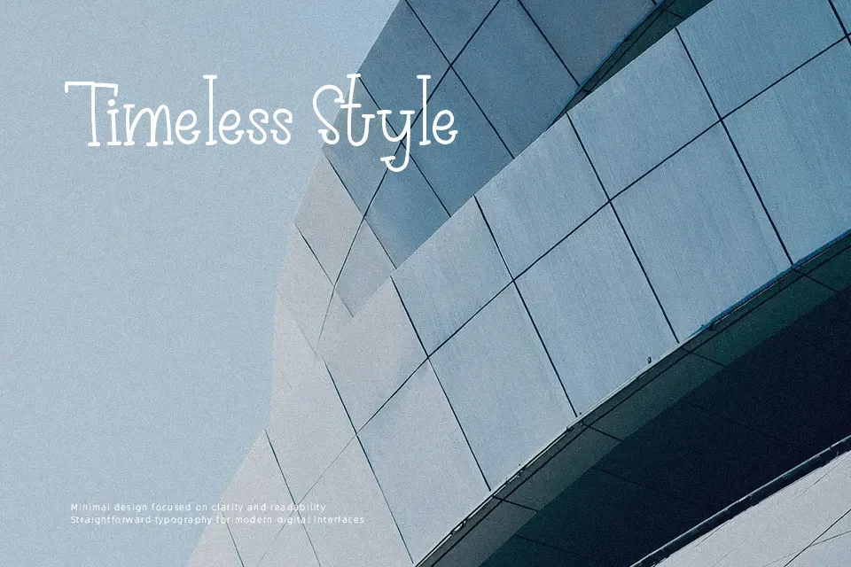
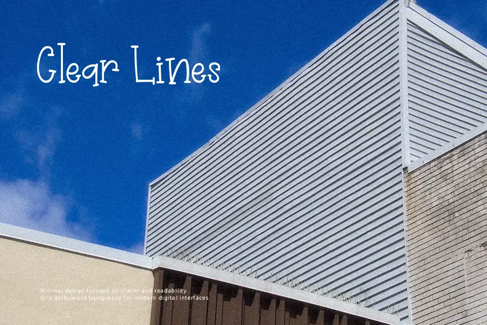
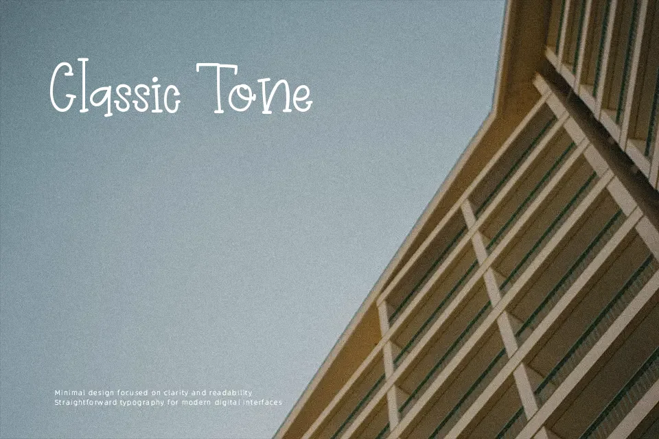
Primrose Font delivers a lively, hand-drawn aesthetic characterized by its bouncy baseline and chunky, irregular stroke thickness. The letterforms exhibit a friendly, rounded structure with varied proportions, giving the typeface an energetic, cartoon-like appearance. Open spacing ensures the characters remain distinct, which helps maintain clarity in larger headlines and vibrant festival banners. This dynamic rhythm makes the design perfectly suited for crafting projects, playful branding, and seasonal packaging. However, the varying stroke weights and bouncing alignment become less effective at smaller sizes, reducing continuous reading comfort. Consequently, this display design is less suitable for dense paragraph text or small interface labels, shining best when applied to high-impact titles.
Best For: children’s book covers, seasonal holiday packaging, crafting project headers, playful festival posters
Not Ideal For: dense editorial layouts, corporate reports, small interface labels
Perfect for headline, holiday, and kids, with a creative and cartoon style.
License
Gallery