Poker in Fire Font
Free for personal useAbout
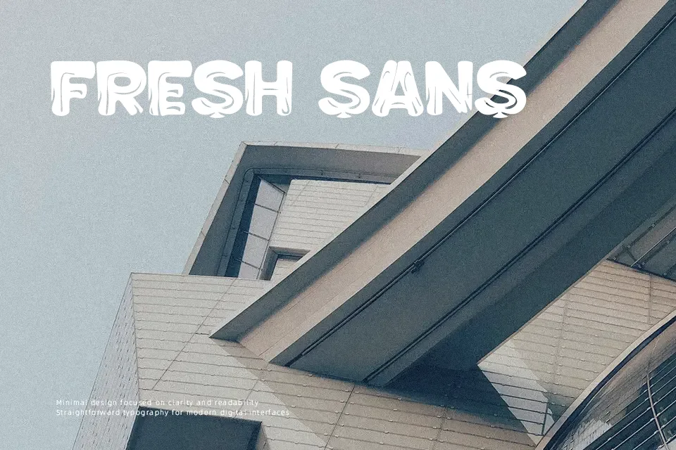
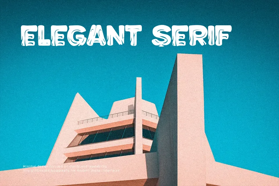
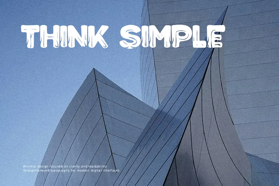
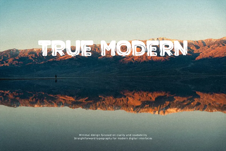
Poker in Fire Font immediately draws attention with its dramatic flame-inspired letterforms and solid, heavy baseline. The structure relies on thick, condensed strokes that anchor the fiery flourishes extending from the top of the characters, creating a strong sense of upward motion. Because the decorative elements heavily alter the character silhouettes, the typeface performs best when displayed at larger sizes where the textural details can be easily appreciated. The tight spacing helps maintain a cohesive block of text for short, punchy titles, making it highly effective for music festival posters or extreme sports branding. However, these complex decorative forms reduce continuous reading comfort, meaning the design is less suitable for long paragraphs or small interface elements.
Best For:
music festival posters, extreme sports branding, gaming title screens, event promotional flyers
Not Ideal For:
continuous body text, small interface labels, corporate presentations, dense editorial layouts
Perfect for gaming, headline, and poster, with a dramatic and decorative style.
License
Gallery