Pieces Font
Free for personal useAbout
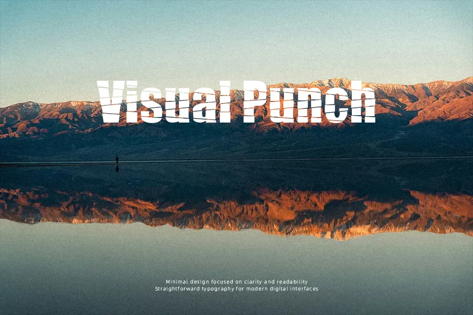
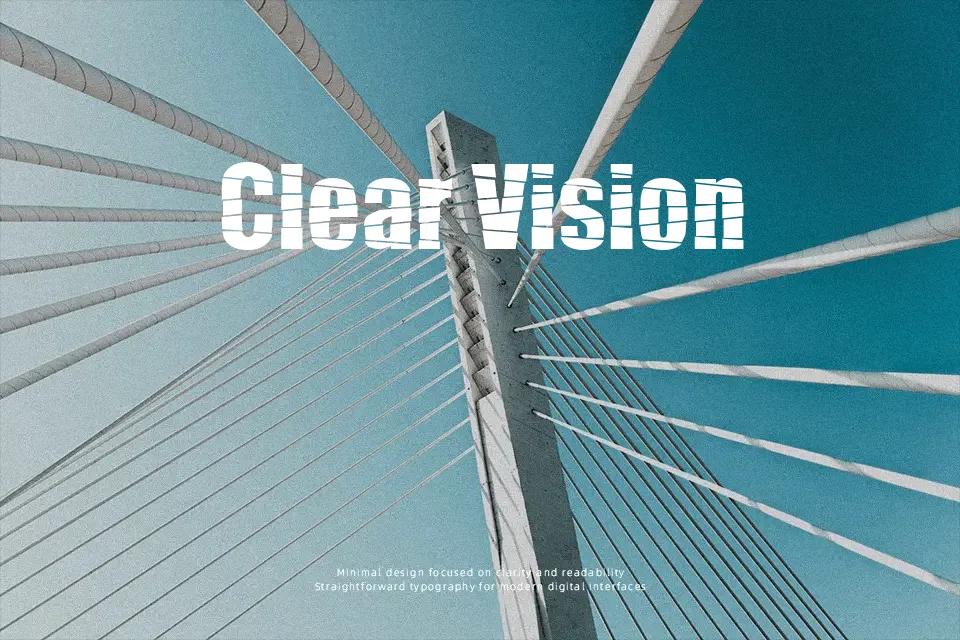
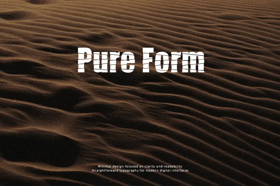
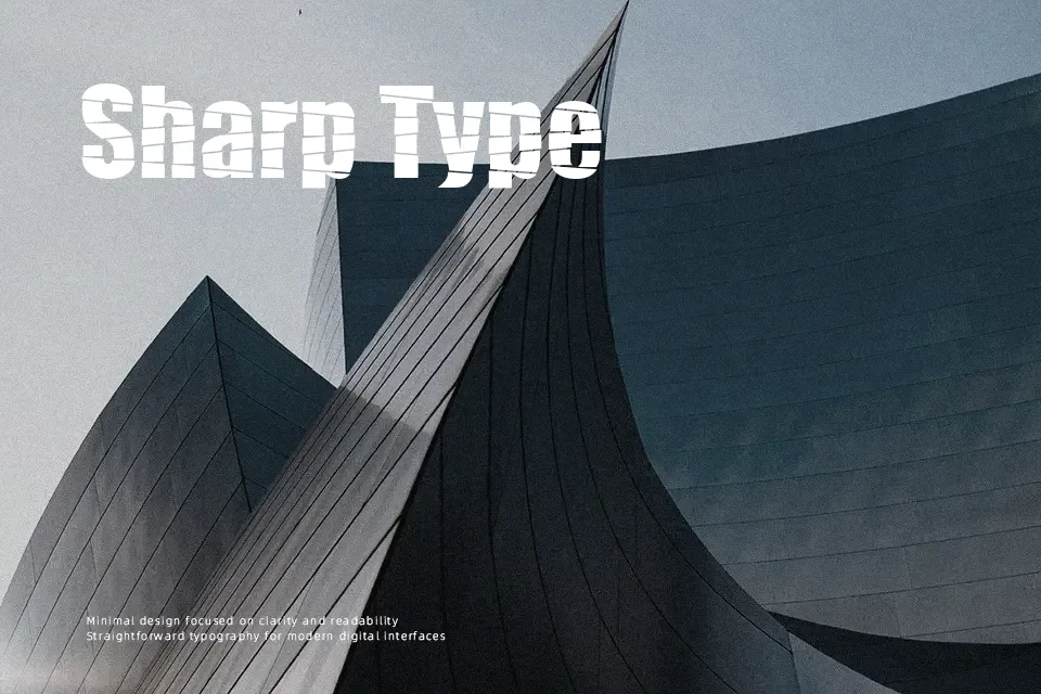
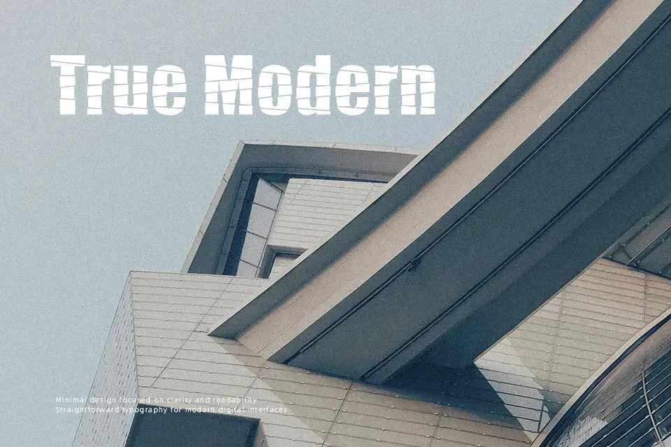
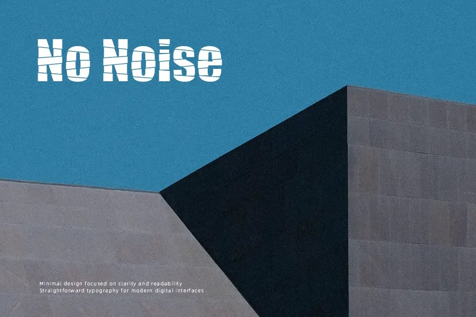
Pieces Font works best as large-scale display lettering where its broken, geometric forms can remain distinct. The character shapes use sharp interruptions and uneven internal divisions rather than smooth, continuous strokes, giving words a constructed and visually restless appearance. Spacing appears most effective when text is kept short, allowing each letterform enough room to read as an individual shape. It suits titles, cover artwork, and graphic-led promotional layouts. The decorative structure provides impact in headlines, but reduced continuity makes it less comfortable for small text or long passages.
Best For: music event posters,album cover titles,streetwear graphics,game title screens
Not Ideal For: long paragraph text,small interface labels,legal documents,dense editorial layouts
Perfect for gaming, logo, and music, with a bold and decorative style.
License
Gallery