Patchy Robots Font
Free for personal useAbout
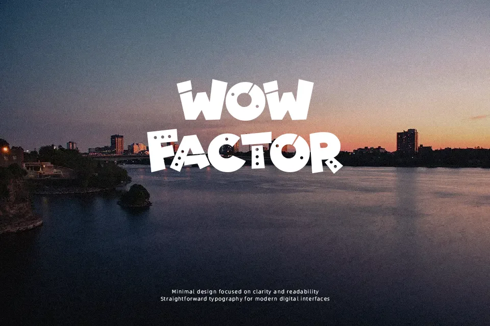
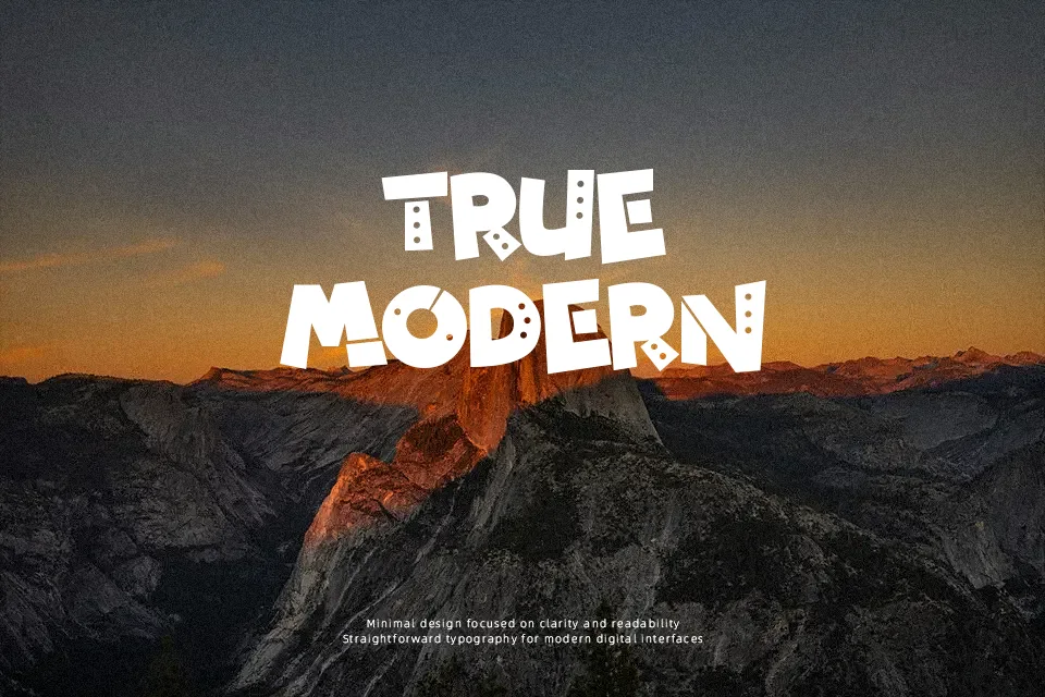
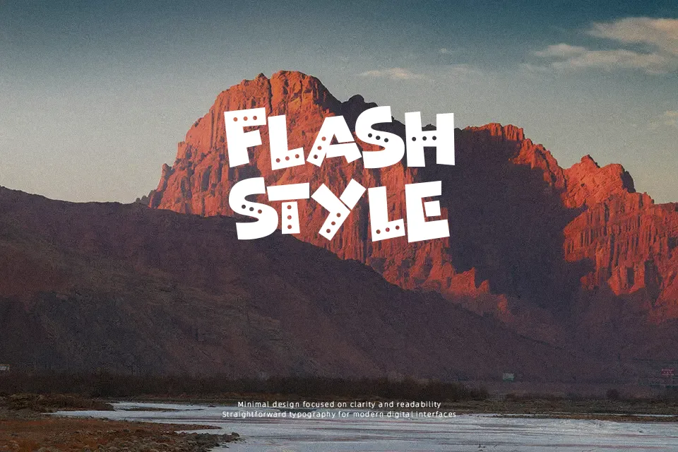
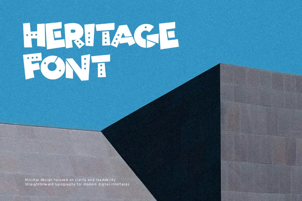
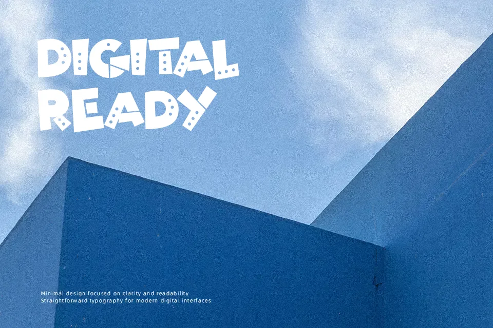
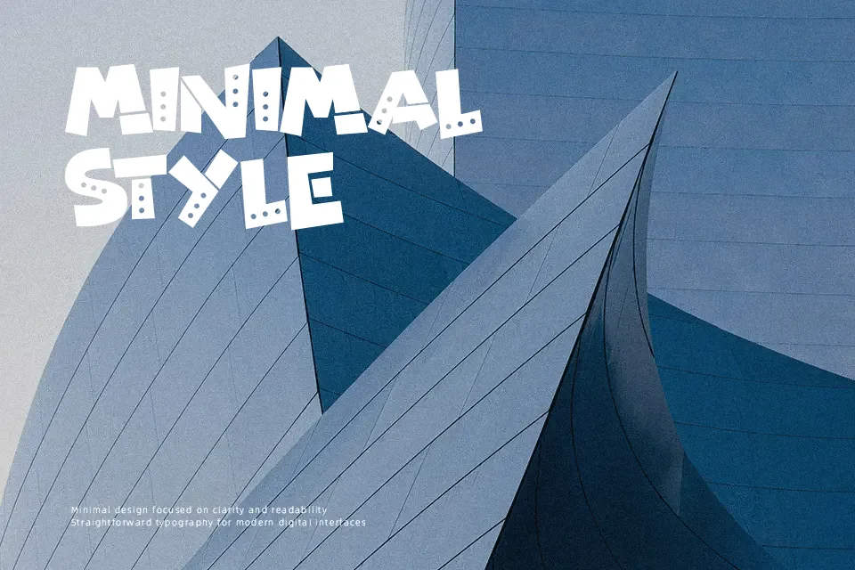
Patchy Robots Font works best as oversized display lettering, using chunky forms with uneven, patch-like edges and a deliberately assembled appearance. The strokes look heavy and low in contrast, while the broad proportions create a bold silhouette across short words. Spacing feels most comfortable in headlines, labels, and title treatments rather than compact copy. Uppercase characters have a consistent cartoon rhythm, and the visible numerals suit short, attention-led messages. The design remains most readable when given room to breathe at larger sizes. Its irregular details become less clear in small captions, dense layouts, and continuous reading.
Best For: kids’ game titles,robot-themed party invitations,playful product labels,poster headlines
Not Ideal For: long paragraph text,small interface labels,corporate reports,dense editorial layouts
Perfect for gaming, headline, and invitation, with a bold and cartoon style.
License
Gallery