Opointe Font
Free for Commercial UseAbout
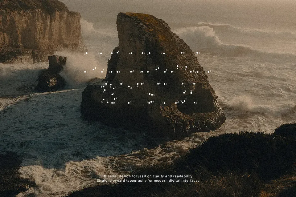
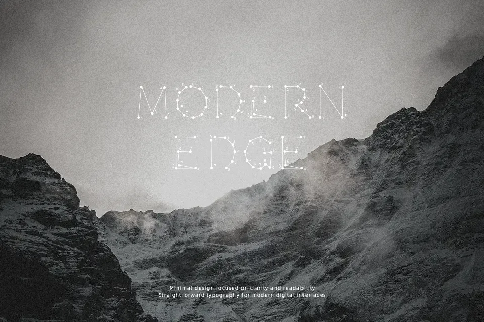
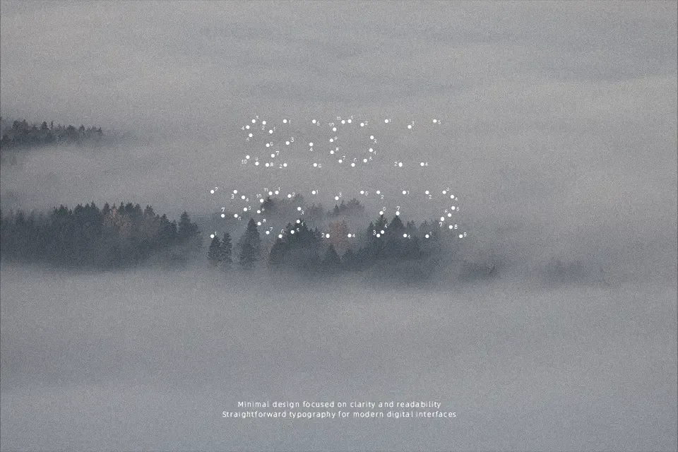
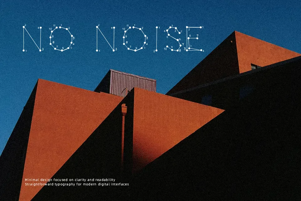
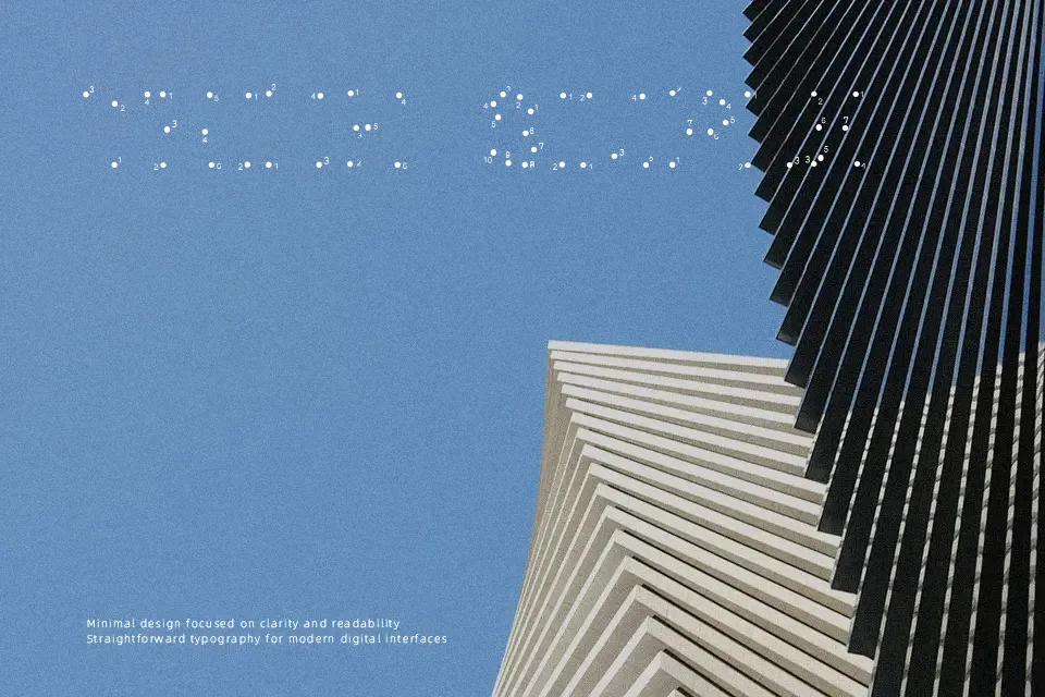
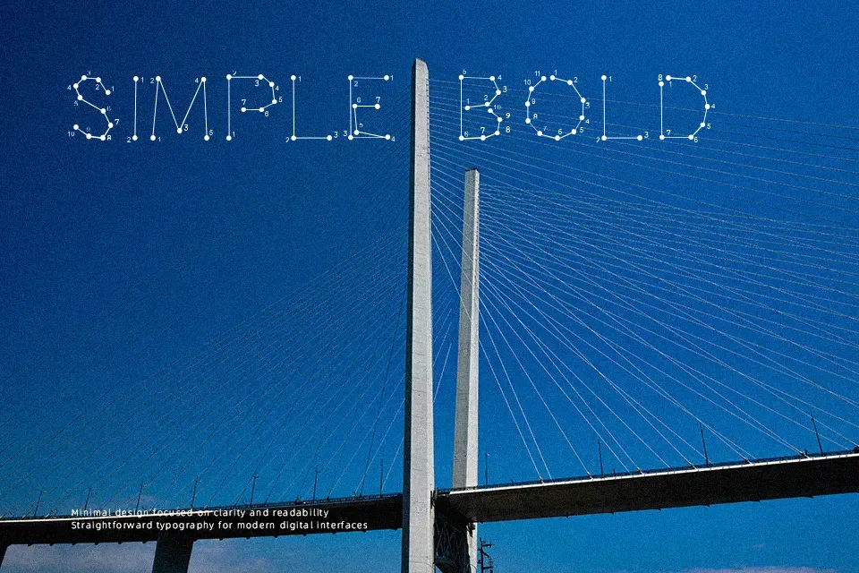
Opointe Font uses angular, segmented shapes that give its alphabet a constructed, digital-looking character. The strokes appear evenly weighted, while the compact proportions and deliberate gaps create a mechanical visual rhythm across uppercase letters, numerals, and punctuation. It reads most effectively in large headlines, where the unusual forms have room to separate and remain recognizable. The typeface is a practical fit for short titles, cover artwork, and identity marks needing a technical edge. Its decorative structure becomes harder to scan in small sizes, so it is less comfortable for continuous text or detailed interface copy.
Best For: electronic music artwork,futuristic poster headlines,game title graphics,technology event branding
Not Ideal For: long paragraph text,small interface labels,legal documents,dense editorial layouts
Perfect for branding, gaming, and logo, with a creative and decorative style.
License
Gallery