Numero Font
Free for Commercial UseAbout
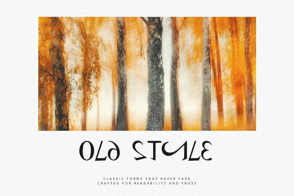
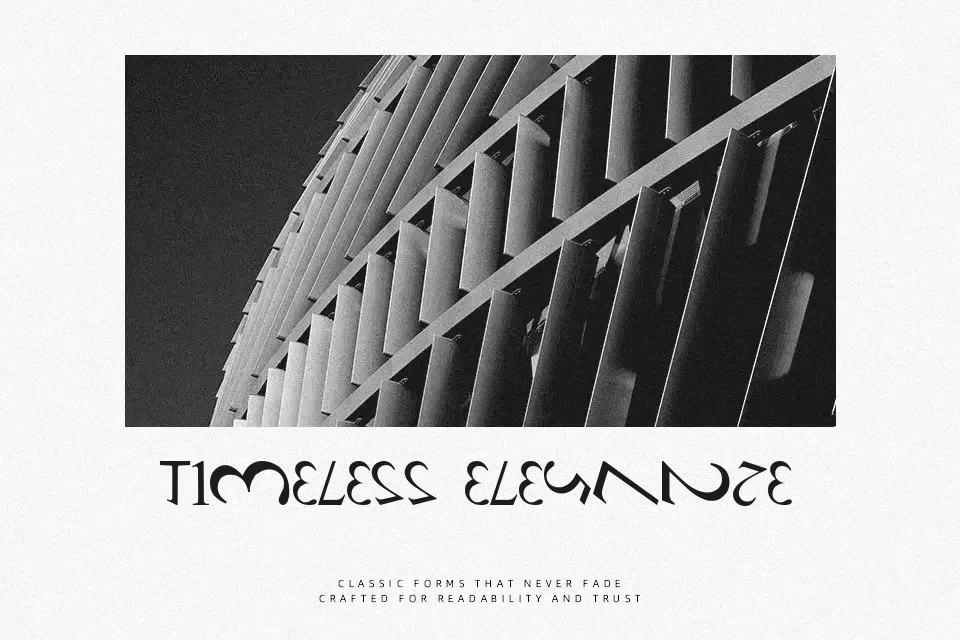
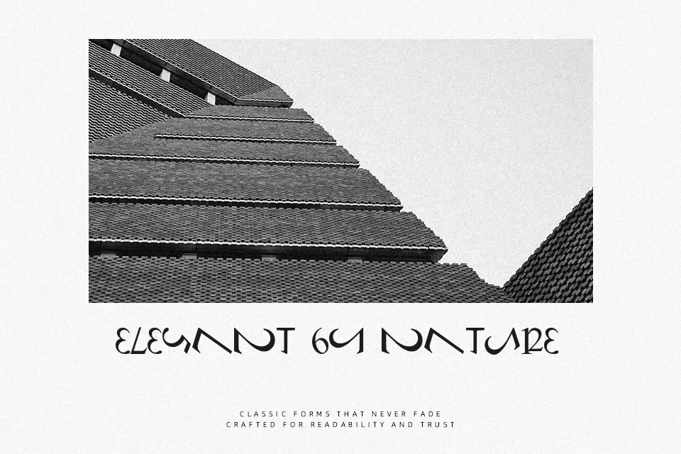
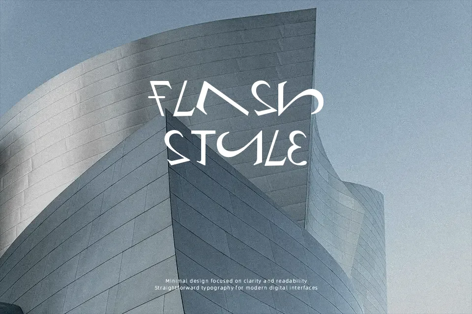
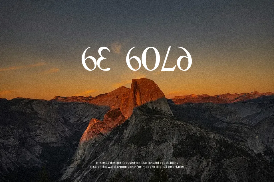
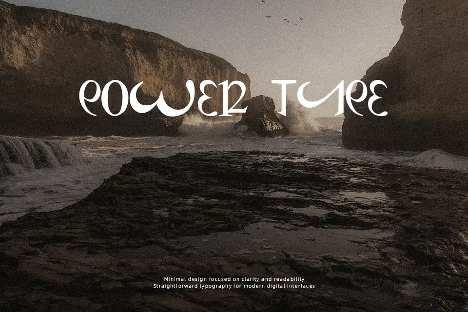
Numero uses a deliberate character swap: uppercase and lowercase letters follow recognizable serif construction, while numerals take on clean sans-serif forms. The contrast makes short words look slightly coded, especially where letters and figures are read together. Spacing appears generally balanced, and the conventional proportions keep individual glyphs identifiable at display sizes. The font works best when the visual substitution is part of the message, such as a playful heading or typographic graphic. Its mixed logic is engaging in short lines, but it can slow reading in small copy or extended text.
Best For:
poster headlines,typographic puzzles,editorial feature titles,social media graphics
Not Ideal For:
long paragraph text,small interface labels,legal documents,dense editorial layouts
Perfect for editorial, headline, and poster, with a classic and decorative style.
License
Gallery