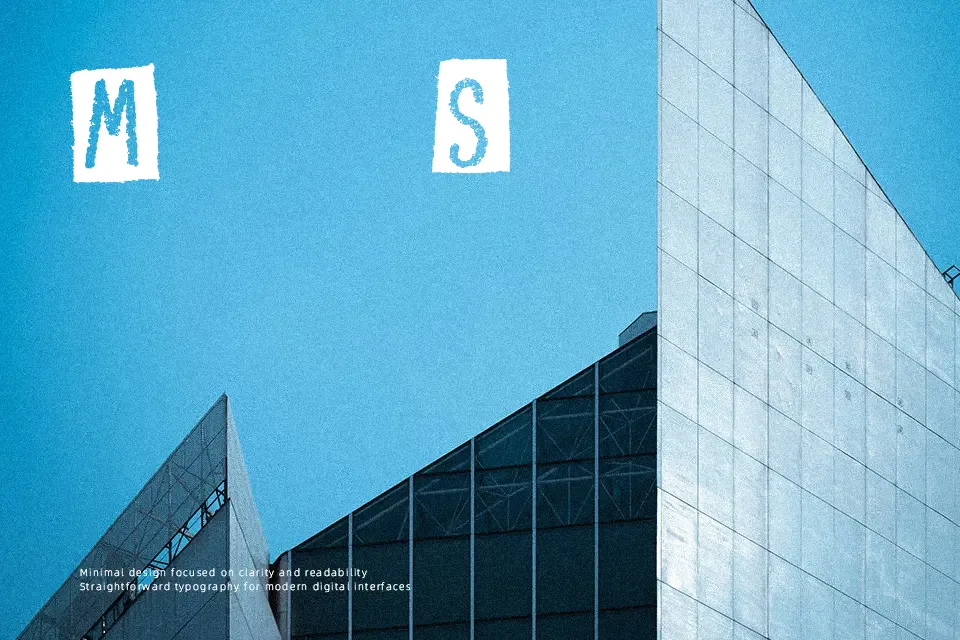
Craps of Paper Font
Free for personal useAbout
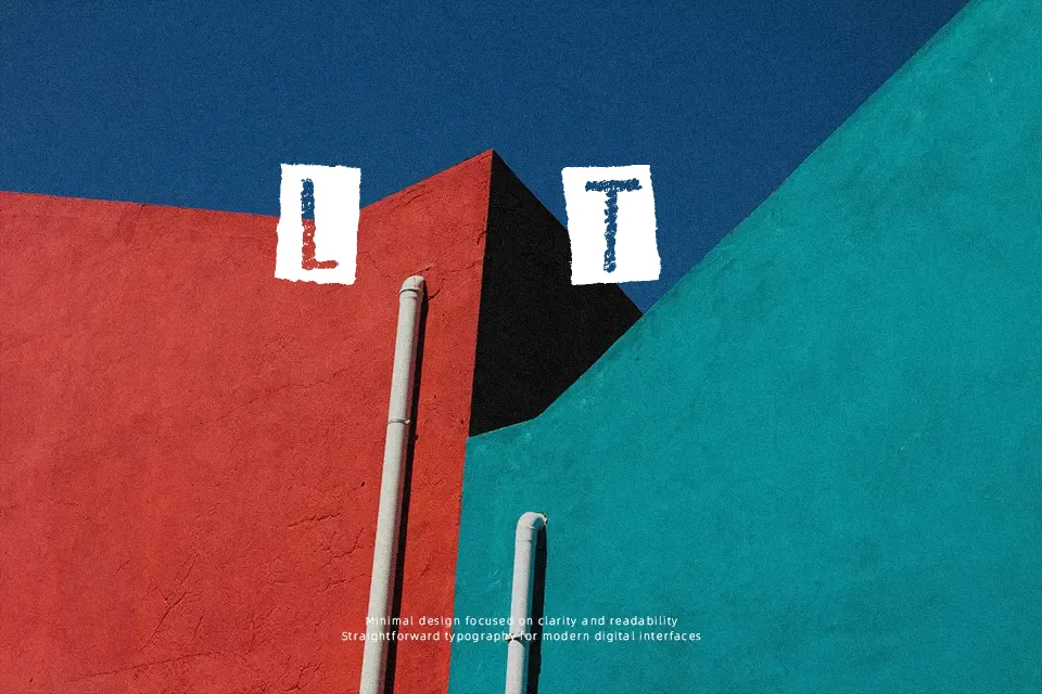
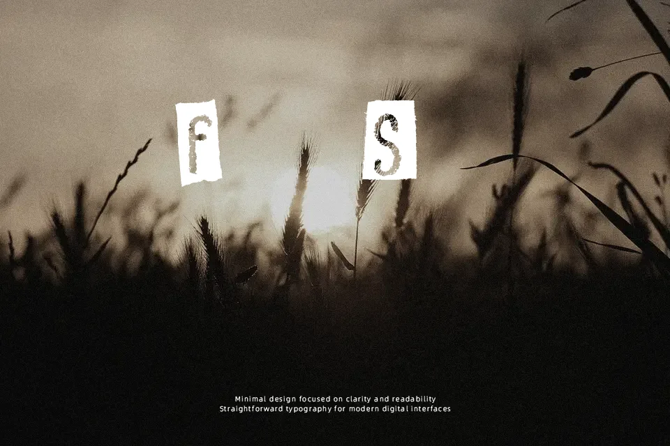
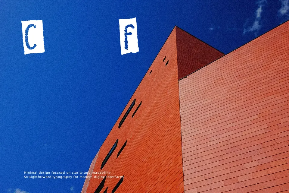
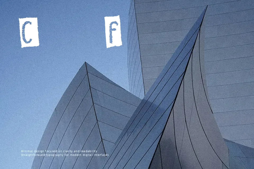
Craps of Paper Font distinguishes itself through solid glyphs embedded directly onto ragged, irregular cut-paper polygons. Heavy dark strokes form the core characters, generating stark contrast against the angular white backdrops of each torn scrap. Character spacing remains loose and uneven to preserve the organic rhythm of hand-assembled paper collages, while letter proportions vary slightly across individual silhouettes. The design delivers immediate graphic punch across album jackets, event flyers, and rebellious editorial covers. However, the heavy boundary shapes compromise legibility in compact settings, making the typeface poorly suited for dense paragraphs or modest subheadings where intricate cutout contours clutter adjacent rows.
Best For: indie music posters, DIY zine covers, scrapbook album headers, merchandise packaging
Not Ideal For: continuous paragraph text, corporate financial reports, mobile user interface labels, dense book setting
Perfect for headline, music, and packaging, with a creative and decorative style.
License
Gallery