Noto Serif Font

Free for Commercial Use
Designed by Google

A A
NotoSerif-Thin.ttf
The quick brown fox jumps over the lazy dog
NotoSerif-ThinItalic.ttf
The quick brown fox jumps over the lazy dog
NotoSerif-ExtraLight.ttf
The quick brown fox jumps over the lazy dog
NotoSerif-ExtraLightItalic.ttf
The quick brown fox jumps over the lazy dog
NotoSerif-Light.ttf
The quick brown fox jumps over the lazy dog
NotoSerif-LightItalic.ttf
The quick brown fox jumps over the lazy dog
NotoSerif-Regular.ttf
The quick brown fox jumps over the lazy dog
NotoSerif-Italic.ttf
The quick brown fox jumps over the lazy dog
NotoSerif-Medium.ttf
The quick brown fox jumps over the lazy dog
NotoSerif-MediumItalic.ttf
The quick brown fox jumps over the lazy dog
NotoSerif-SemiBold.ttf
The quick brown fox jumps over the lazy dog
NotoSerif-SemiBoldItalic.ttf
The quick brown fox jumps over the lazy dog
NotoSerif-Bold.ttf
The quick brown fox jumps over the lazy dog
NotoSerif-BoldItalic.ttf
The quick brown fox jumps over the lazy dog
NotoSerif-ExtraBold.ttf
The quick brown fox jumps over the lazy dog
NotoSerif-ExtraBoldItalic.ttf
The quick brown fox jumps over the lazy dog
NotoSerif-Black.ttf
The quick brown fox jumps over the lazy dog
NotoSerif-BlackItalic.ttf
The quick brown fox jumps over the lazy dog

About

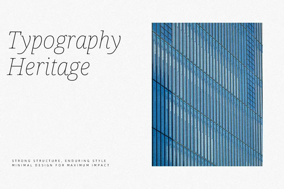
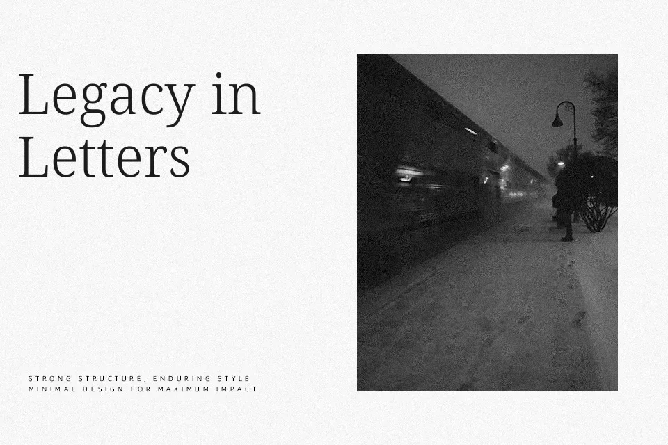
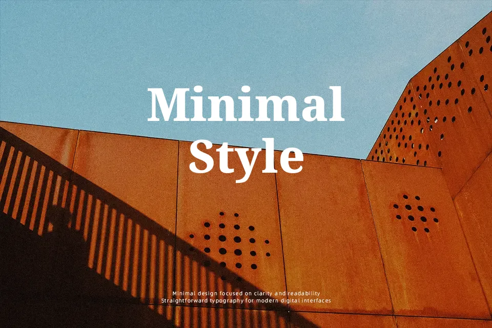
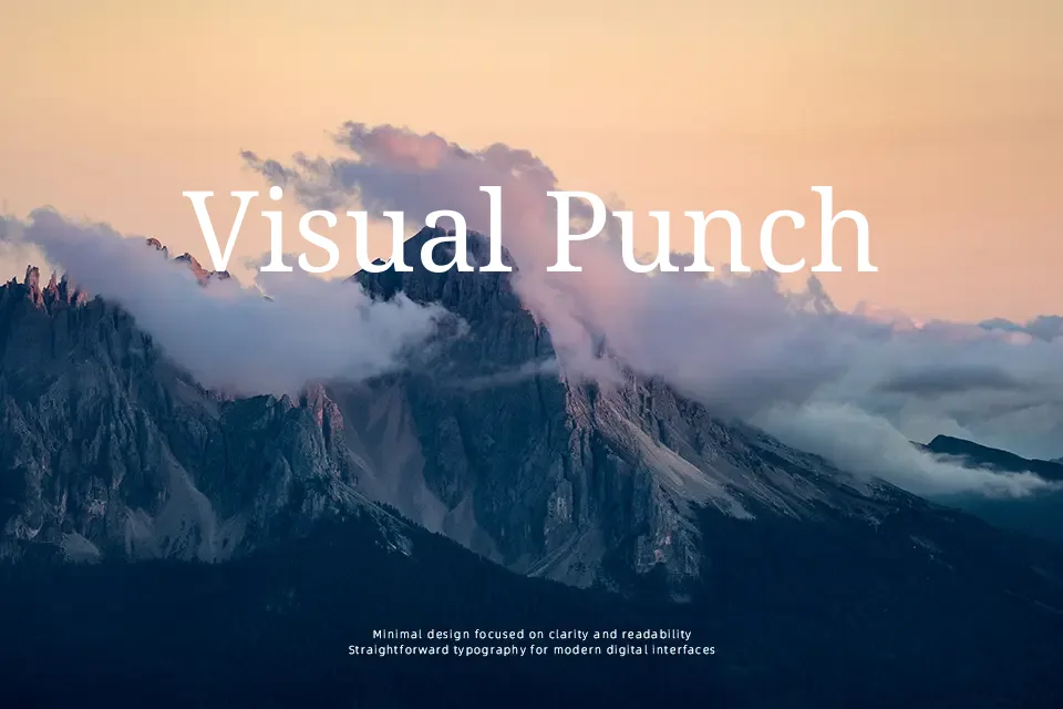
Noto Serif balances traditional proportions with functional screen readability. The letterforms feature moderate contrast and open counters, ensuring high legibility even at smaller text sizes. Its structural foundation leans classic, yet lacks the heavy ornamentation that often weighs down older serif revivals. This makes the typeface highly effective for dense editorial layouts, long-form articles, and multilingual corporate branding where visual consistency across alphabets is required. While it succeeds in body copy and interfaces demanding extended reading, its utilitarian nature struggles to deliver the dramatic flair needed for luxury display typography. Compared to highly stylized options, Noto Serif feels grounded, prioritizing sheer function and global accessibility over purely decorative expression.

Best For:
Multilingual corporate publishing
Extensive editorial body copy
Information-dense reading components

Not Ideal For:
Expressive luxury branding
Playful or casual youth campaigns
Avant-garde poster displays

Perfect for body text, branding, and editorial, with a classic and serif style.

License

check
Free for commercial use
This font may be used in commercial design projects such as branding, advertising, and visual content. Usage rights may vary depending on the license terms. Please review the license details for specific restrictions.
check
Free for personal use
You can also use this font freely in personal and non-commercial projects.
Noto Serif Font is licensed under the SIL Open Font License (OFL).
Noto Serif Font is distributed under the README.txt. The full license document is included in the downloaded package.

Similar Fonts

You may also like

Fonts by Language

How to Use Noto Serif Font

  1. Download the font file.
  2. Install it on your device (TTF or OTF format).
  3. Use it in your favorite design tools, such as Photoshop, Illustrator, or Canva.

Noto Serif Font FAQ

Q: Is this font free for commercial use?

A: This font is released under the SIL Open Font License (OFL), which generally allows both personal and commercial use. Please review the license for specific conditions or contact the author if you have any questions.

Q: Can I use this font for logos or branding?

A: This font can typically be used for logos and branding, subject to the OFL terms. For further clarification, please contact the author.

Q: What file formats are included?

A: Most fonts include TTF or OTF files.