Norikee Font
Free for personal useAbout
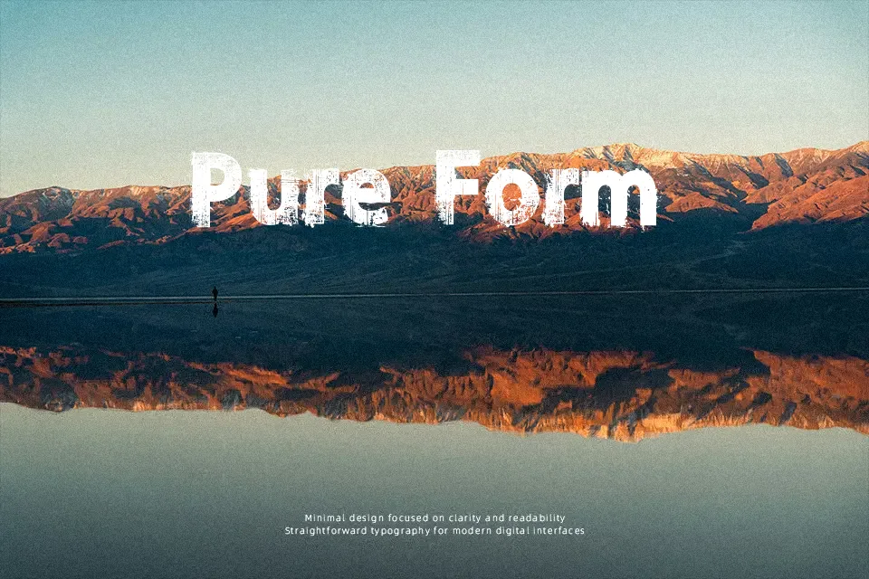
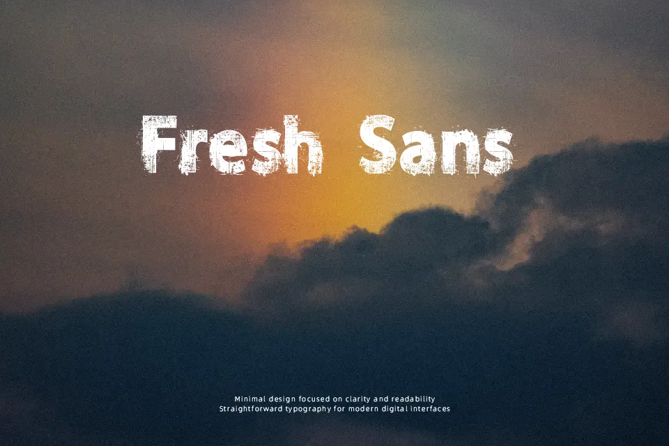
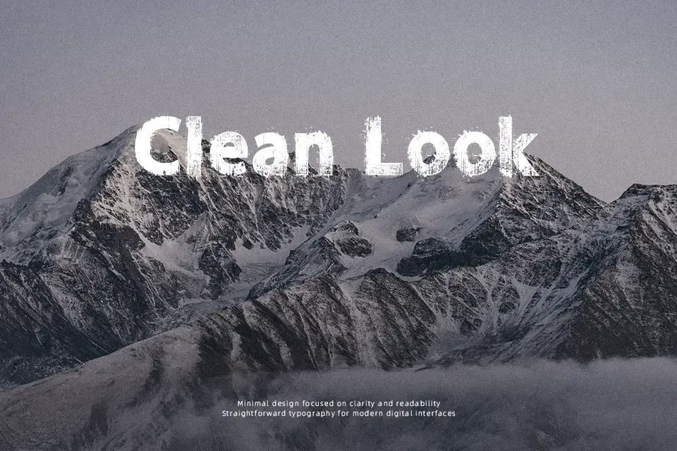
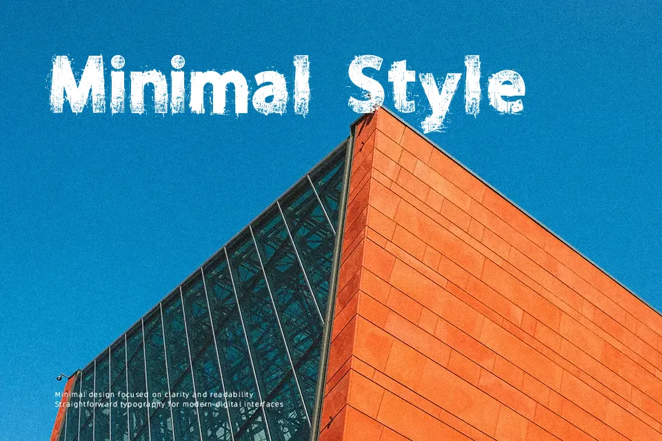
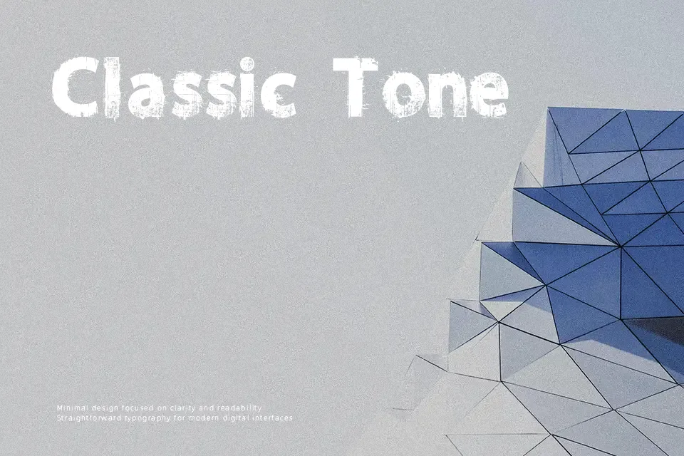
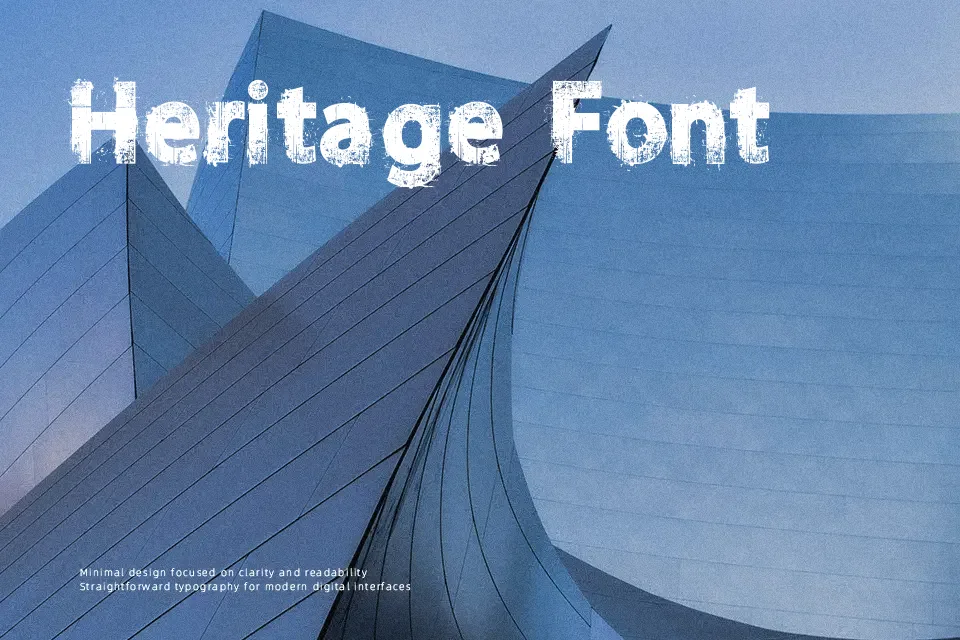
Norikee Font performs best in large-format display work, where its heavy, worn letterforms can remain distinct. The uppercase and lowercase characters use thick strokes with visibly distressed breaks, creating an irregular texture across words. Spacing appears fairly compact, while the broad proportions give short titles a dense, forceful presence. It suits apparel graphics, cover art, and attention-led editorial headings more naturally than refined layouts. The rough surface adds impact at headline sizes, but small text and long passages can become difficult to scan because the damaged edges reduce character clarity.
Best For: t-shirt graphics,album covers,magazine headlines,poster titles
Not Ideal For: long paragraph text,small interface labels,legal documents,dense editorial layouts
Perfect for fashion, headline, and music, with a bold and decorative style.
License
Gallery