Nittenaattifire Font
Free for Commercial UseAbout
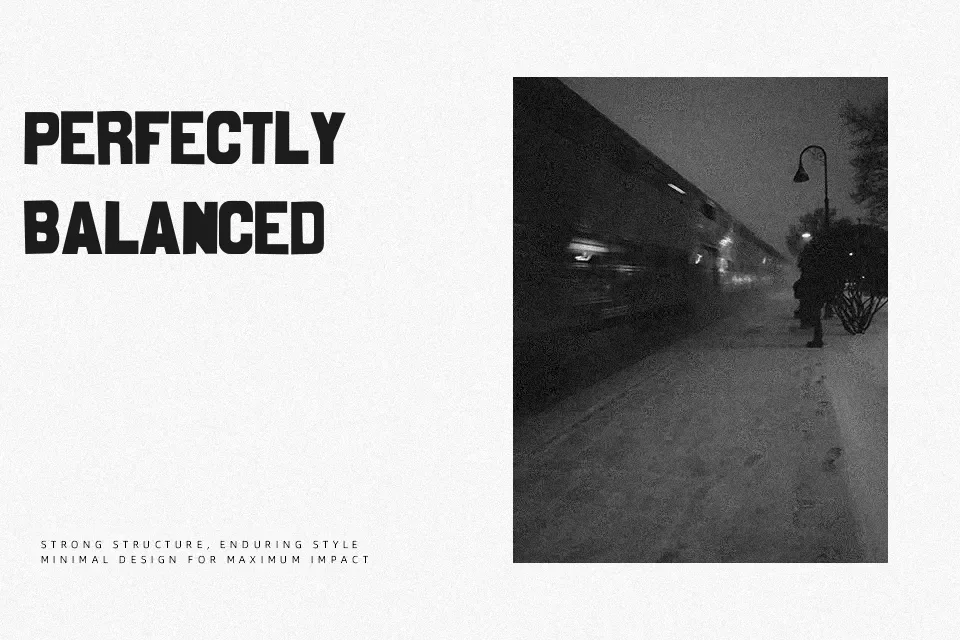
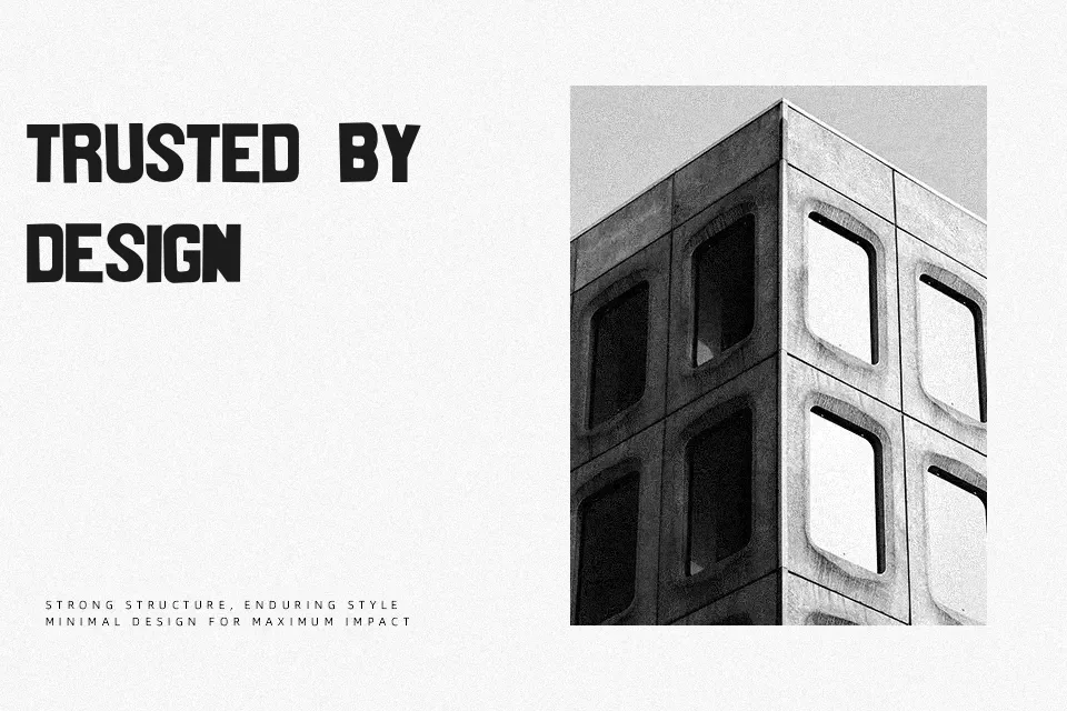
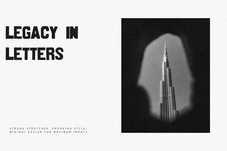
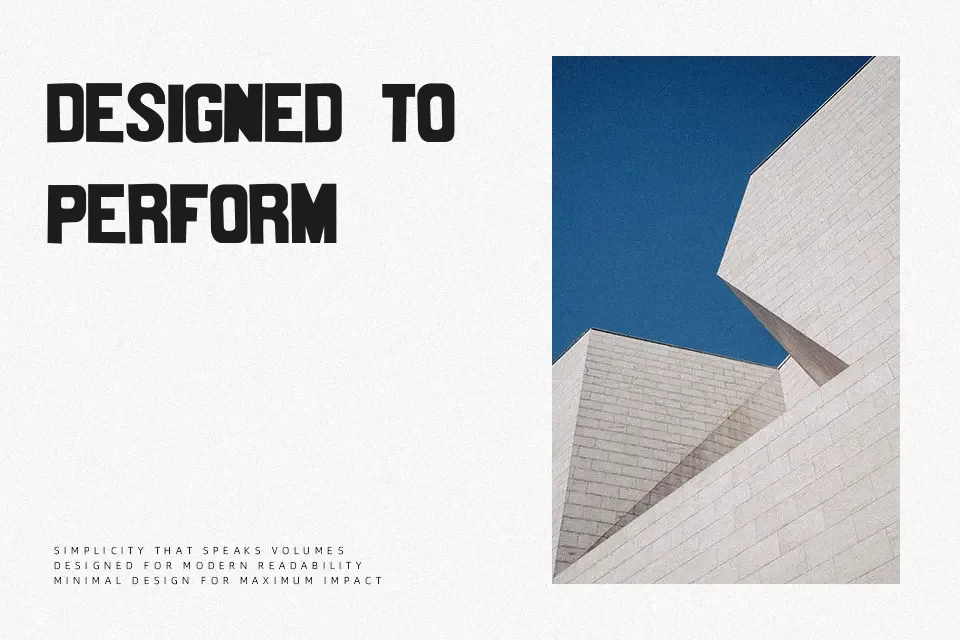
Nittenaattifire Font works best as a distinctive display face with narrow, angular forms and an intentionally irregular visual rhythm. The strokes appear firm and mostly even, while the compressed proportions make words feel compact across a line. Uppercase letters carry the strongest presence, giving short titles, cover graphics, and identity marks a structured but unconventional look. Spacing is close enough to build impact in larger settings, though it can make individual shapes harder to separate at small sizes. The design has enough character for a headline, but dense paragraphs would quickly become tiring to read.
Best For: album cover titles,poster headlines,experimental logo concepts,apparel graphics
Not Ideal For: long paragraph text,small interface labels,legal documents,dense editorial layouts
Perfect for branding, headline, and logo, with a creative and decorative style.
License
Gallery