New Sailor Font
Free for Commercial UseAbout
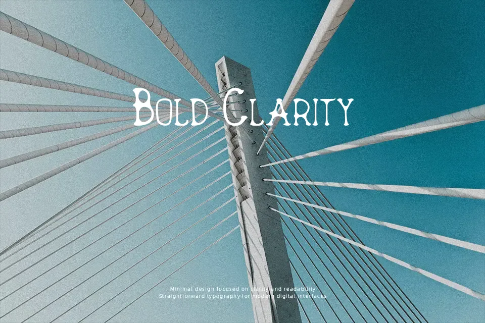
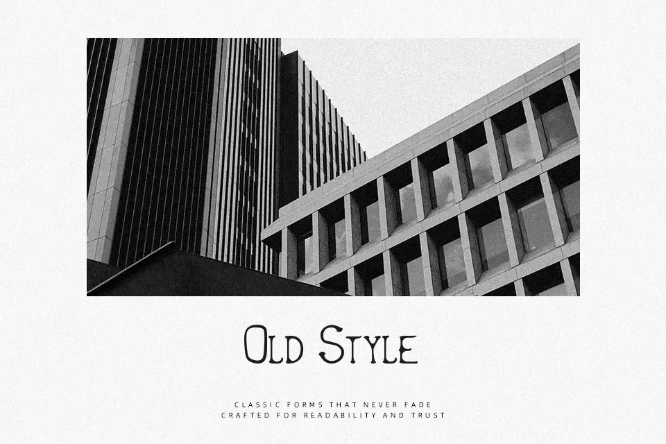
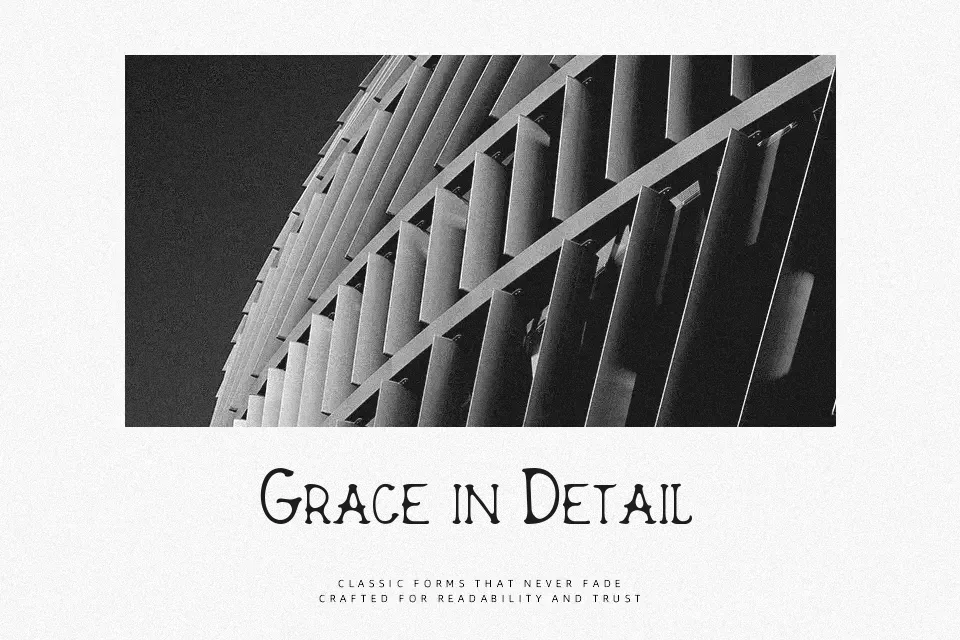
Thick, serifed letterforms with slightly irregular shapes give this design a hand-cut, vintage look that leans strongly toward display use. Strokes appear heavy and mostly uniform in weight, with firm corners and minimal fine detail, so the characters stay clear when shown large. The spacing feels compact but still separates each glyph enough for short titles and phrases. Overall, it reads confidently in headlines and short lines, though the dense structure can feel tiring in long paragraphs or at very small sizes. It suits designers who want a bold retro accent rather than a general-purpose text face.
Best For:
poster headlines for retro events,characterful titles on product labels,short slogans on apparel designs,eye-catching text on music or festival artwork
Not Ideal For:
long paragraph text,formal documents or reports,small interface labels,content-heavy editorial layouts
Perfect for headline, logo, and music, with a artistic and decorative style.
License
Gallery