New Press Eroded Font
Free for personal useAbout
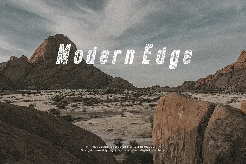
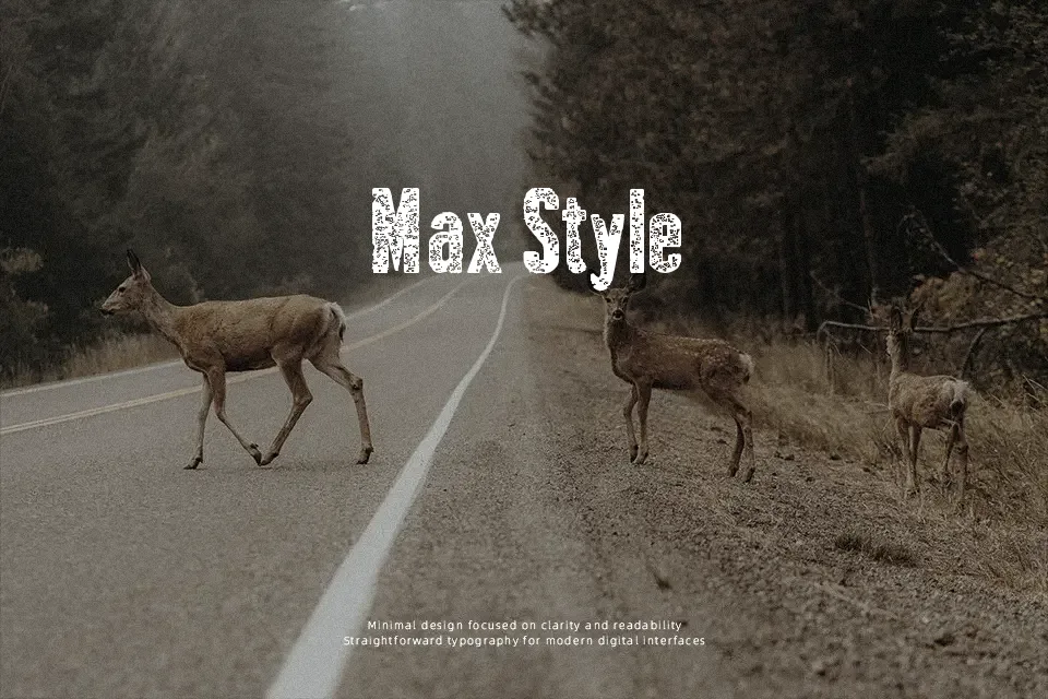
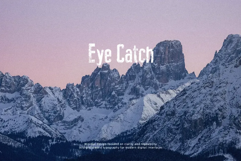
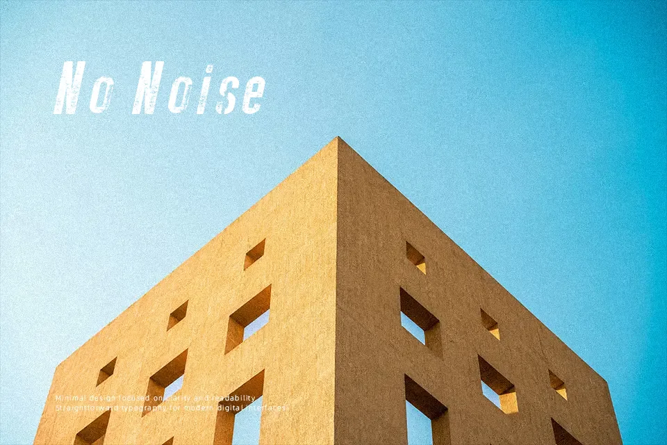
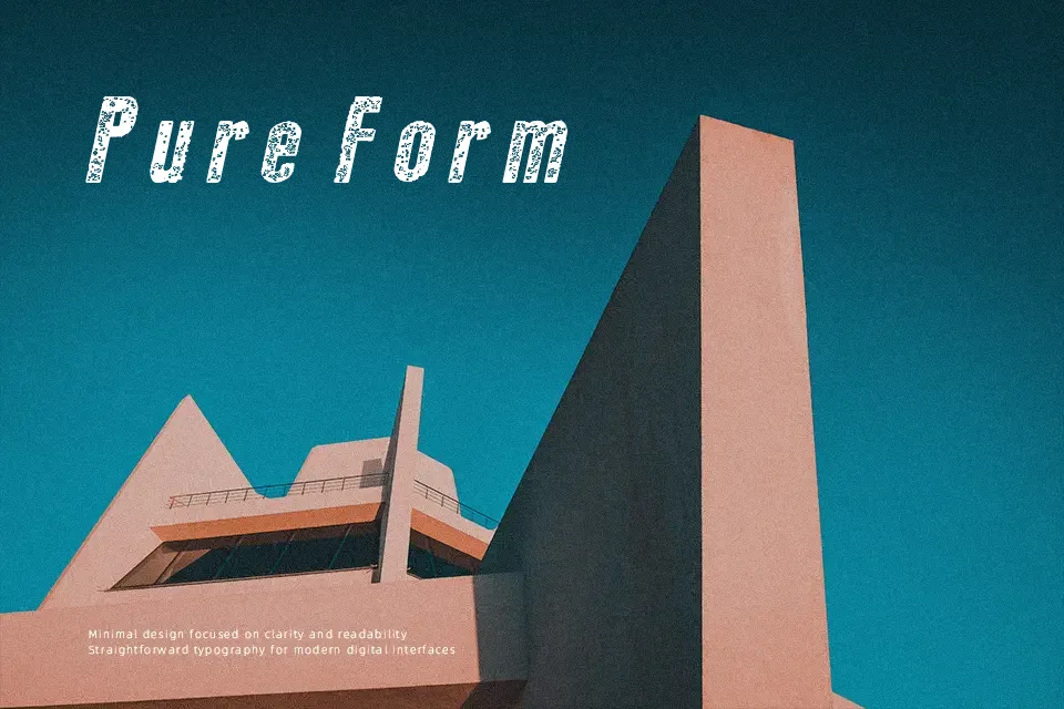
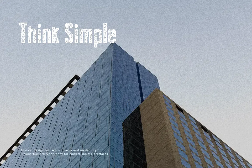
This typeface presents heavy, squared letterforms that have been visibly chipped and worn away, giving each glyph a rough, distressed contour. Strokes are thick and mostly uniform, with the eroded texture creating the impression of irregular contrast rather than true modulation. Spacing sits on the tighter side, so words feel compact and dense, which suits punchy headlines more than extended reading. Overall proportions lean toward sturdy, block-style shapes, and the uppercase set appears consistent in height and rhythm despite the random-looking erosion. At larger sizes, characters remain easy to distinguish, but at smaller scales the broken edges and gaps start to undermine clarity. It works well when you need a bold, damaged print effect, while long paragraphs or small captions quickly become tiring to scan.
Best For:
music festival posters,grunge album covers,urban event flyers,distressed logo wordmarks
Not Ideal For:
long paragraph text,corporate reports,small interface labels,technical documentation
Perfect for advertising, headline, and logo, with a bold and decorative style.
License
Gallery