New Motor Font
Free for personal useAbout
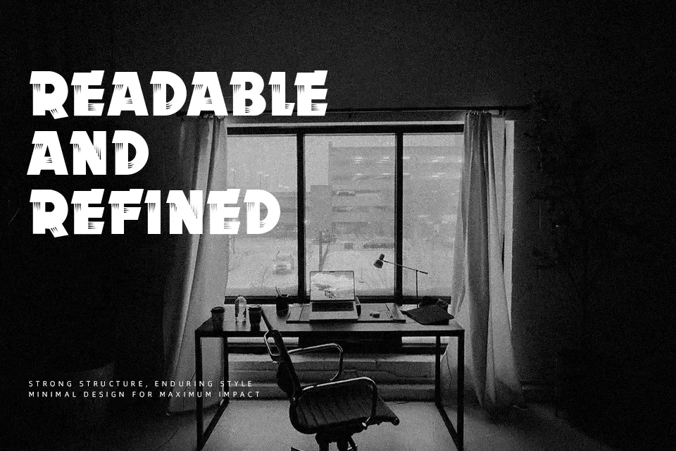
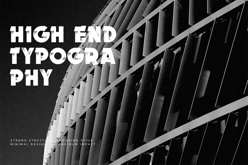
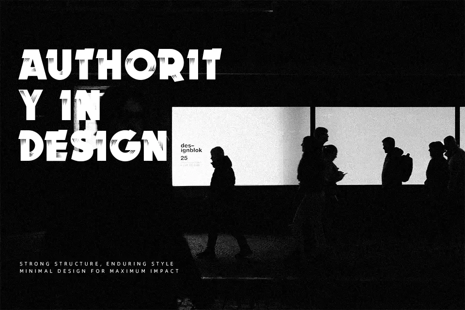
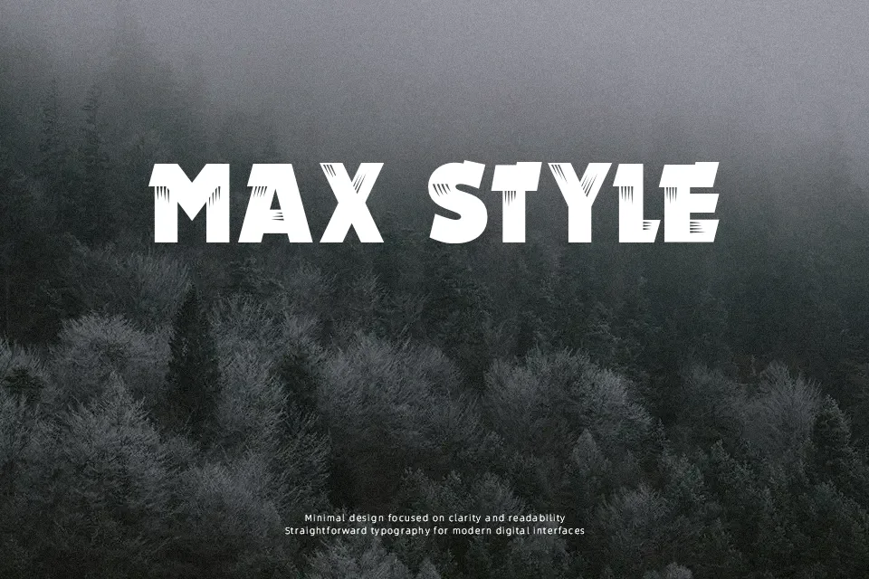
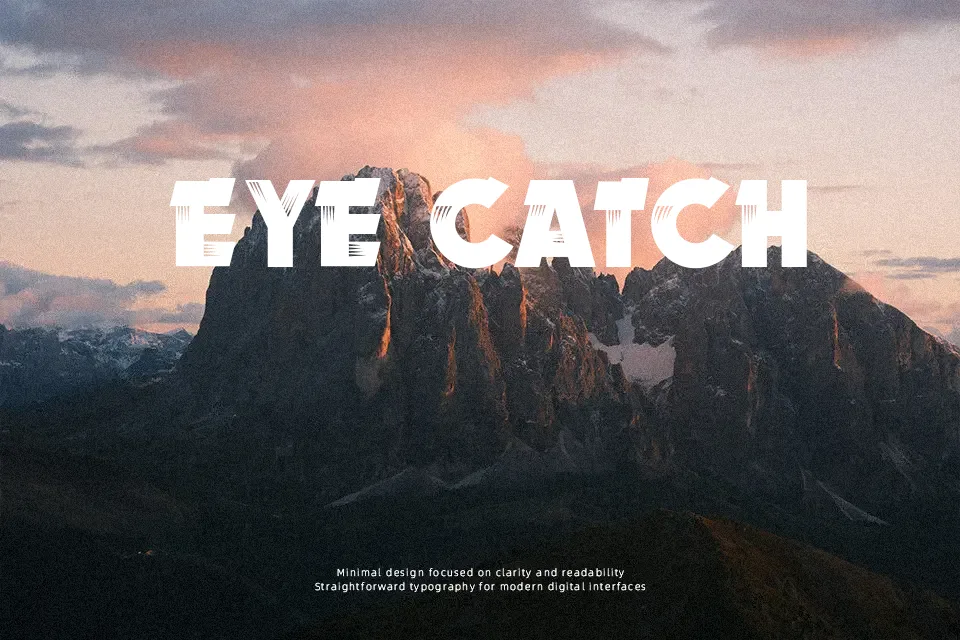
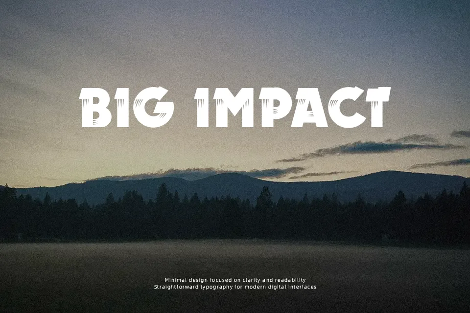
Readability-first, the characters in this typeface look like they have been scuffed and dragged across the surface, with jagged edges and irregular outlines that push it firmly into display territory. Strokes appear thick and roughly consistent, but distressed cuts and gaps interrupt the shapes, which reduces clarity as sizes get smaller. Spacing feels fairly tight, adding visual energy to short words and stacked headings. It reads with impact at larger sizes, yet the textured detailing makes continuous text tiring. Overall, it gives a gritty, energetic voice to titles and short phrases while remaining too aggressive for calm, long-form typography.
Best For:
music artwork titles,grunge or rock event posters,urban clothing or skateboard graphics,edgy website hero headlines
Not Ideal For:
long paragraph text,formal corporate documents,small interface labels,detailed technical manuals
Perfect for headline, logo, and music, with a artistic and decorative style.
License
Gallery