Neucha Font
Free for Commercial UseAbout
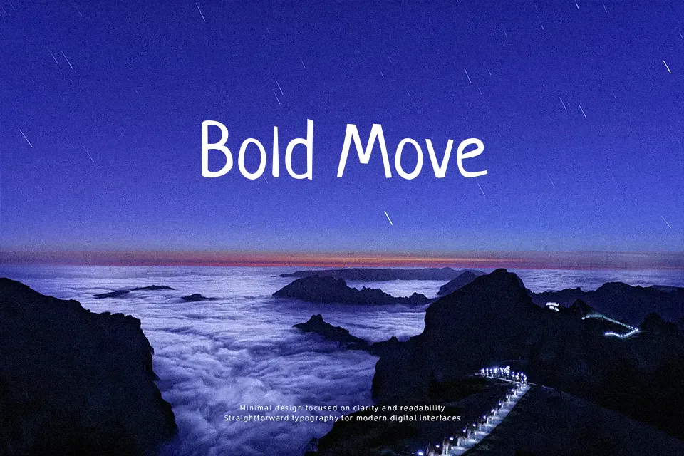
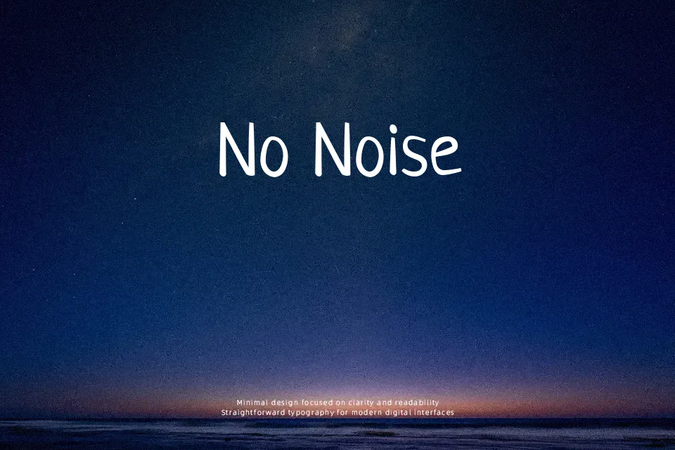
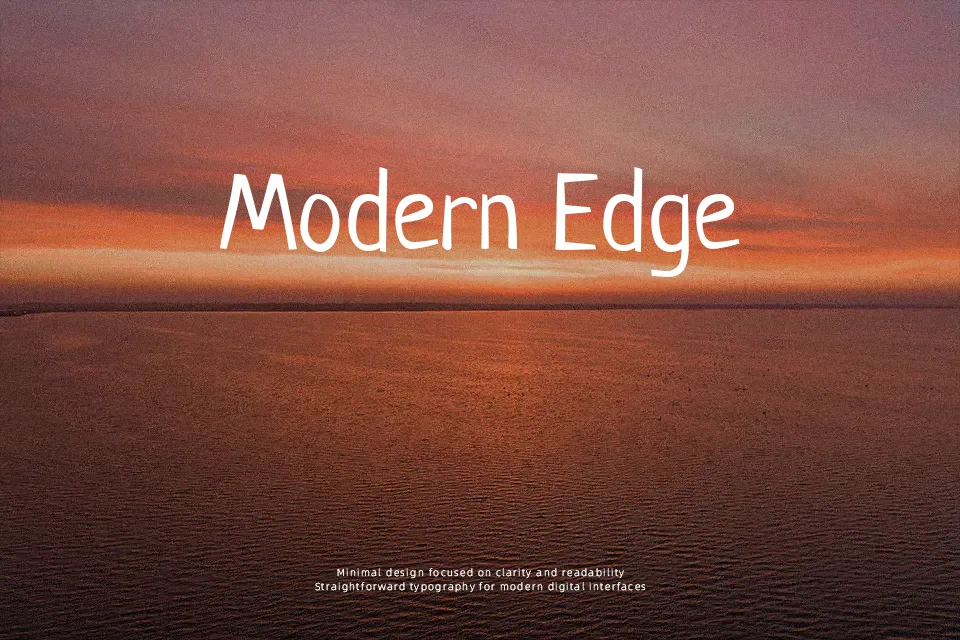
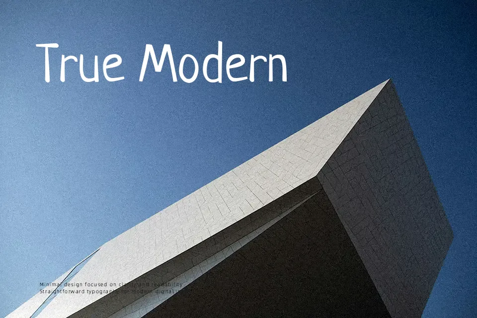
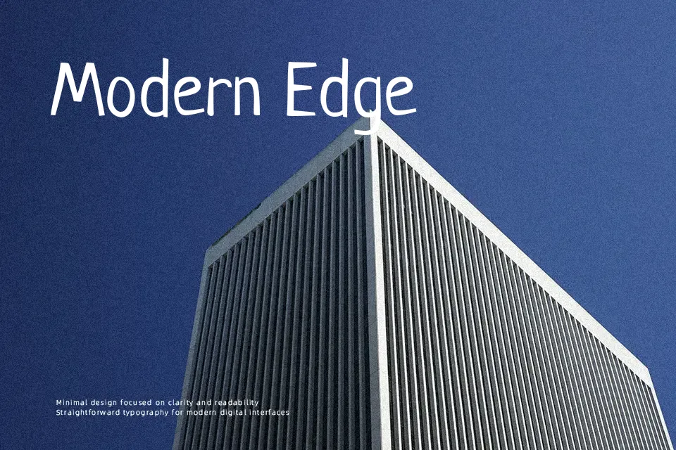
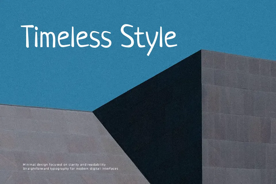
Neucha has loose, uneven strokes with gentle contrast and slightly wobbly baselines, which gives it a quick marker-note feeling while staying surprisingly readable. Letters lean organically, counters stay open, and spacing is relaxed enough that words breathe without falling apart. Overall it feels casual and friendly rather than polished or corporate, so it works when you want a human touch instead of a neutral system face. I like it for handwritten-style headings, callouts on infographics, or interface elements that mimic sticky-note comments. It struggles in dense body text and in situations where strict typographic discipline or formality is required.
Best For:
playful headline notes
handwritten-style UI labels
casual poster captions
Not Ideal For:
long paragraphs
formal documents
highly technical reports
Perfect for branding, headline, and logo, with a artistic and display style.
License
Gallery