Nersans Font
Free for personal useAbout
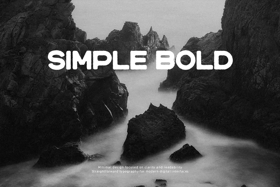
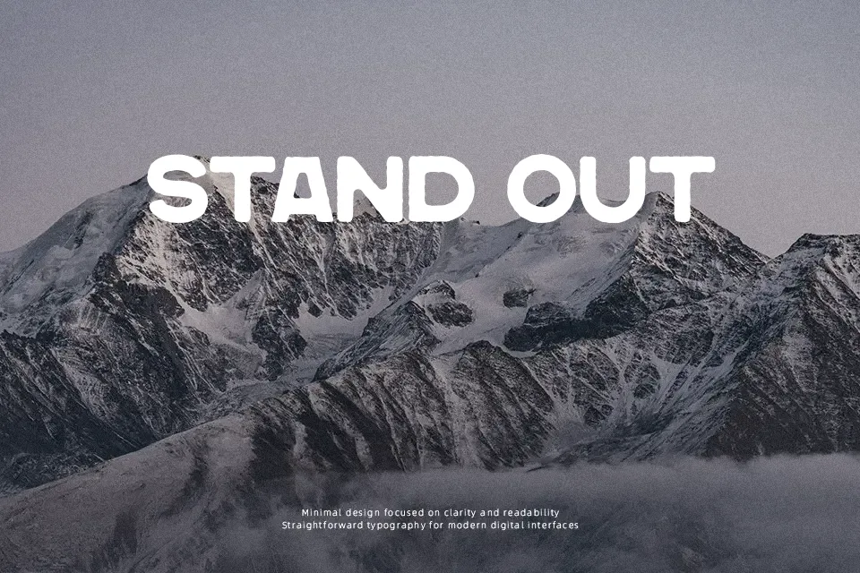
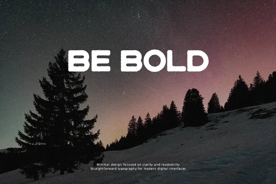
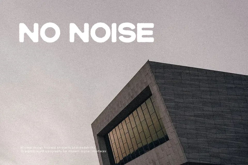
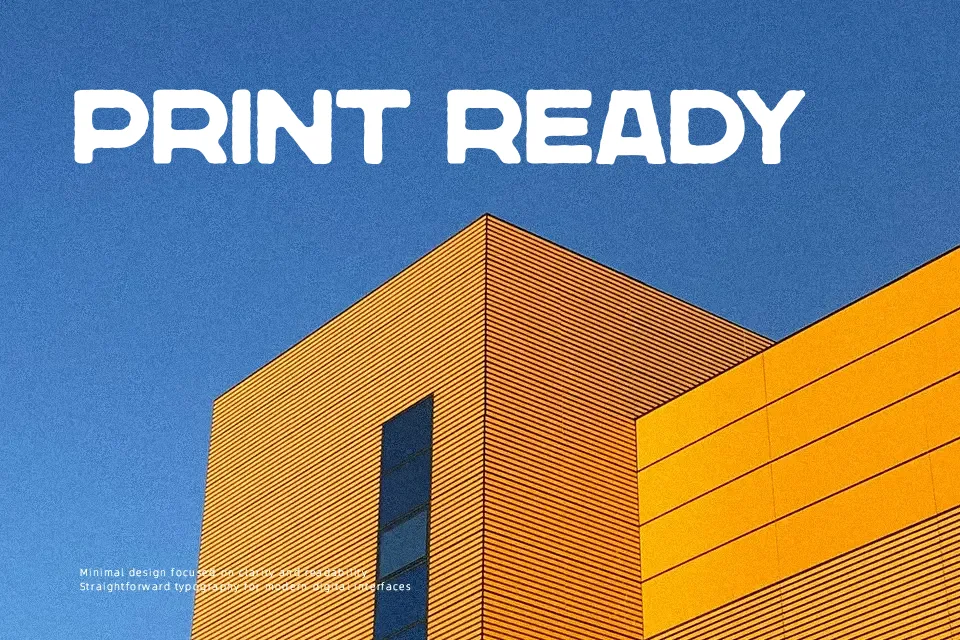
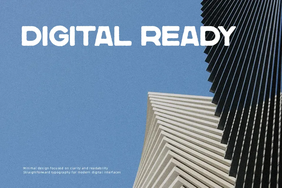
Letterforms appear as a condensed, all-caps display style with straight-sided shapes and visibly eroded edges that suggest age and wear. Strokes are fairly even in weight, but the irregular texture breaks up the contours and makes the characters feel rough rather than clean. Spacing runs on the tighter side, which keeps short words compact and punchy but can feel dense in longer lines. Characters read clearly at larger sizes, though small text will lose detail as the distressed cuts merge together. It works well when you want strong, vintage-flavored headlines or branding pieces, and its worn texture gives posters and packaging extra character. Continuous reading or small captions are less comfortable in this style.
Best For:
vintage poster titles
distressed logo marks
beer or craft product labels
event or music flyer headlines
Not Ideal For:
long paragraph text
formal corporate documents
small interface labels
dense technical manuals
Perfect for branding, headline, and logo, with a bold and decorative style.
License
Gallery