Neptunus Font
Free for personal useAbout
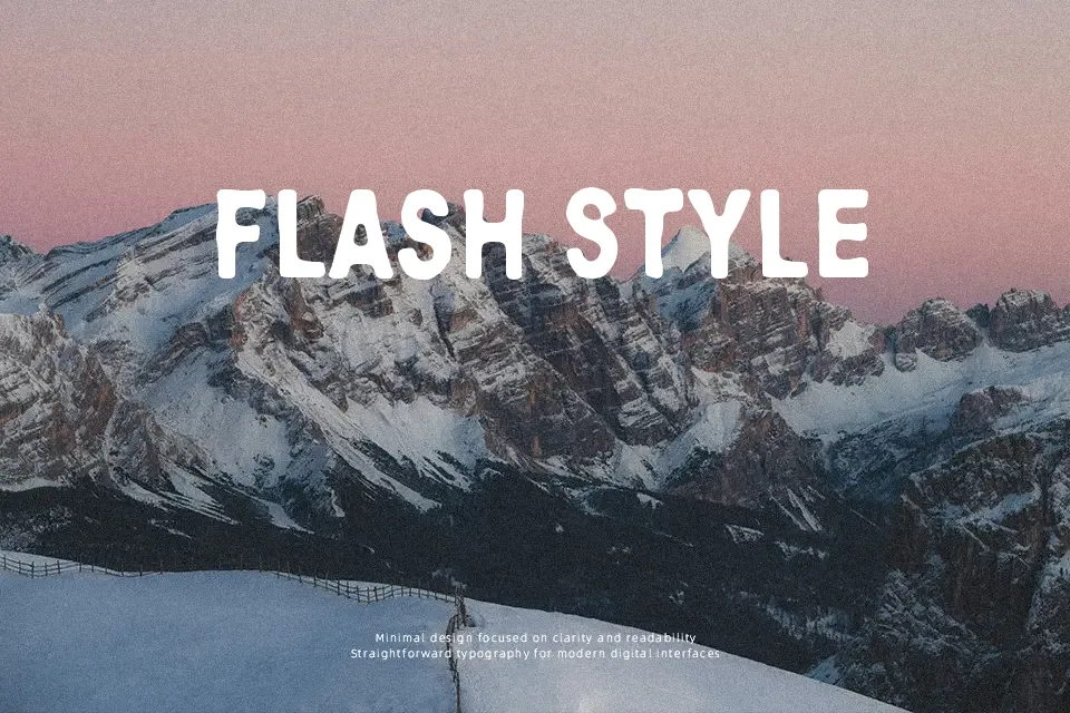
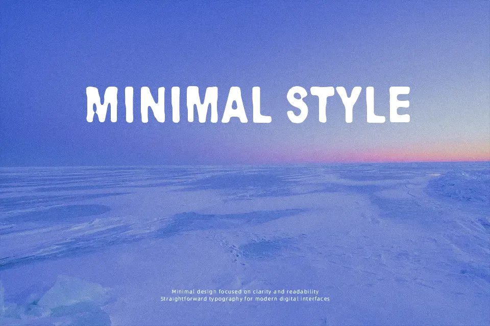
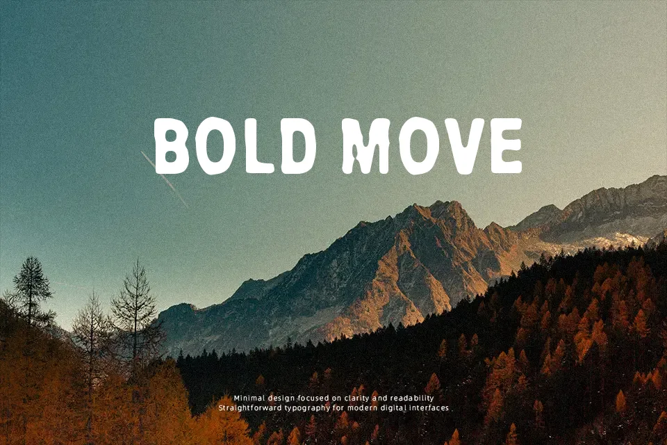
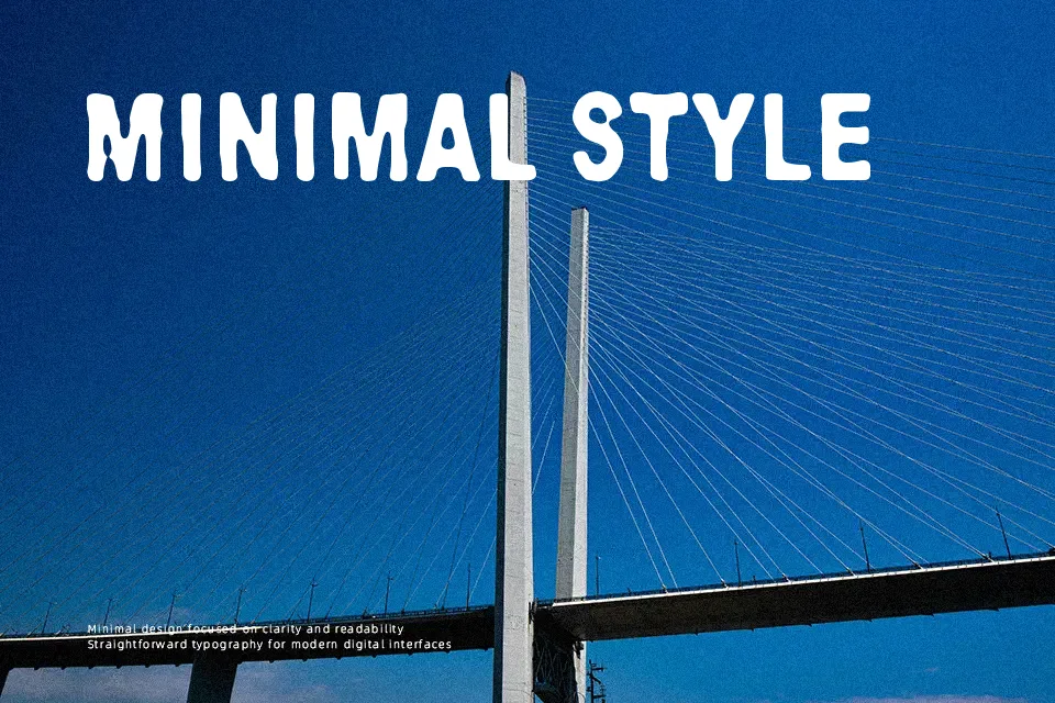
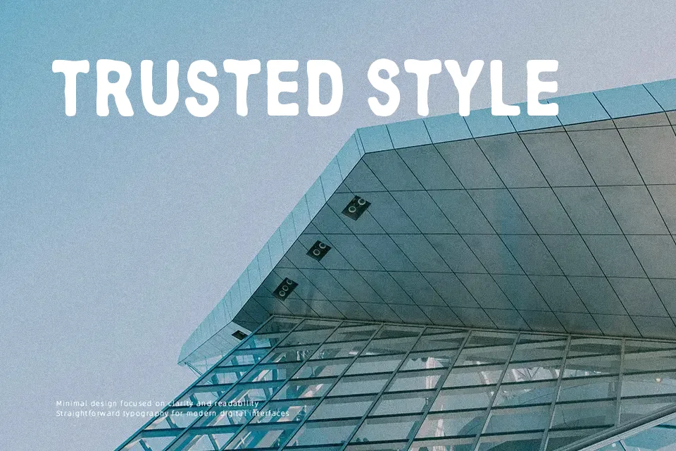
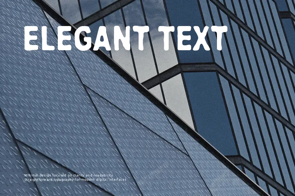
Letterforms in this typeface appear as bold, blocky shapes with heavy erosion cutting through the strokes, so individual characters feel rugged and broken rather than clean. The stroke weight is generally thick, but irregular gaps and chipped areas create strong texture and visible contrast within each glyph. Spacing between characters is fairly tight, which intensifies the dense, distressed feel in words and short phrases. At larger sizes, the rough outlines read clearly and each letter stays recognizable, while at smaller sizes the fragmented edges start to blur and reduce legibility. It works well when you need a worn, grunge-style headline, but continuous reading or small captions will feel strained.
Best For:
game title screens with a distressed feel,grunge-style music or event posters,weathered signage mockups,merch or sticker designs with a rough edge
Not Ideal For:
long paragraph text,formal corporate documents,small UI labels or captions,technical manuals or data-heavy layouts
Perfect for gaming, headline, and logo, with a bold and decorative style.
License
Gallery