Neon Planet Display Font
Free for personal useAbout
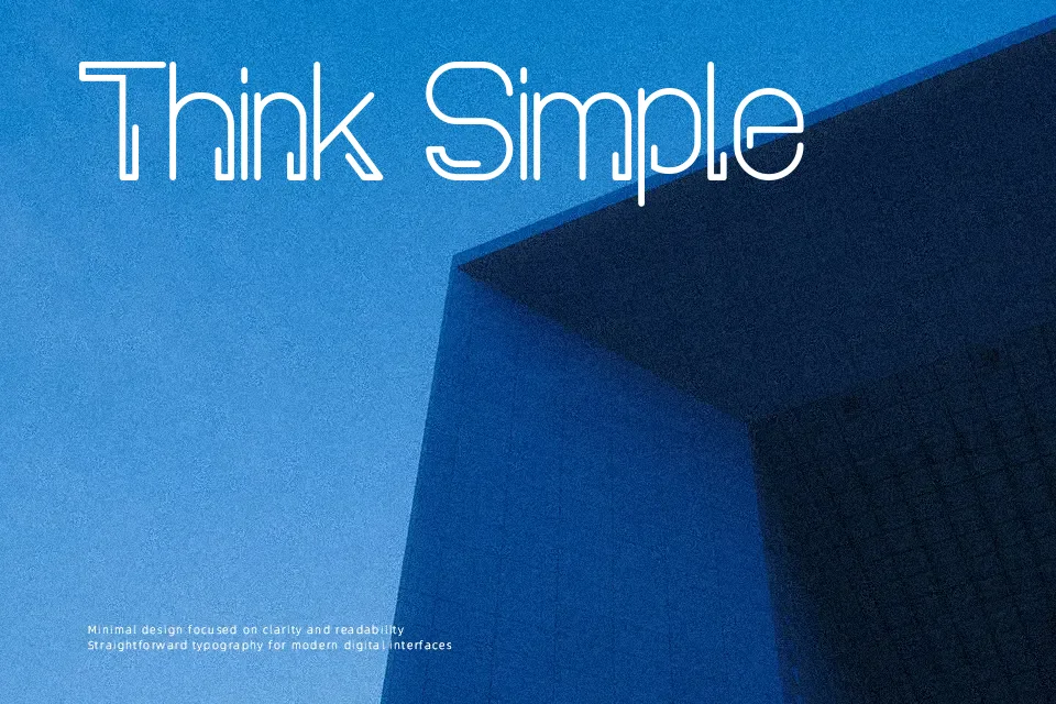
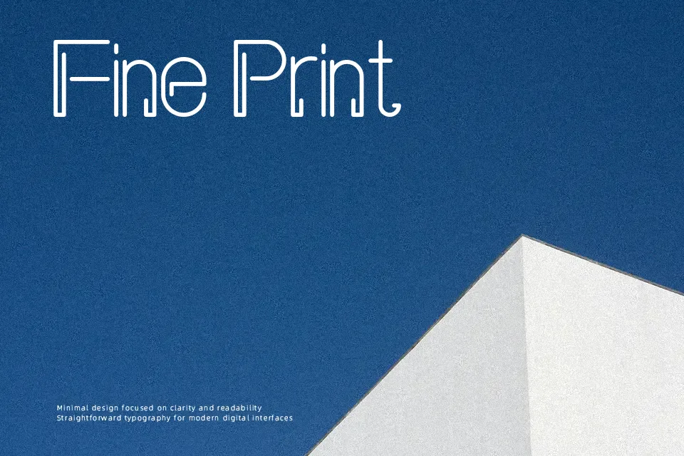
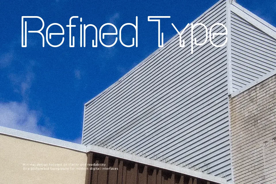
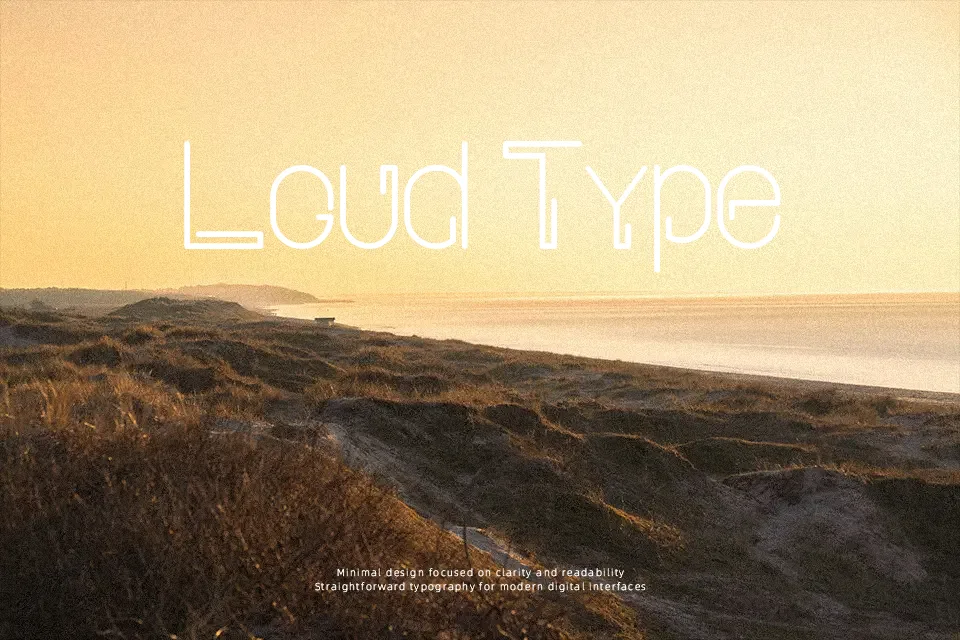
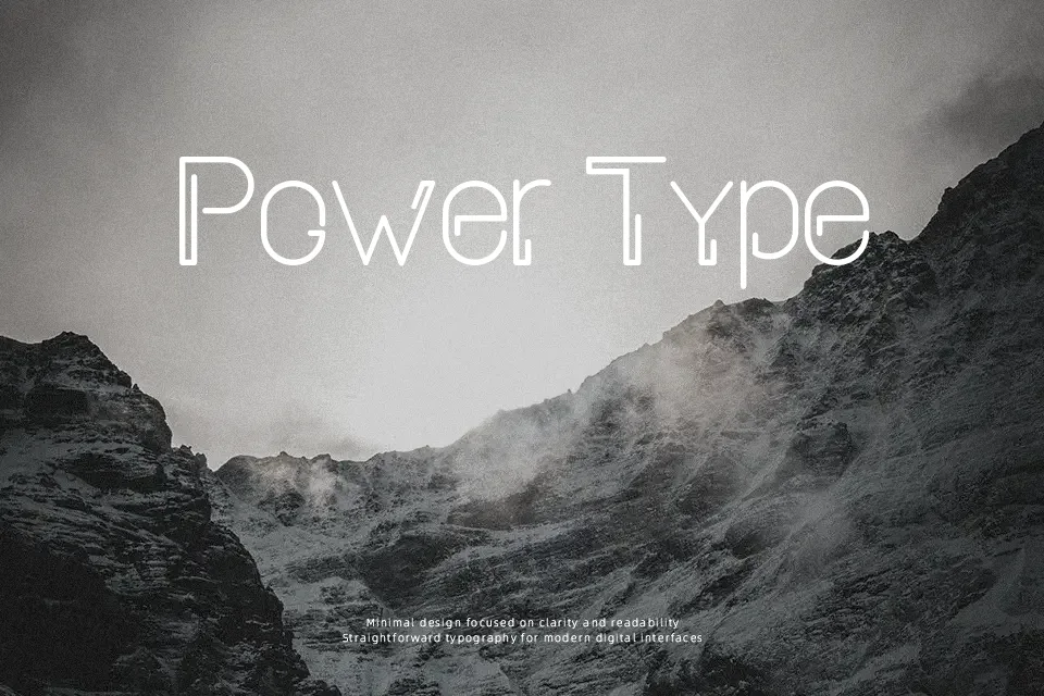
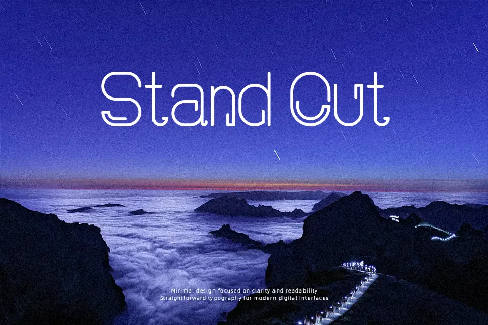
Letterforms appear as thick, rounded outlines that mimic neon tubing, with inner space kept generous so each character stays legible when used large. Strokes are heavy and consistent, with smooth curves and soft corners rather than sharp angles, giving the design a playful, futuristic feel. Spacing between characters looks moderately tight but even, which works well for compact wordmarks and short titles. Overall, the structure is clearly display-oriented, and while readability holds up in big headings, the outlined construction and decorative glow effect make continuous, small-sized text harder to scan. In practice, it suits poster titles, event logos, and social media graphics where a bold neon look is more important than long-form comfort, and it performs best when you give it room and larger point sizes.
Best For:
music festival posters,event banner headlines,nightlife or club logo lockups,social media promo graphics
Not Ideal For:
long paragraph text,legal documents,corporate reports,small interface labels
Perfect for advertising, headline, and logo, with a bold and decorative style.
License
Gallery