Neo Spain Font
Free for personal useAbout
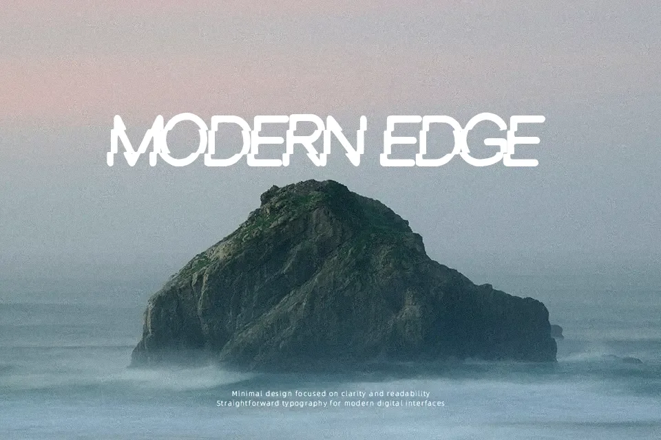
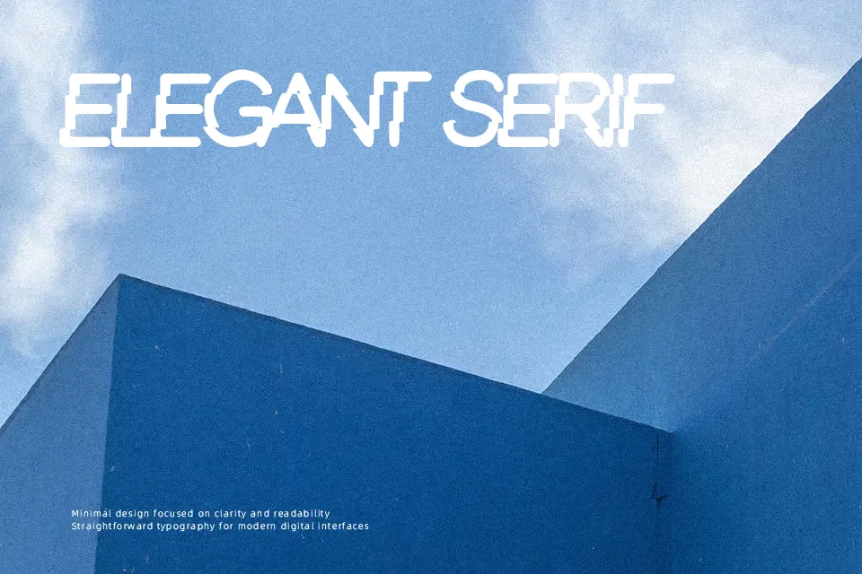
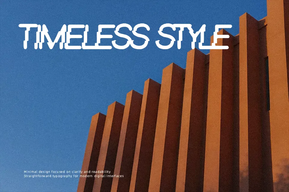
Letters appear bold and heavily distressed, with broken contours and uneven edges that create a worn, inked impression across the character set. Strokes are thick and mostly uniform, so shapes stay recognizable even as the texture adds noise to each glyph. Spacing feels compact, which keeps words visually dense and suited to short headlines rather than long reading lines. This construction works well for posters, album covers, and attention‑grabbing labels, but continuous body copy would quickly become tiring to read. Overall, the font performs best when used sparingly as a strong display element instead of paragraph text.
Best For:
music festival posters,grunge album covers,streetwear logo lockups,edgy product packaging
Not Ideal For:
long paragraph text,legal documents,corporate reports,small interface labels
Perfect for branding, headline, and logo, with a artistic and decorative style.
License
Gallery