NeNe WeNo Reliev Font
Free for Commercial UseAbout
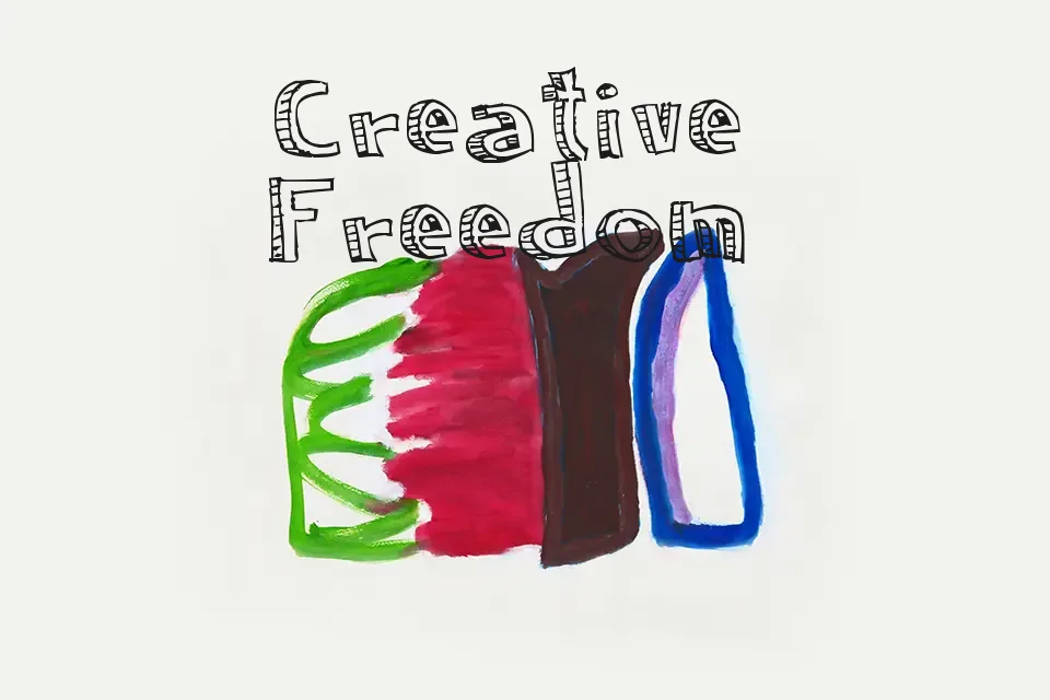
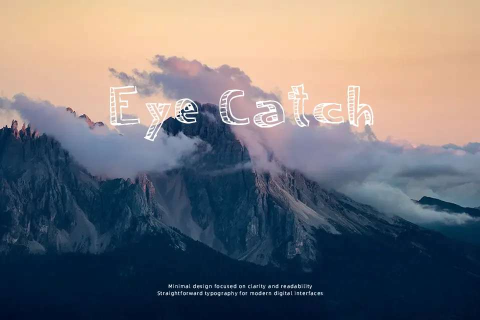
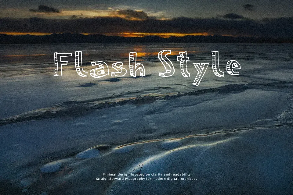
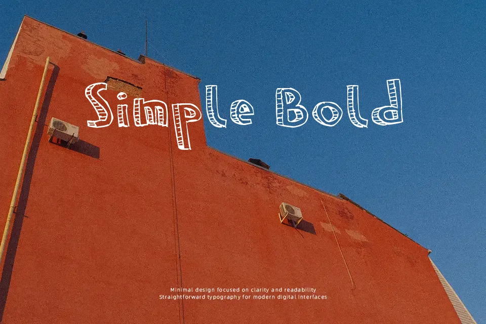
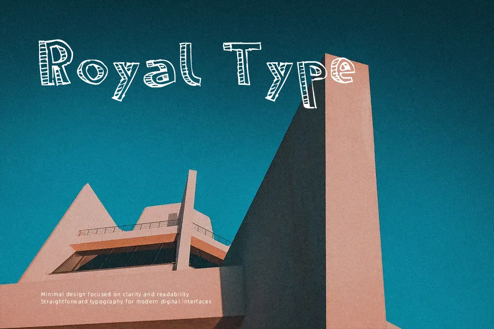
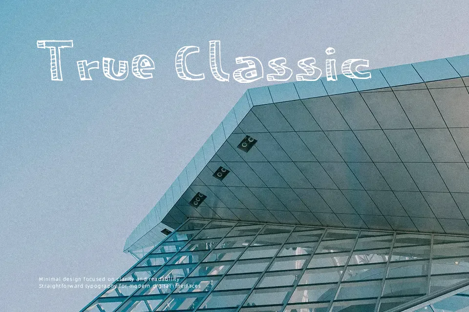
Irregular shapes and uneven stroke construction give this font a distinctly decorative presence. The letterforms vary in proportion, with a mix of angular and slightly distorted curves that create a loose, expressive rhythm. Spacing appears inconsistent, which adds character in short phrases but can feel crowded in longer lines. Uppercase and lowercase follow a similar playful logic, prioritizing style over strict uniformity. Readability holds up in large headlines, where the quirks become visually engaging, but smaller text quickly loses clarity. It works best when used sparingly, as its strong personality can overpower more structured layouts.
Best For:
poster headlines,album cover titles,social media graphics,creative logo concepts
Not Ideal For:
long paragraph text,small interface labels,formal documents,dense editorial layouts
Perfect for headline, logo, and poster, with a artistic and decorative style.
License
Gallery