Mukta Vaani Font
Free for Commercial UseAbout
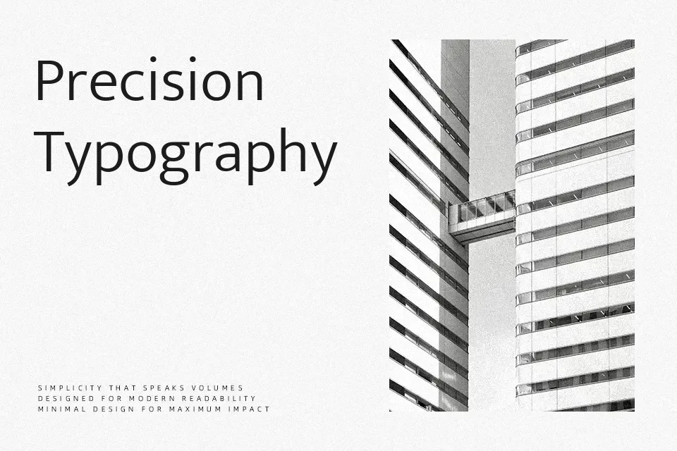
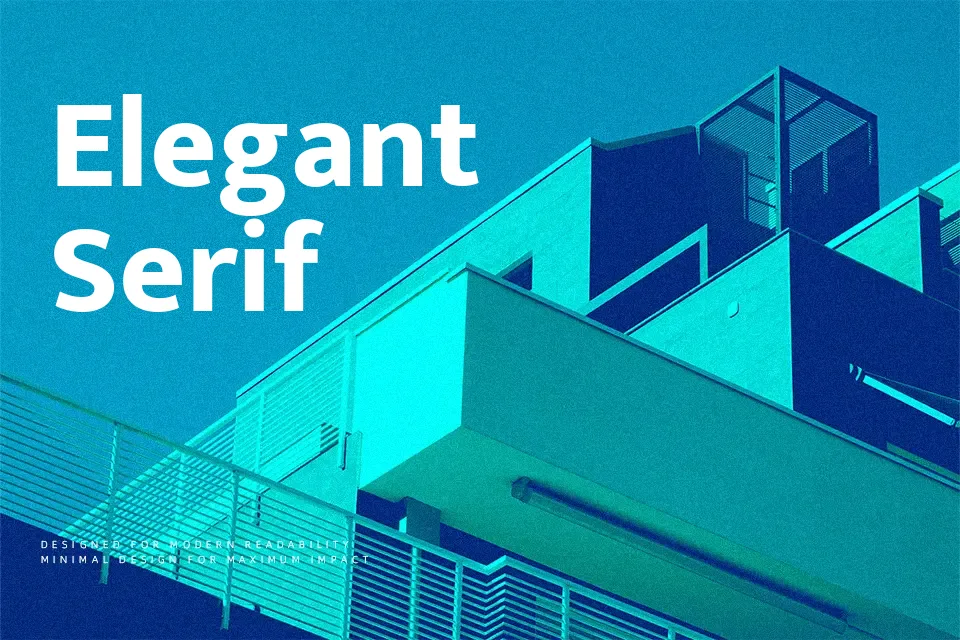
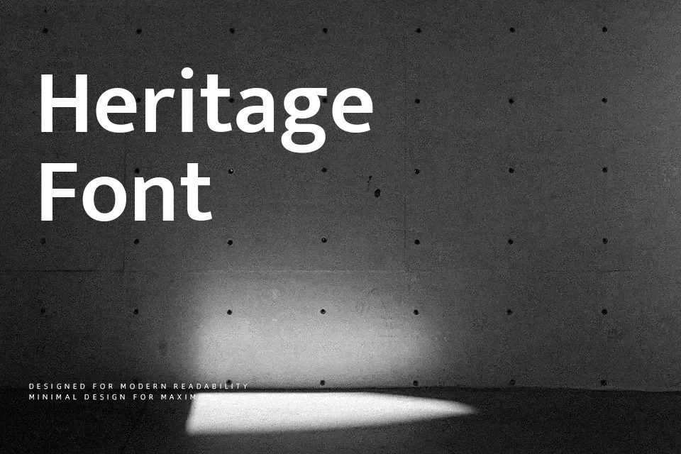
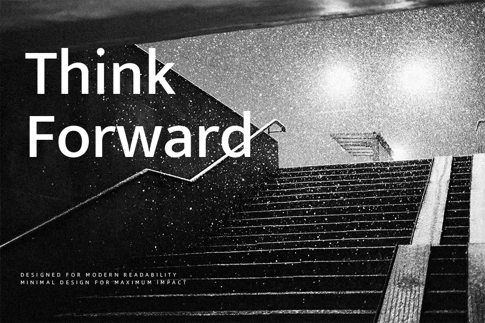
Mukta Vaani has mono-linear strokes, generous counters, and a clean geometric skeleton softened by rounded terminals, so it reads smoothly at both small and large sizes. The family spans multiple weights, which helps you build hierarchy in Gujarati–Latin layouts without resorting to a second typeface. It feels restrained and contemporary rather than flashy, so it suits interfaces, editorial systems, and information-heavy posters more than expressive display work. I reach for it when a project needs multilingual consistency and steady tone; if you want highly characterful branding or ultra-tight wordmarks, its openness and neutrality can feel a bit too quiet.
Best For:
bilingual ui and app interfaces
educational and governmental materials in gujarati and latin
information-heavy websites and dashboards
signage or wayfinding that must stay legible at a distance
Not Ideal For:
highly expressive logo wordmarks
playful kids packaging or toys
luxury fashion branding
dense print set at very small sizes where a serif reads better
Perfect for advertising, body text, and headline, with a calm and geometric style.
License
Gallery