Mukta Malar Font
Free for Commercial UseAbout
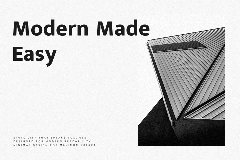
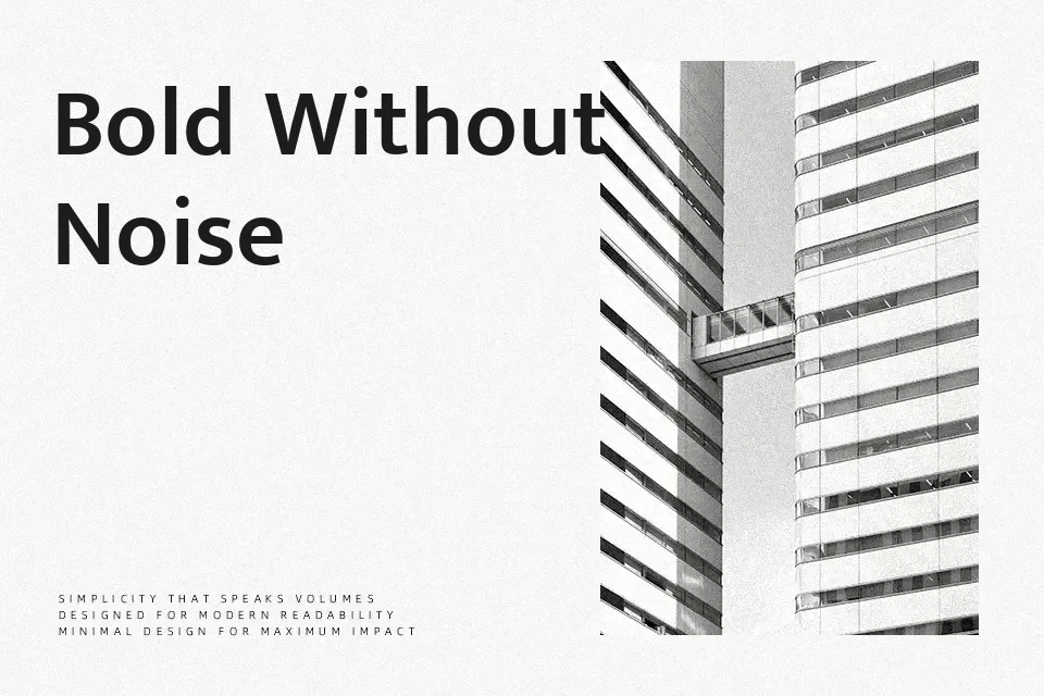
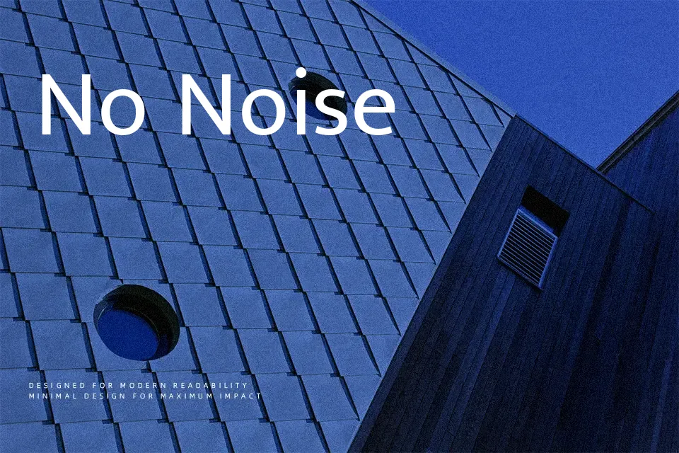
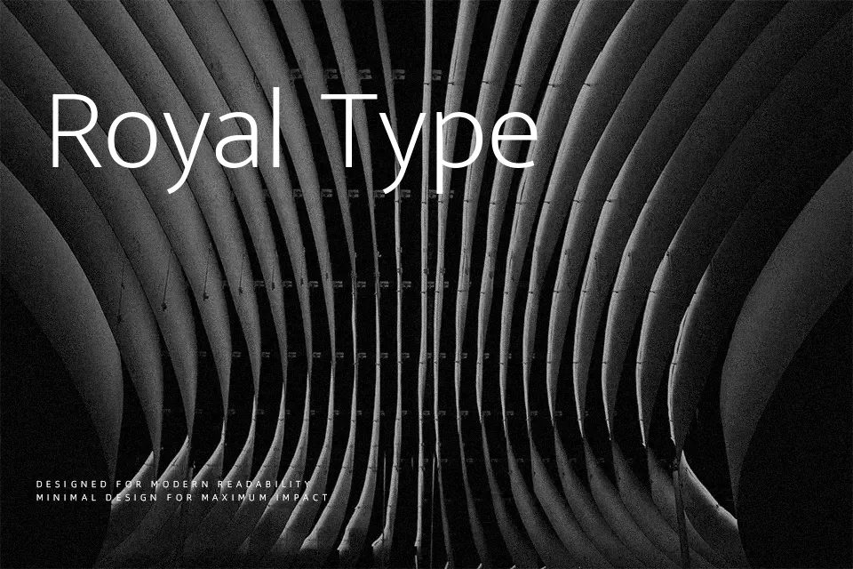
Mukta Malar combines a mono-linear skeleton with humanist proportions, so strokes feel even while the curves stay approachable rather than mechanical. Letterforms show open counters, a generous x-height, and modest contrast, which keeps long Tamil and Latin passages readable on screens and in print. Across its seven weights, spacing is tuned for continuous text first and hierarchy second, so you can push headings slightly heavier without the page looking shouty. In practice, it works especially well for bilingual websites, app UIs, and editorial systems where Tamil, English, and numerals share the same grid. If you want highly expressive branding or decorative display work, though, this family feels too restrained and utilitarian compared with more characterful display faces.
Best For:
bilingual Tamil–English interfaces and apps
reading-focused websites and blogs
editorial layouts with multi-weight hierarchy
product dashboards and UI text
Not Ideal For:
expressive display wordmarks
playful kids branding
overly decorative poster typography
highly formal luxury branding
Perfect for body text, editorial, and headline, with a clean and sans serif style.
License
Gallery