Mooli Font
Free for Commercial UseAbout
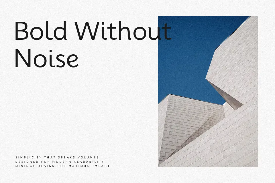
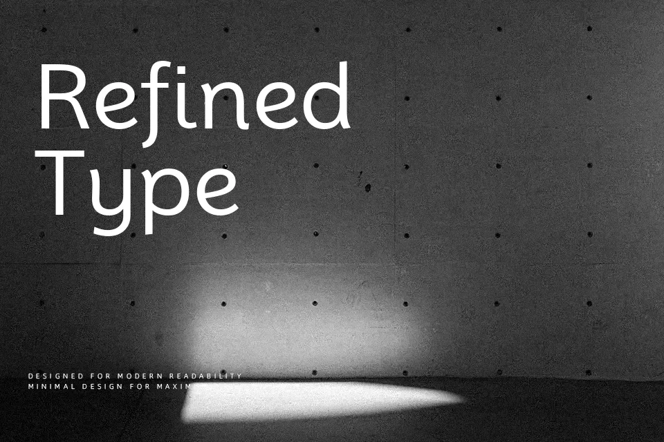
Mooli’s character comes from its oval-driven letterforms and softly rounded stroke endings, which give it an organic quality that sets it apart from colder geometric sans-serifs. It was deliberately engineered for young readers, and that intent shows — open counters, a generous x-height, and consistent stroke weight all contribute to strong on-screen legibility at small sizes. Where it earns its place most naturally is in mobile app interfaces, children’s educational platforms, and packaging contexts where the tone needs to feel approachable rather than authoritative. The single-weight structure is both a strength and a constraint: it keeps the visual tone consistent, but leaves little room for typographic hierarchy in complex layouts. Designers working on long editorial pieces or data-heavy dashboards will likely find themselves reaching for something with more weight options.
Best For:- children’s app UI and educational platforms
– editorial subheadings and pull quotes
– product packaging targeting younger audiences
– clean website headlines
Not Ideal For:- long-form body text in print
– formal documents or legal materials
– typographic systems requiring multiple weights
Perfect for branding, editorial, and headline, with a clean and rounded style.
License
Gallery