Monoton Font
Free for Commercial UseAbout
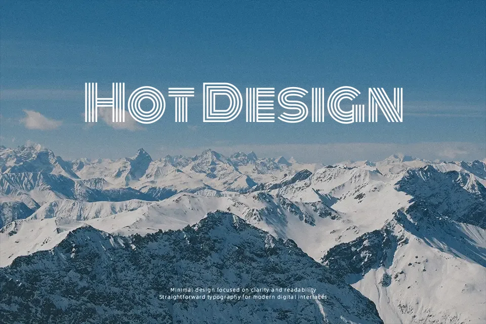
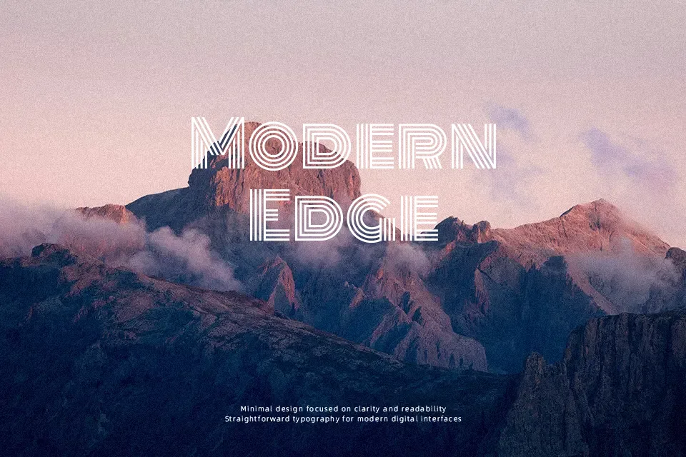
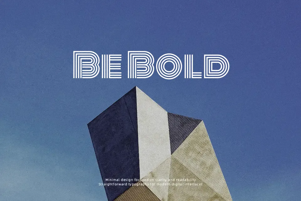
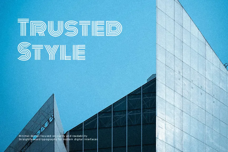
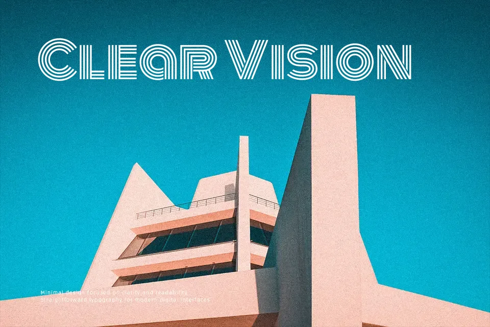
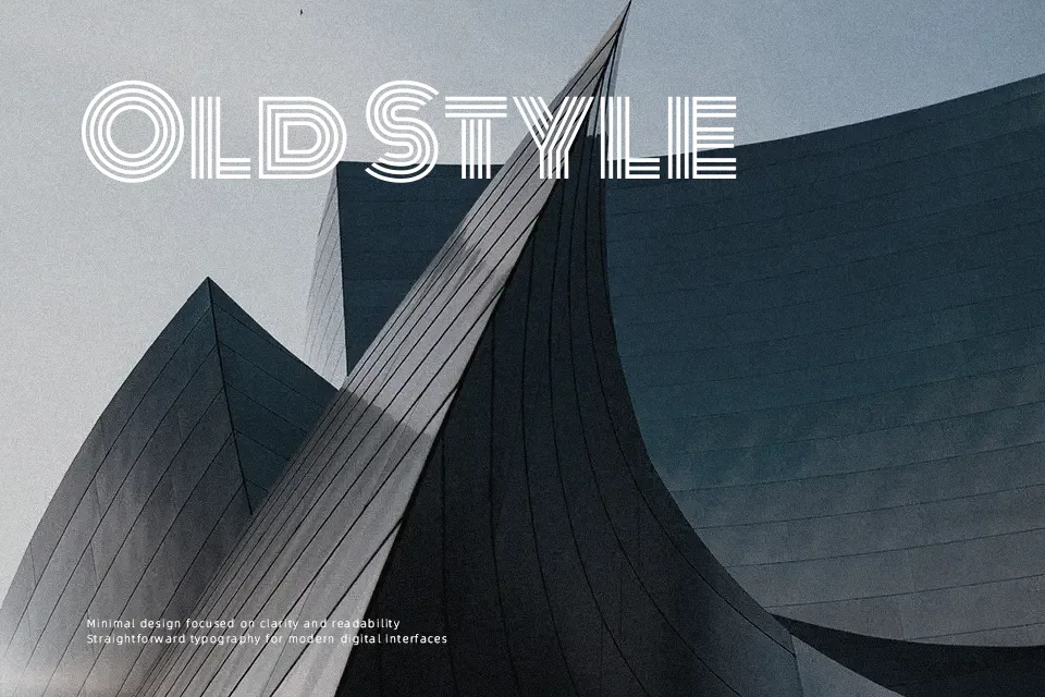
Monoton draws its design lineage from embossed metalpress typefaces of the 1930s — most notably Rudolf Koch’s *Prisma* — reinterpreted for contemporary screens. Every character carries perfectly uniform stroke weights arranged in a double-line inline structure, creating an optical depth effect without gradients or fills. The letterforms are geometric and wide-spaced, which amplifies the retro-neon atmosphere at headline scales. It earns its place on concert posters, vinyl cover layouts, ’80s-style game title screens, or event branding where a single word needs to stop the scroll. That said, drop it below 24pt and the inline lines visually collapse into noise. This is a one-trick font — and it knows it. Pushing it into multi-line body copy doesn’t just look wrong; it actively undermines legibility.
Best For:- retro poster headlines
– music event branding
– large-scale neon signage design
– gaming and entertainment titles
Not Ideal For:- body text or any extended reading
– UI labels and small screen elements
– formal or corporate documents
Perfect for branding, headline, and logo, with a bold and decorative style.
License
Gallery