Monda Font
Free for Commercial UseAbout
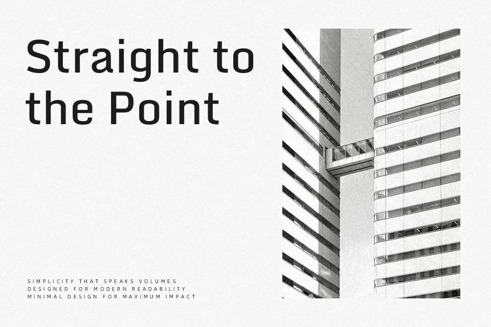
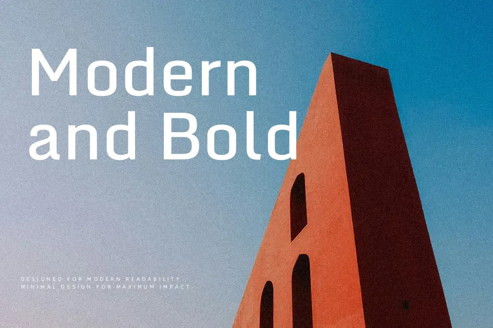
Monda carries a quiet geometric confidence — rounded terminals, open counters, and a consistent stroke weight that keeps it grounded without feeling stiff. Designed by Vernon Adams in 2012 and released under the SIL Open Font License, it was built with screen legibility as the driving priority. The generous x-height and even spacing allow it to hold up in both tight UI labels and larger display headings. It fits naturally into developer tool branding, SaaS product pages, and app navigation headers. Where it falls short is extended editorial — the same uniformity that reads clean on screen grows flat in dense paragraphs. As a screen-first sans-serif, it sits closer to Source Sans Pro than Raleway — less personality, but sharper functional clarity.
Best For:UI navigation and interface labels, tech startup branding, app and SaaS product pages, website headers and subheadings
Not Ideal For:Long-form editorial body copy, formal print documents, decorative or expressive display work
Perfect for branding, headline, and logo, with a clean and geometric style.
License
Gallery