Menbere Font
Free for Commercial UseAbout
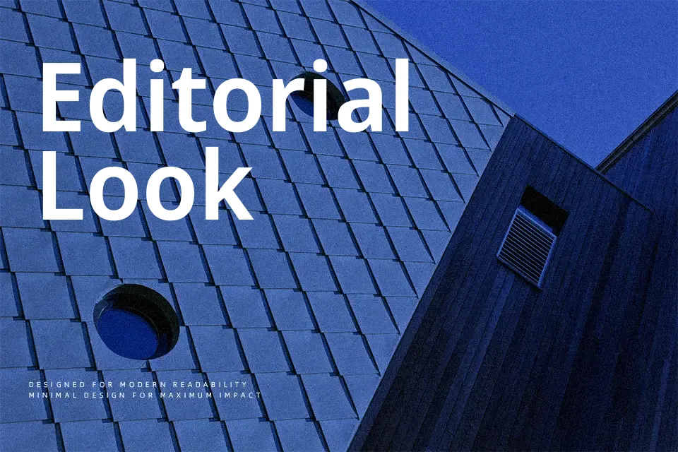
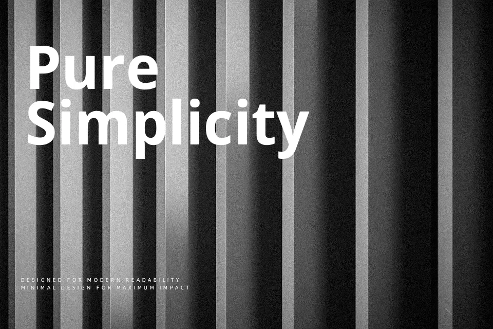
Menbere combines rounded Ethiopic forms with a contemporary sans serif structure, so strokes feel even, measured, and calm rather than showy. The spacing is tuned for screen use, which keeps text legible in UI labels and short paragraphs, especially when mixing Ethiopic and Latin scripts in the same block. Lighter weights read crisply in longer captions, while the heavier cuts create confident headings without turning bulky. I tend to reach for it when a project needs bilingual clarity and a neutral voice, rather than expressive personality. It is less convincing for highly character-driven branding, where a more distinctive display face would carry the tone better.
Best For:
bilingual ui headlines
ethiopic-latin editorial layouts
app interfaces with clear hierarchy
informational posters and signage
Not Ideal For:
expressive logo wordmarks
highly decorative branding
handwritten or craft-style projects
dense book-length text
Perfect for advertising, editorial, and headline, with a clean and sans serif style.
License
Gallery