Matangi Font
Free for Commercial UseAbout
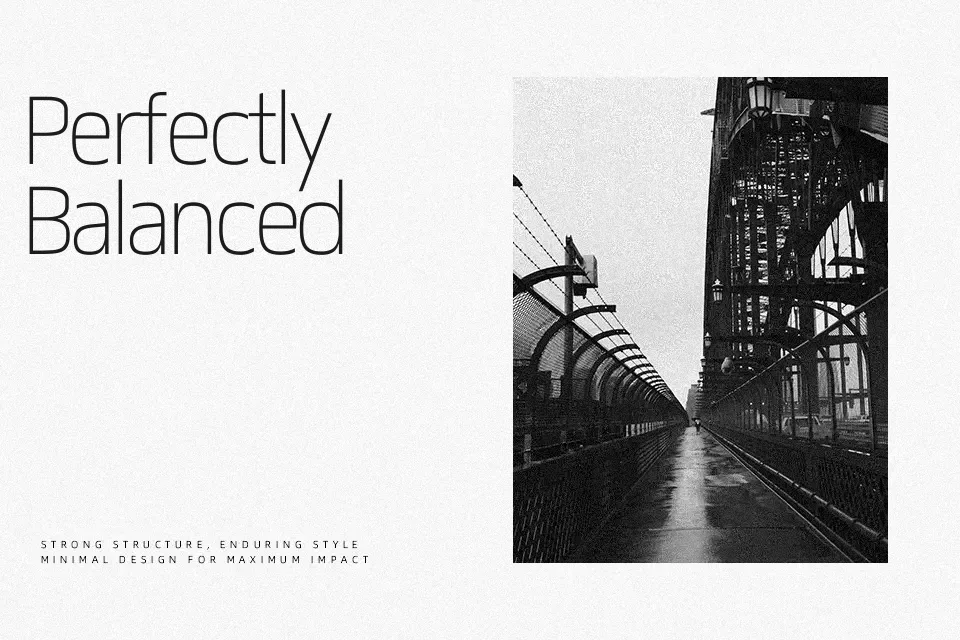
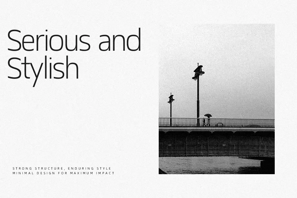
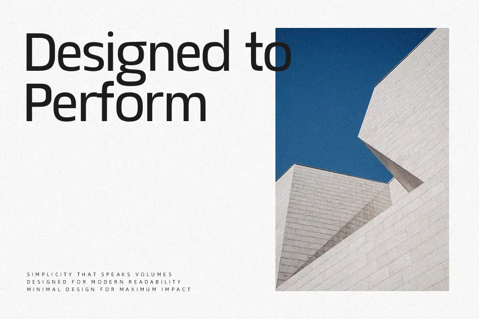
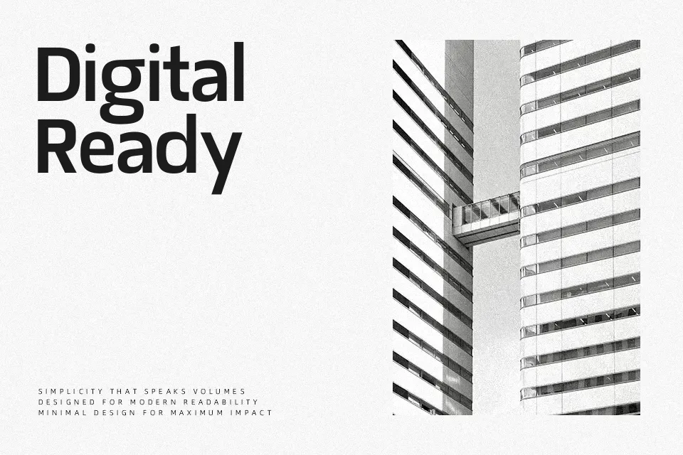
Matangi combines a semi-condensed width with geometric construction, so letters feel compact yet readable, with even stroke weight, tight but controlled spacing, and subtle inktraps that keep text crisp at small sizes. Its overall impression is modern and functional rather than flashy, which suits interfaces, bilingual print layouts, and branding systems that need Hindi or Nepali alongside English without visual clash. The family’s multi-weight range works nicely for hierarchy—lighter cuts for UI labels or captions, heavier ones for section headings, navigation, or compact poster titles. However, if you want an expressive display face for loud streetwear logos or characterful kids’ packaging, Matangi can feel too restrained and rational. In that case it pairs better as the supporting workhorse while a more decorative companion handles the hero moments.
Best For:
multilingual ui design
bilingual branding systems
editorial layouts with devanagari
app and web interface text
Not Ideal For:
highly decorative logo wordmarks
kids product packaging
expressive poster typography
long-form print novels
Perfect for branding, editorial, and headline, with a clean and sans serif style.
License
Gallery