Libre Caslon Display Font
Free for Commercial UseAbout
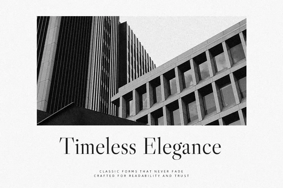
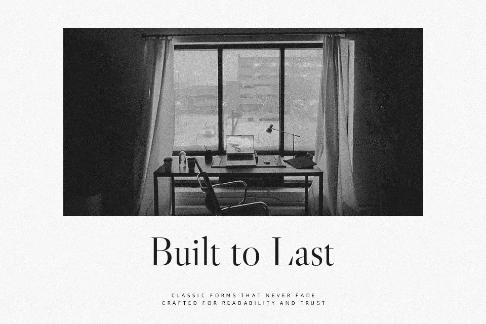
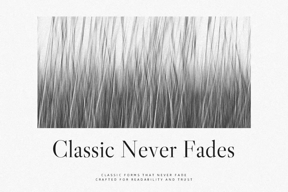
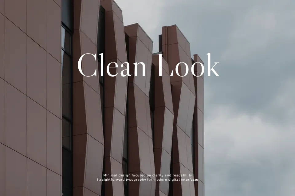
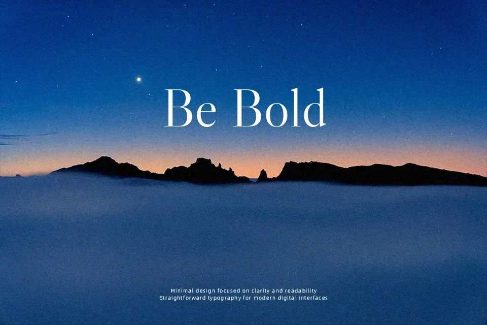
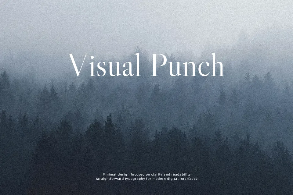
Libre Caslon Display takes the familiar Caslon spirit and pushes it toward a more dramatic, high-contrast look, with pronounced thick–thin strokes and crisp, bracketed serifs that feel confident on the page. The counters stay relatively open, and the spacing is tight enough to create dense, expressive word shapes at large sizes, which works especially well in magazine covers, title pages, and identity systems that need a sense of heritage without feeling dusty. It behaves more like a display cut than a workhorse text face, so small sizes and heavy copy blocks can feel busy and fatiguing. If you like classic book serifs but want something more cinematic than typical oldstyle text fonts, this is a smart step up.
Best For:
large editorial headlines
book cover titles
heritage-inspired branding
elegant poster typography
Not Ideal For:
long paragraphs
small UI labels
dense technical documents
Perfect for branding, editorial, and headline, with a classic and display style.
License
Gallery